DA SmartThings UI Guidelines
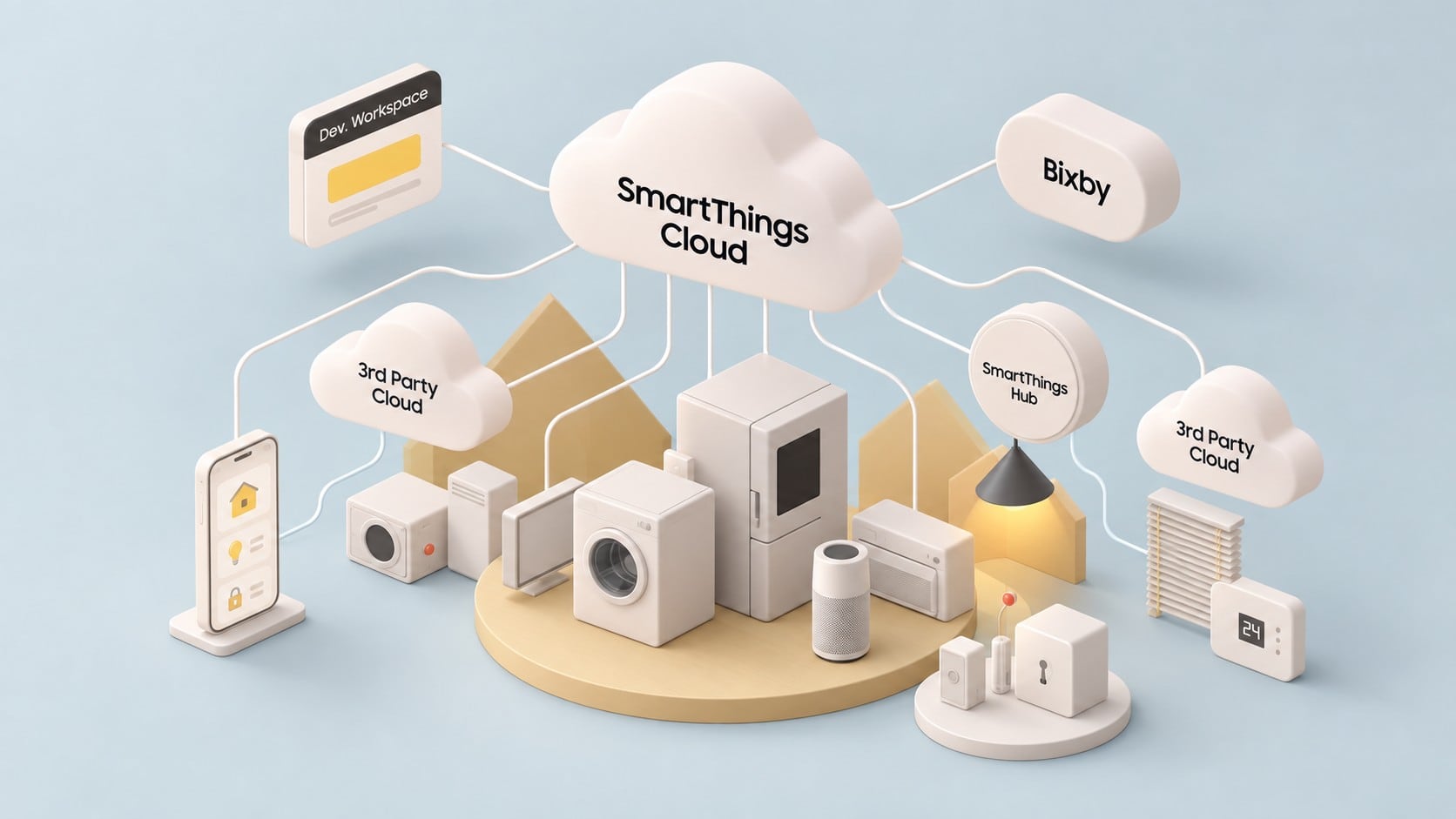
The same function now lives in two places — the app in your hand and the panel on the machine. When they disagree, the person is the one who has to reconcile them.
SmartThings reached the point where an appliance could be worked from a phone or from its own screen, and both had to be right.
The decision is not what to unify but what is allowed to differ. A phone can scroll and a washing machine cannot; pretending otherwise makes both worse. So: what matches exactly, and where a device's own nature may show through.
It built on guideline work carried forward from earlier years, widened this time to take in the set screens as well.
4 separate engagements on this line, 2021–2024.
Technology trends
Written by AEON from public sources. It describes the field, not the project above.
In the mid-2020s the largest platform owners each moved towards a single design language spanning all their screens. Apple's June 2025 redesign was described as the first to extend across iOS, iPadOS, macOS, watchOS and tvOS while keeping what is distinct about each. Samsung took a parallel step for the kitchen and laundry room two months later, extending its One UI platform to home appliances so that phones, TVs and appliances share common interface elements, apps and services, with up to seven years of software updates for Wi-Fi models launched from 2024. The appliance is no longer treated as a separate island of interface design. It is one more surface in a family.
The case for this rests on an old usability principle. Nielsen Norman Group distinguishes internal consistency within a product family from external consistency with conventions people meet elsewhere, and argues that both reduce the effort of learning and give people confidence that the same element will behave the same way. A household that owns a phone, a television and a refrigerator from one maker reasonably expects an icon, a colour or a gesture to mean the same thing on each.
A shared language does not mean identical screens, however, and the Apple announcement was careful to speak of harmony rather than sameness. An appliance panel is fixed in place, often small, used with wet or full hands and sometimes read from across a room, while a television is used from a distance with a remote and a watch is used in seconds. What platform owners tend to share across such different surfaces is the foundation: colour, type, iconography, motion and the names of things. Layout and interaction stay specific to each class of device, and design systems increasingly document those platform-specific rules alongside the shared ones.
The tooling has caught up with the ambition. In October 2025 the W3C Design Tokens Community Group released the first stable version of its specification, a vendor-neutral format for design decisions with support for theming and multiple brands and with output to several platforms. It is a community group report rather than a formal W3C standard, but several major design tools already support it. For a manufacturer maintaining dozens of product screens alongside a phone app, tokens mean that a decision about colour or type can travel from one source to every surface, rather than being copied by hand and drifting apart.
For the people living with these products, a unified design language pays off mainly in recognition: an icon learnt on the phone is understood on the television, and a settings structure met once does not have to be learnt again. The risk is a surface-level consistency, where screens share a visual style but differ in how they behave, which can mislead more than an honest difference would. A useful measure of the trend is therefore not how alike the screens look, but how reliably people can predict what will happen when they act on any of them.