CASES
Each entry is one engagement — the condition the work had to meet, and what that condition decided. The deliverables themselves are not published.
Not everything AEON has done can sit on one page, so this is a selection, weighted towards the last ten years or so.
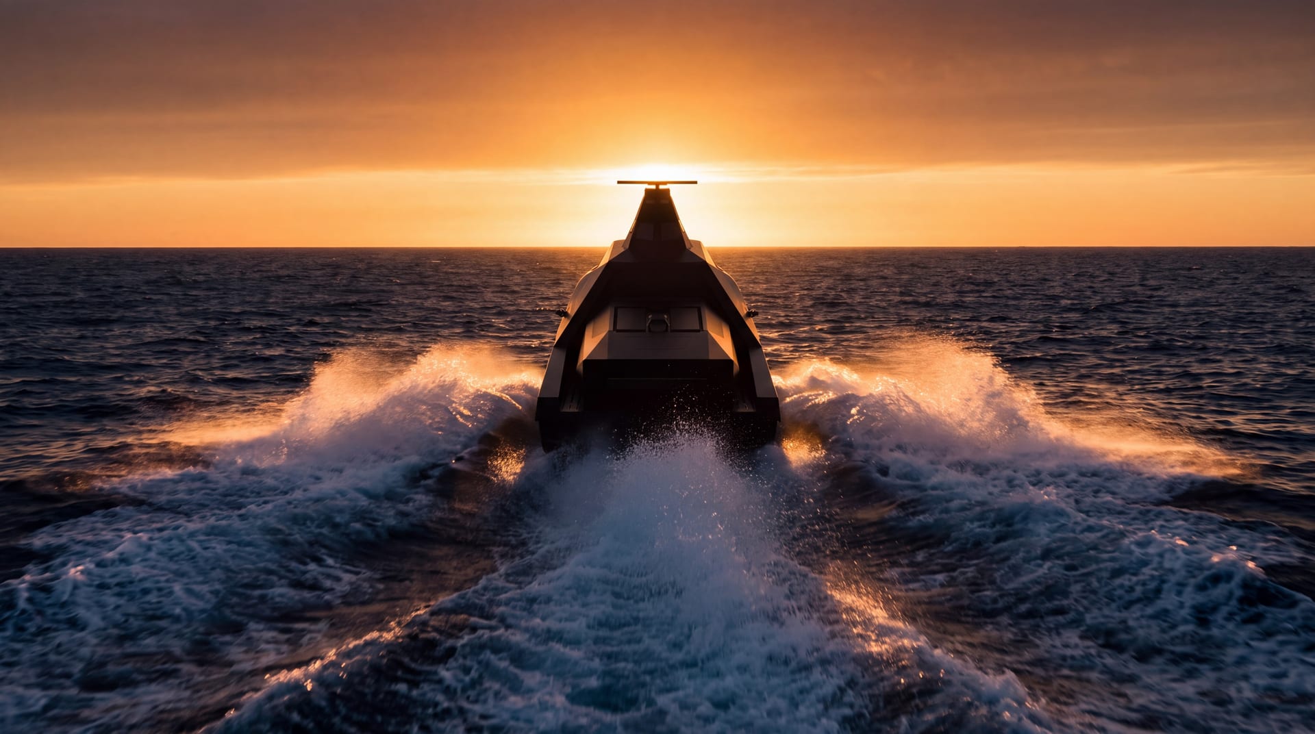 Sea-Sword — Promotional Film
Promotional Film
Sea-Sword — Promotional Film
Promotional Film
Sea-Sword — Promotional Film
A family this wide reads as a catalogue unless the film can show the pieces working as one thing.
Sea-Sword is the maritime unmanned family — surface, air and underwater vehicles, mine countermeasures craft, one-way attack boats — and the point of it is not the count. The vehicles are modular, they are built to be operated in numbers rather than singly, and the harbour they work out of is part of the concept rather than the place they are kept.
A brand film that walks through a product list leaves the viewer holding a list. So we picked the scenarios where the connection is visible — modular fitting, swarm operation, the smart harbour — and built the film for the family around those.
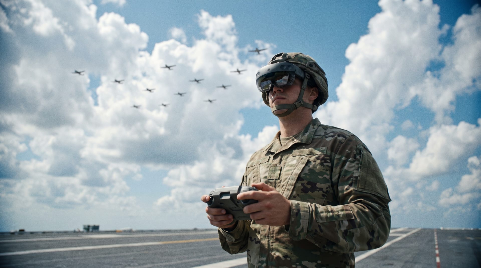 MR-based Swarm Drone Operation & Control
MR UX Design
MR-based Swarm Drone Operation & Control
MR UX Design
MR-based Swarm Drone Operation & Control
A swarm cannot be flown one machine at a time. Here the operator wears the interface instead of sitting at one.
Mixed reality replaces the console. Tactical options arrive from an AI as the situation changes, and the operator answers with a gesture rather than a cursor.
The hardware is not ready, and that is the design problem rather than a caveat attached to it. Gesture recognition is less exact than a mouse and takes more steps to say the same thing, so the question is what may be entrusted to it now and what has to wait.
We worked heuristically, on the actual equipment, arguing the interface out in front of it. A gesture cannot be judged on paper.
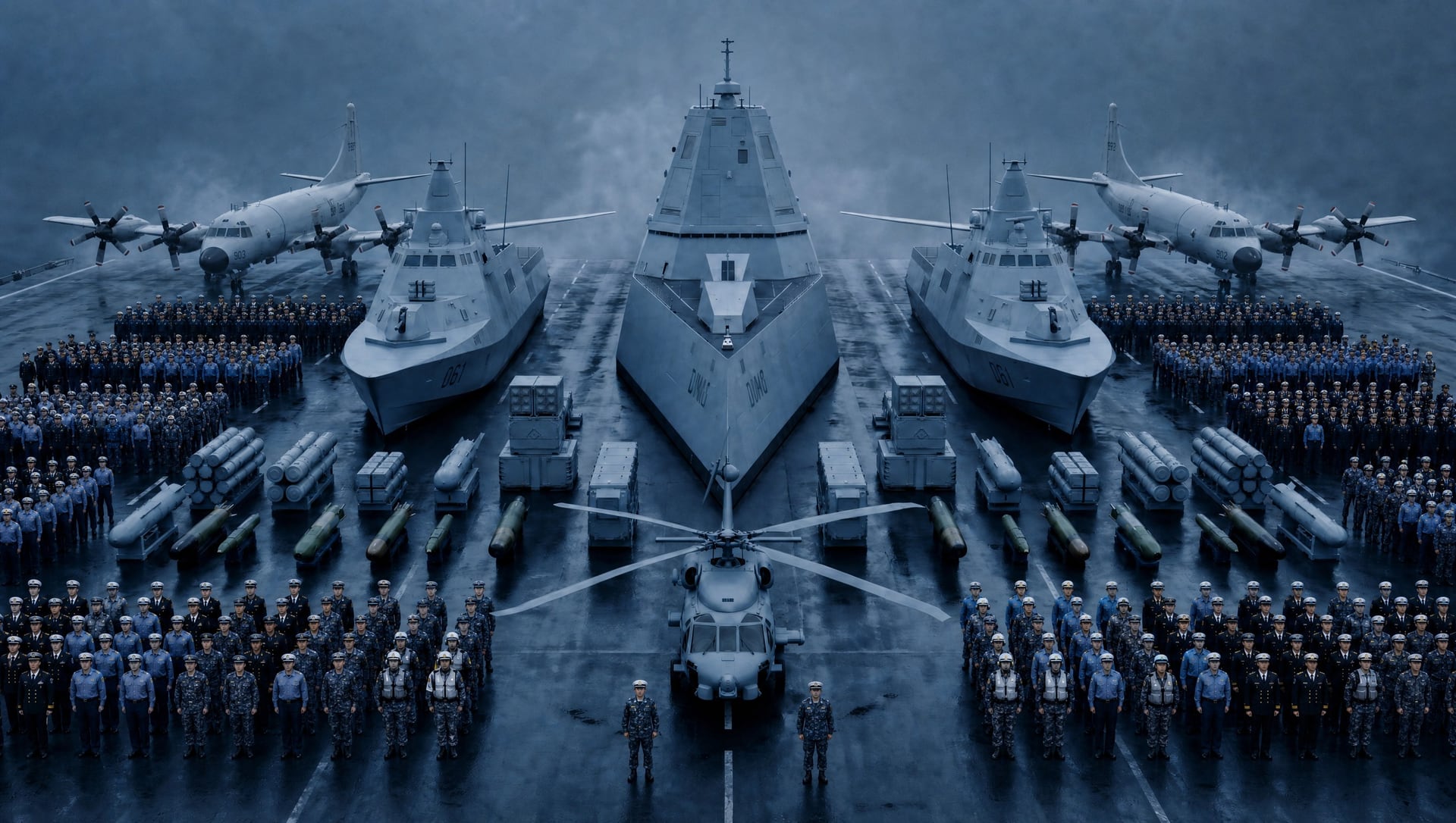
SoS Presentation Materials
A System of Systems is an argument about how forces work together, and it had to be made in the time a conference talk allows.
The material was prepared for a Republic of Korea Navy academic conference. What it had to carry was a proposal — that the way naval forces are operated, anti-submarine warfare among them, should change — and a System of Systems concept that made the proposal concrete enough to argue with.
A room of specialists does not need to be told what a submarine is; it needs to see how the pieces connect. So the case was built as video and multimedia rather than slides of text, and we planned and produced it end to end.
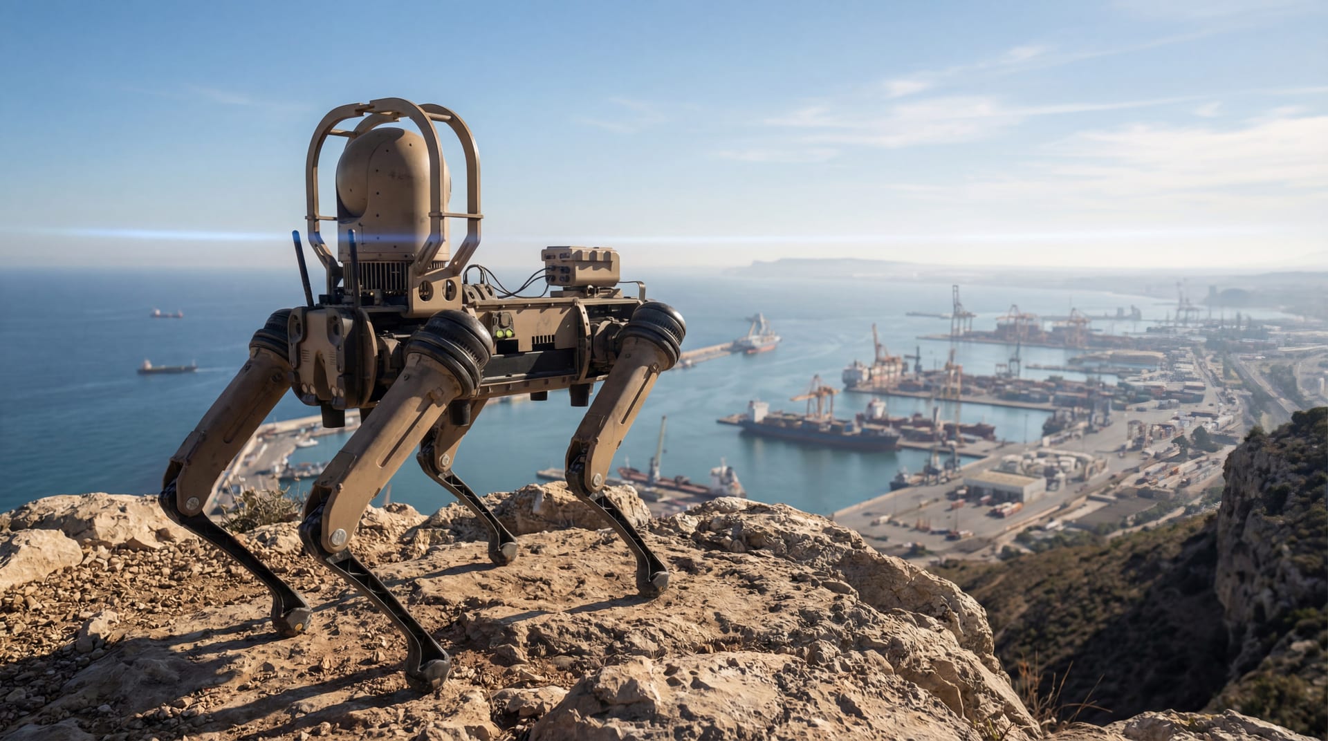 GR-LIG Multi-Robot Control
Service Design & UX
GR-LIG Multi-Robot Control
Service Design & UX
GR-LIG Multi-Robot Control
Three different people in three different places, and one fleet of robots between them.
A control room on a desktop, a field operator on a phone, and the suppliers of the payloads on a platform of their own. One package had to hold all three.
This was the first of these programmes run in sprints rather than phases, which meant the service structure and the detailed design were being settled while the build was already moving.
Requirements moved throughout — a demonstration for visiting executives arrived mid-flight and had to be absorbed. That is the cost of working this way, and also the reason for it.
 Global Multi-Layered Air Defence System — Promotional Film
Promotional Film
Global Multi-Layered Air Defence System — Promotional Film
Promotional Film
Global Multi-Layered Air Defence System — Promotional Film
Six layers, each with its own answer, and none of them meaning much alone.
A multi-layered air defence is not six systems standing next to each other. Each layer is matched to a different part of the threat — its range, its altitude, the time there is to react — and what makes them a defence rather than a collection is the command and control running across all of them.
So the film is organised around C2 rather than around the products. System of Systems is what it is actually arguing, and the scenarios move through the layers in order, which is the only way the arrangement explains itself.
 M-SAM Block-III — Operations & Engagement Control Centre
UX Design & Prototype
M-SAM Block-III — Operations & Engagement Control Centre
UX Design & Prototype
M-SAM Block-III — Operations & Engagement Control Centre
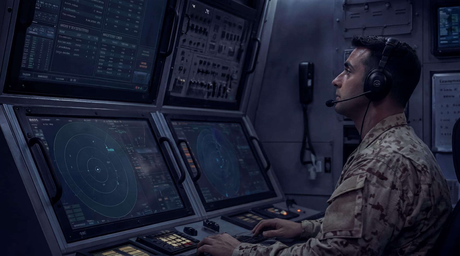
This control centre has to work alongside another system's control centre. Designing one now means designing the seam.
M-SAM Block-III inherits the L-SAM control centre and extends it into integrated air defence, where the two are operated as one.
The inheritance is what makes it difficult, not what makes it easy. Carrying a design forward means understanding the weapon system well enough to know which of its conventions still hold — and the work reached past the screens into the integration test equipment, the development bench, the tactical telephone and parts of the hardware.
We built the development support tools first and the control system after. The tools are where a system's actual behaviour becomes visible.
L-Sword (UGV) — Promotional Film
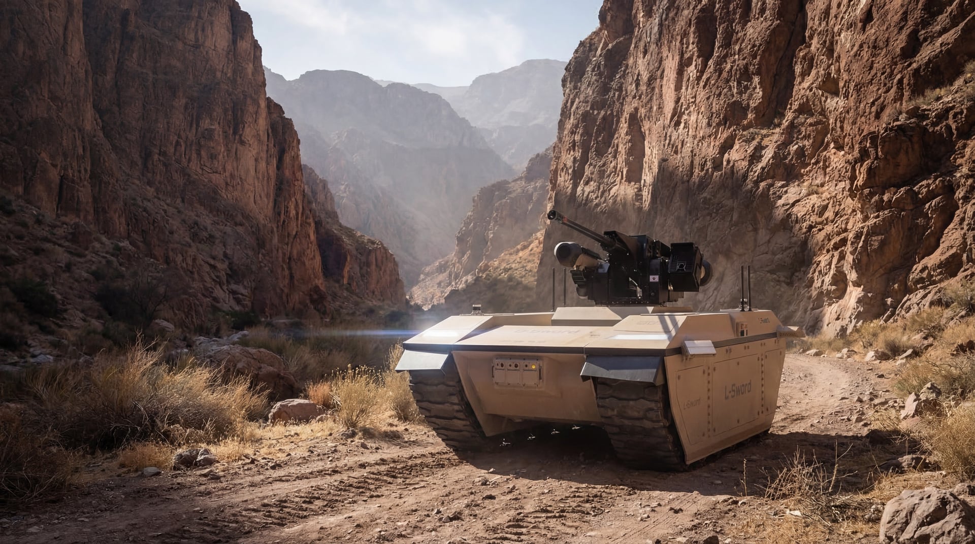
A modular vehicle is hard to show, because what it is depends on what has been fitted to it.
L-Sword is a tracked unmanned ground vehicle, and modularity is its starting point rather than an option — the same platform takes on different missions as what it carries changes. That is the product, and it is also the difficulty. A film cannot show every configuration, so the work was choosing which few would stand for the rest.
We selected the mission scenarios where the modular approach makes the clearest difference, and built the brand film for the unmanned ground family around them.
Conference — ASW Presentation Materials
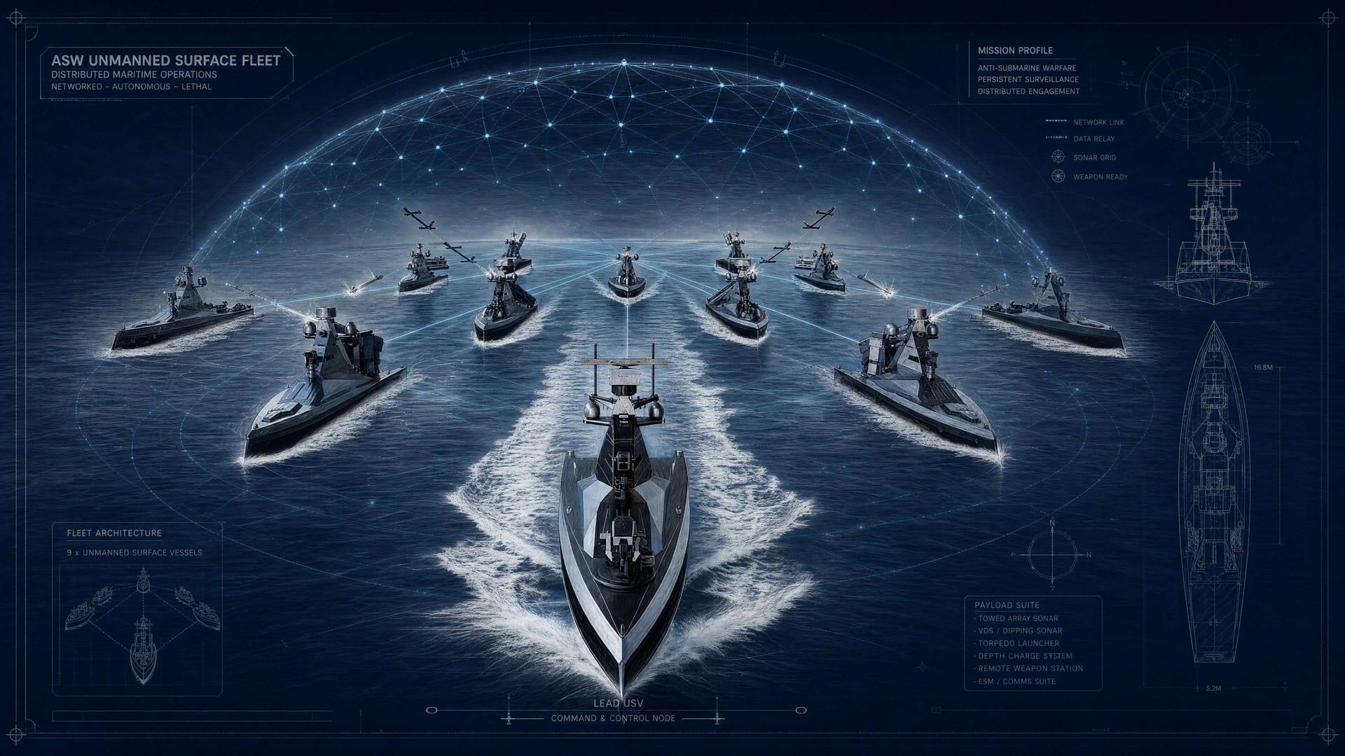
Three arguments had to land in one sitting — how anti-submarine warfare is changing, how it would be operated, and how it would be sold abroad.
Those are different kinds of claim. The first is about the world, the second about a system, the third about a market, and each one persuades a different part of the room. Put in sequence they ask the audience to change its mind three times; put in one structure they hold each other up.
We made the material as a multimedia presentation for that reason. The form was chosen to carry the argument, not to dress it.
UMEX2026 Vision60 Promotional Film
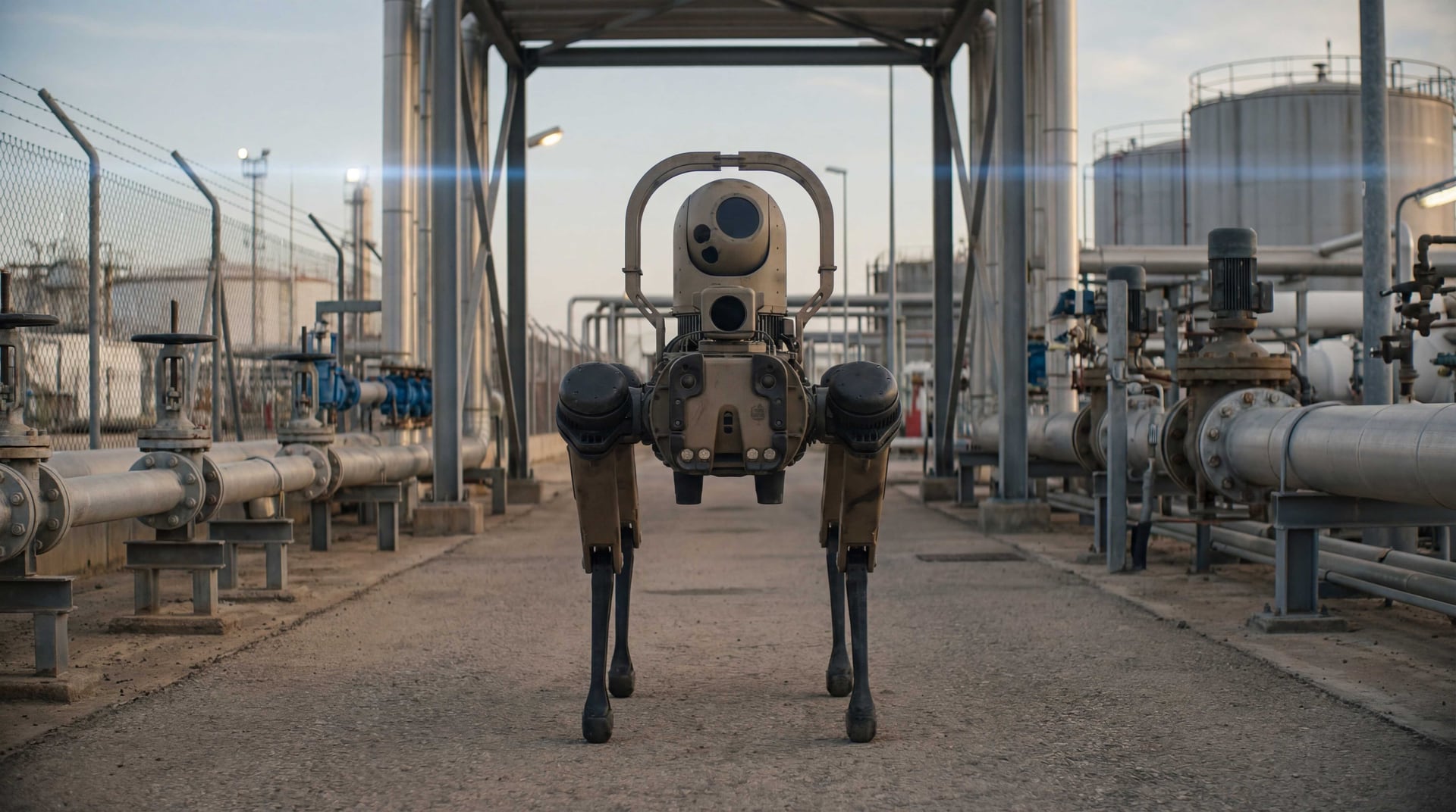
A film made for one exhibition is a film made for one audience, and that audience was not the one at home.
UMEX is held in the Gulf, and the work was aimed at opening that market. What a machine does in a demonstration reel is not what it does in the heat, the dust and the ground of the region it is being sold into — so the operating scenarios were written against those conditions rather than generic ones.
Climate and terrain came first. The regional situation and the social and cultural setting decided what the scenarios could reasonably show. The Vision60 film was built on that reading.
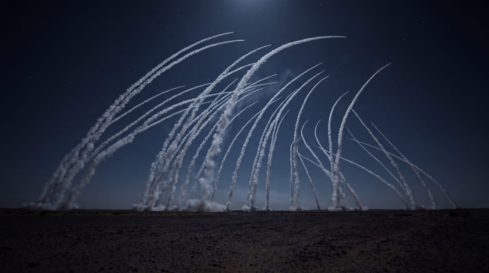 LAMD — Operations Panel 3D Terrain Map UI/UX Consulting
3D UX & Film
LAMD — Operations Panel 3D Terrain Map UI/UX Consulting
3D UX & Film
LAMD — Operations Panel 3D Terrain Map UI/UX Consulting
Low-altitude interception gets judged against the terrain, and terrain does not reduce to a number.
LAMD intercepts long-range artillery. The engagement is over quickly enough that an operator cannot work through it a step at a time — they have to hold the whole of it and the detail of it at once.
So the altitude map was built in three dimensions, the first time a Korean weapon system had done that. Whatever comes next will be measured against this one.
Then an ordinary fact of the room decided the interface. The altitude map sits on the upper monitor and the cursor cannot travel there. The three-dimensional map is driven from the keyboard instead — keys and shortcuts rather than a pointer — which changes how every control on it has to be thought about.
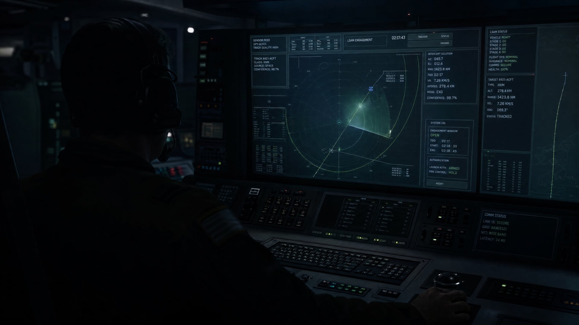
L-SAM-Ⅱ Operations & Engagement Control Centre UX Consulting
The control centre already exists. What arrives next is everything that has to fit inside it.
Additional weapons and equipment brought into the interface L-SAM had established.
Much of it is not the operating screen at all, but the equipment that supports and tests the system — the part nobody demonstrates and everybody uses.
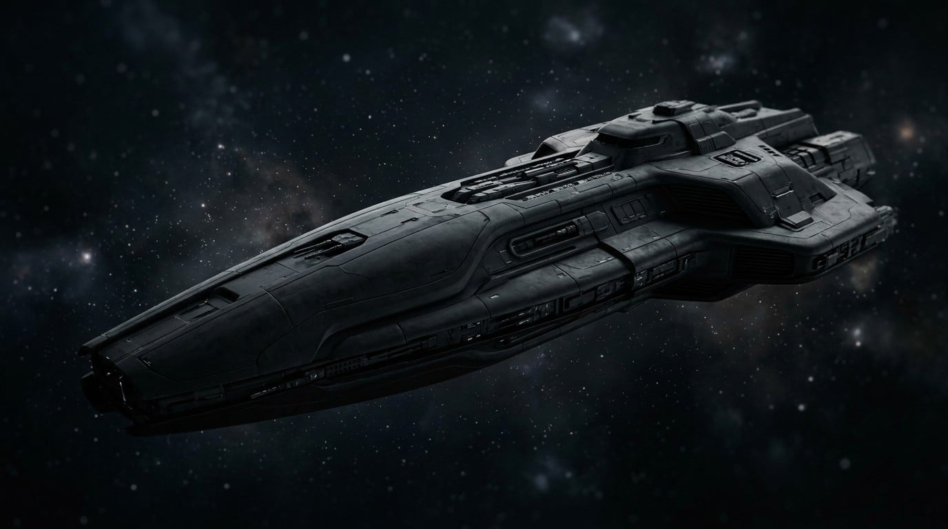
ADEX 2025 — Promotional Film
A wall screen at the front of a booth is watched from a distance, in passing, by people who did not choose to watch it.
The film ran on the main booth wall at ADEX, the defence exhibition in Korea. What it had to put across was the future battlefield as LIG D&A sees it and the company's place in it — not as a claim but as a scene.
A future set far enough away stops being an argument and becomes a picture, so the scenarios were placed in the near term and built from conditions that can be reasoned about now. The imagery was generated rather than filmed.
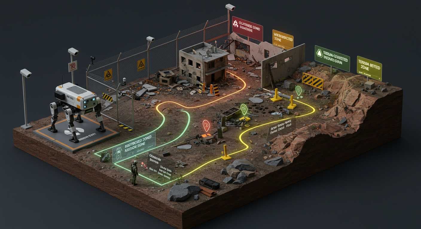
Future Battlefield UX/CX Consulting (Integrated Unmanned Systems)
Drones changed what a battlefield is before anyone had settled what to build for it.
The study was about the near term — what changes when unmanned systems stop being an addition to a force and become part of how it is composed. Drone warfare is the visible part of that, and it is moving faster than the cycles that procure against it.
A forecast in this field is not a number but a reading of what will be needed, so the work was to survey where demand is forming and to say, from that, which directions are worth developing.
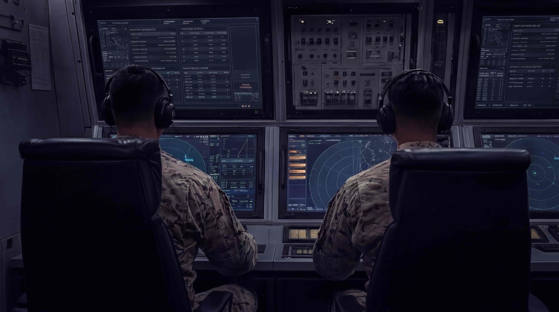
M-SAM Block-II — Control Centre UI Localisation (UAE)
The same control centre, operated by a different army.
Cheongung-II was exported to the United Arab Emirates, and the control centre interface went with it — localised rather than rebuilt.
Localising a control centre is not translation. Part of what is on the screen belongs to the weapon system and must not move. The rest belongs to the army operating it, and that part has to be identified before any of it can be changed.
The domestic design was the base. What the work decided was what the export version could not simply inherit.
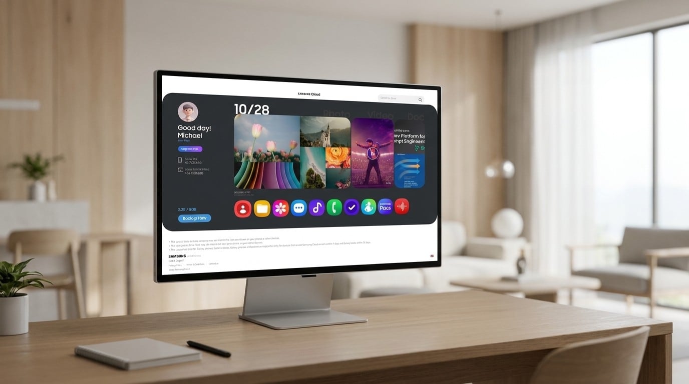
Samsung Cloud Web UX
Samsung Cloud had been sharing its ground with someone else's drive. Standing on its own meant deciding what it was for.
Separating from OneDrive raised a question backup itself never has to answer: what does a person come to the web for, when their data lives on a phone?
Mostly the gallery. So the site was built around photographs and what happens to them — syncing, backing up, and the subscription that pays for the space.
And one account is rarely one device. A current phone, an older one still in a drawer, a tablet, a watch, each with its own idea of what has already been saved. The structure has to hold all of them without asking the person to keep track.
Research into how cloud services present themselves on the web, several design proposals, and a responsive HTML guide — all on the One UI base.
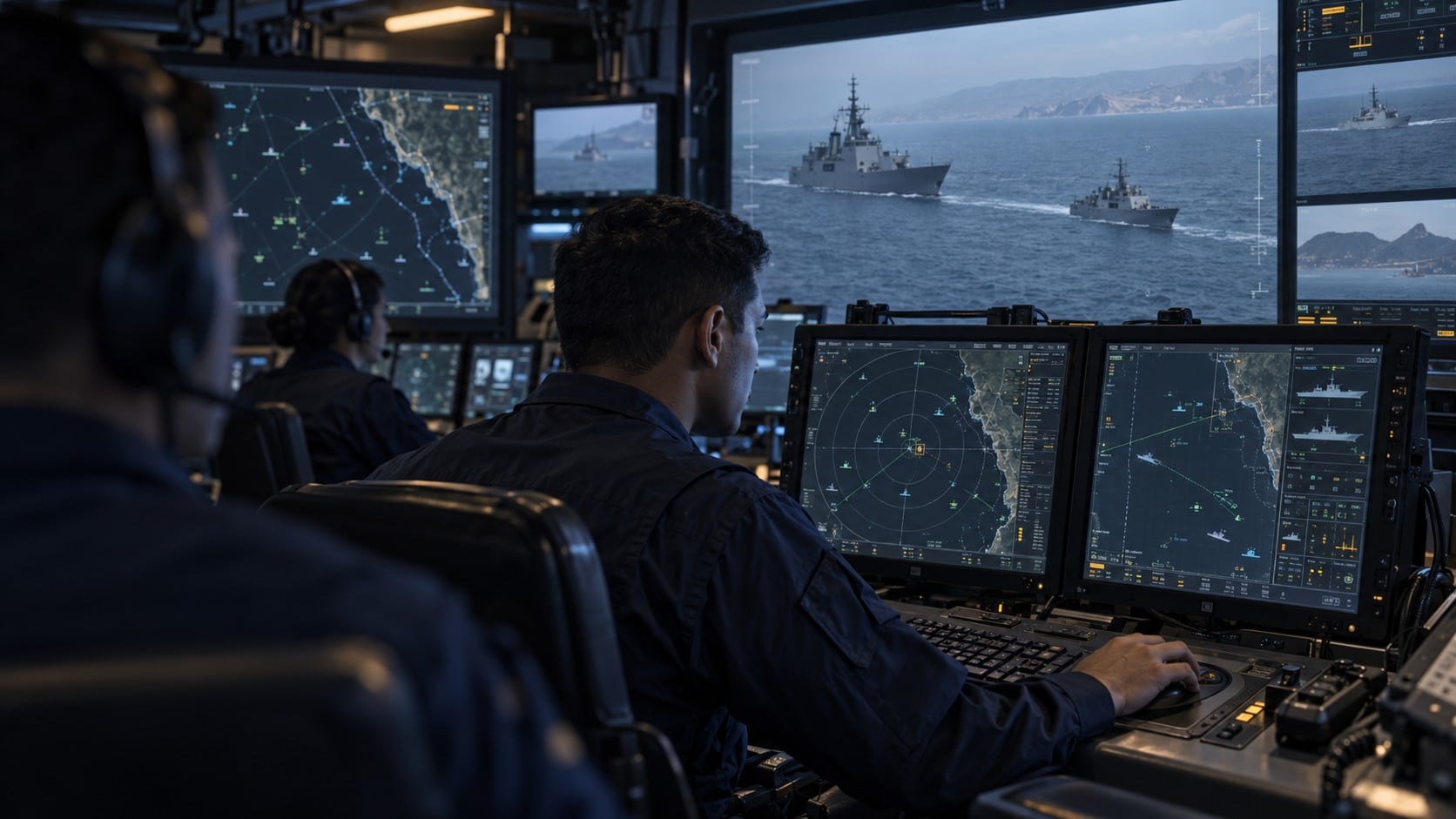
Frigate, OPV Combat System UX Consulting (Peru)
A frigate and an offshore patrol vessel, first of class, built in Korea for Peru.
Combat system interface design for both lead ships, on an export programme run with Hyundai Heavy Industries.
First of class means there is no earlier hull to correct against. What ships is what the crews will learn, and what every following ship will inherit.
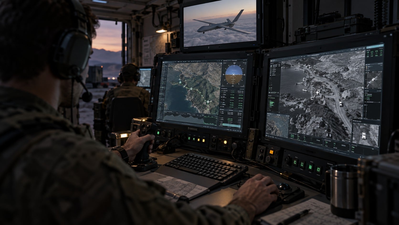
UAV Ground Control System UI/UX Development
A multifunction console in a ground control station, for a swarm rather than a single aircraft.
One operator, several machines, and no way to take them one at a time. Interface design for the console that runs them.
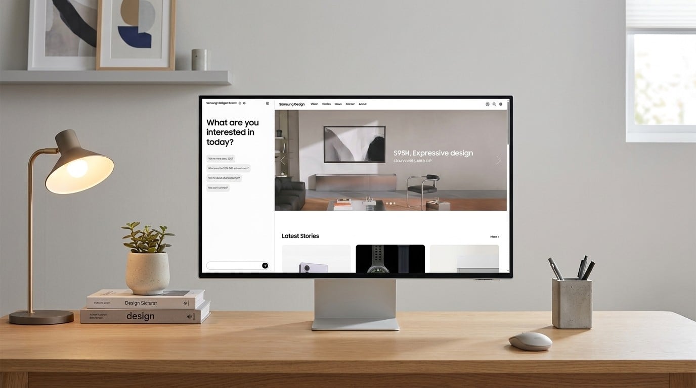
AI Powered Website Navigation Prototype
A design site with several hundred pages does not get searched. It gets given up on.
design.samsung.com held more than anyone could find in it. The question was not how to index it better but whether a person could simply ask.
Three decisions carried the prototype. Whether answers may come only from the site's own content or from anywhere. How a source is shown, so that an answer can be checked rather than believed. And how little screen a conversation actually needs.
We copied the whole site, connected it through retrieval, and built a plain conversational surface. Most of the effort went into whether the answers were right rather than into how the screen looked — a prototype that demonstrates well and answers badly teaches the wrong lesson.
Content Design Research
A notice is written once and arrives on a watch, a refrigerator and a television. The words do not change. Everything around them does.
Samsung makes more kinds of device than any single guideline has had to cover. The text that addresses the user — a system update, a notice, a caution, a warning — appears on all of them, and it is the part people actually read.
One UI already set the base, so the difficulty was never the rule. It was the range. Three things decide how a message lands: where it sits, when it appears, and the tone it takes — and all three shift with the screen. A sentence that reads as calm on a phone reads as an emergency on a watch face, and goes unnoticed on a television across the room.
We gathered how Apple and Google introduce new features across their television, mobile and watch systems, and read the examples for exactly those three. Features arrive faster than they used to, so the moment of introduction is now a large part of whether a function is ever used.
Consistency has a second axis besides the device. What counts as sufficient warning in one market reads as alarming in another, or as evasive. That is a habit, not a translation problem, and it decides whether the same caution is actually heard.
A research report, the writing itself, the design guide, and a prototype.
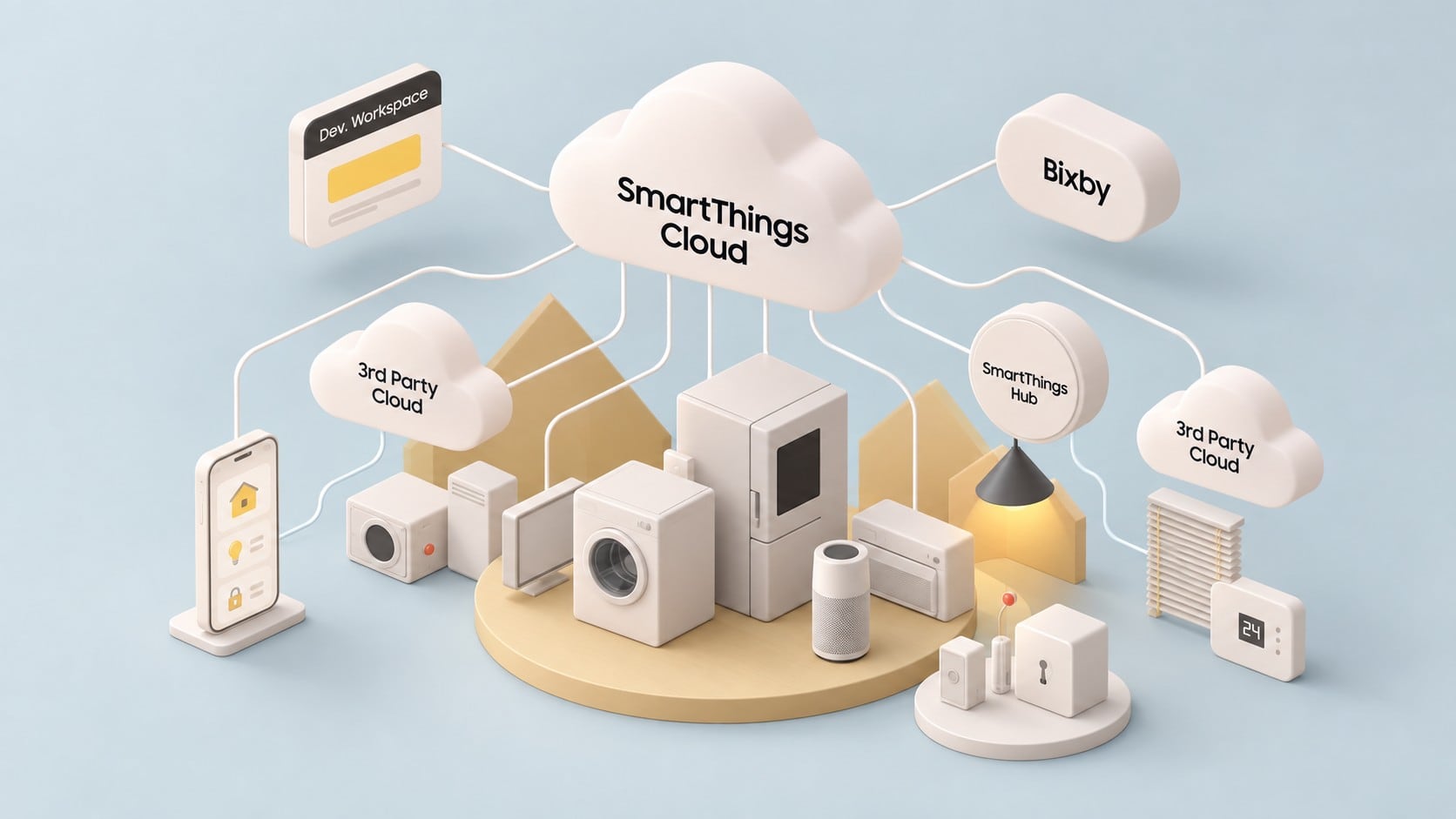
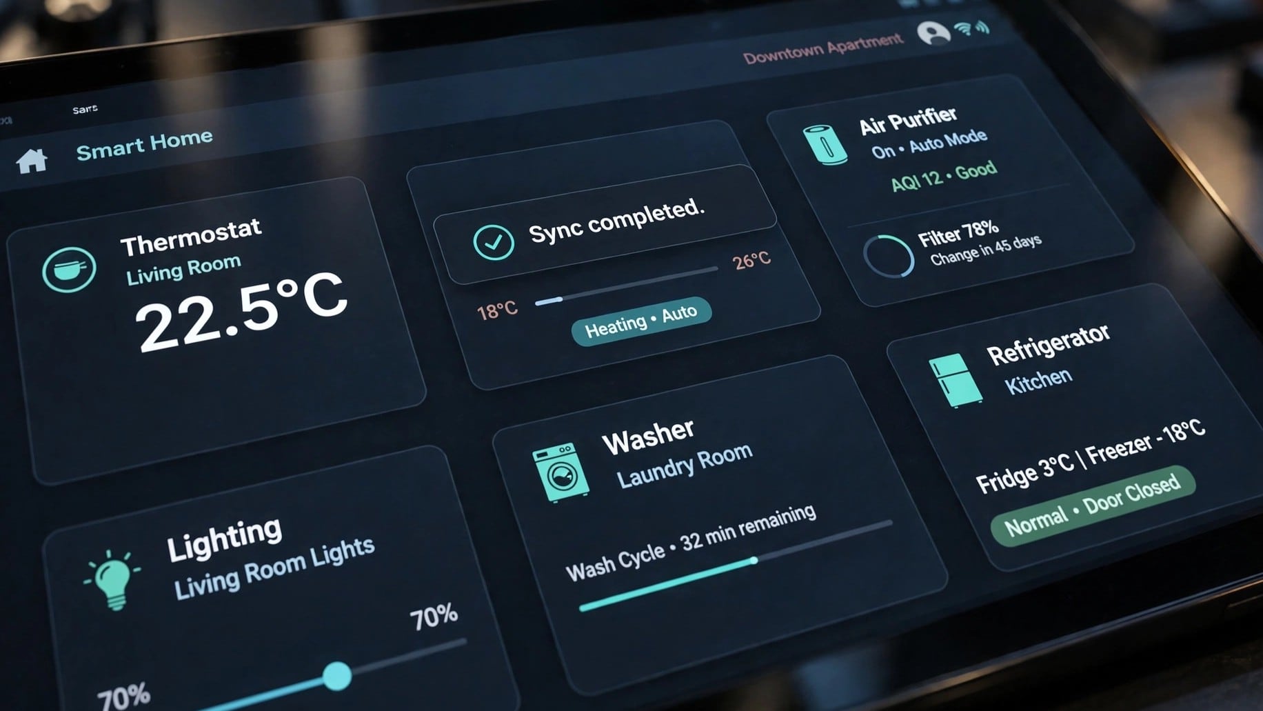
DA SmartThings UI Guidelines
The same function now lives in two places — the app in your hand and the panel on the machine. When they disagree, the person is the one who has to reconcile them.
SmartThings reached the point where an appliance could be worked from a phone or from its own screen, and both had to be right.
The decision is not what to unify but what is allowed to differ. A phone can scroll and a washing machine cannot; pretending otherwise makes both worse. So: what matches exactly, and where a device's own nature may show through.
It built on guideline work carried forward from earlier years, widened this time to take in the set screens as well.
4 separate engagements on this line, 2021–2024.
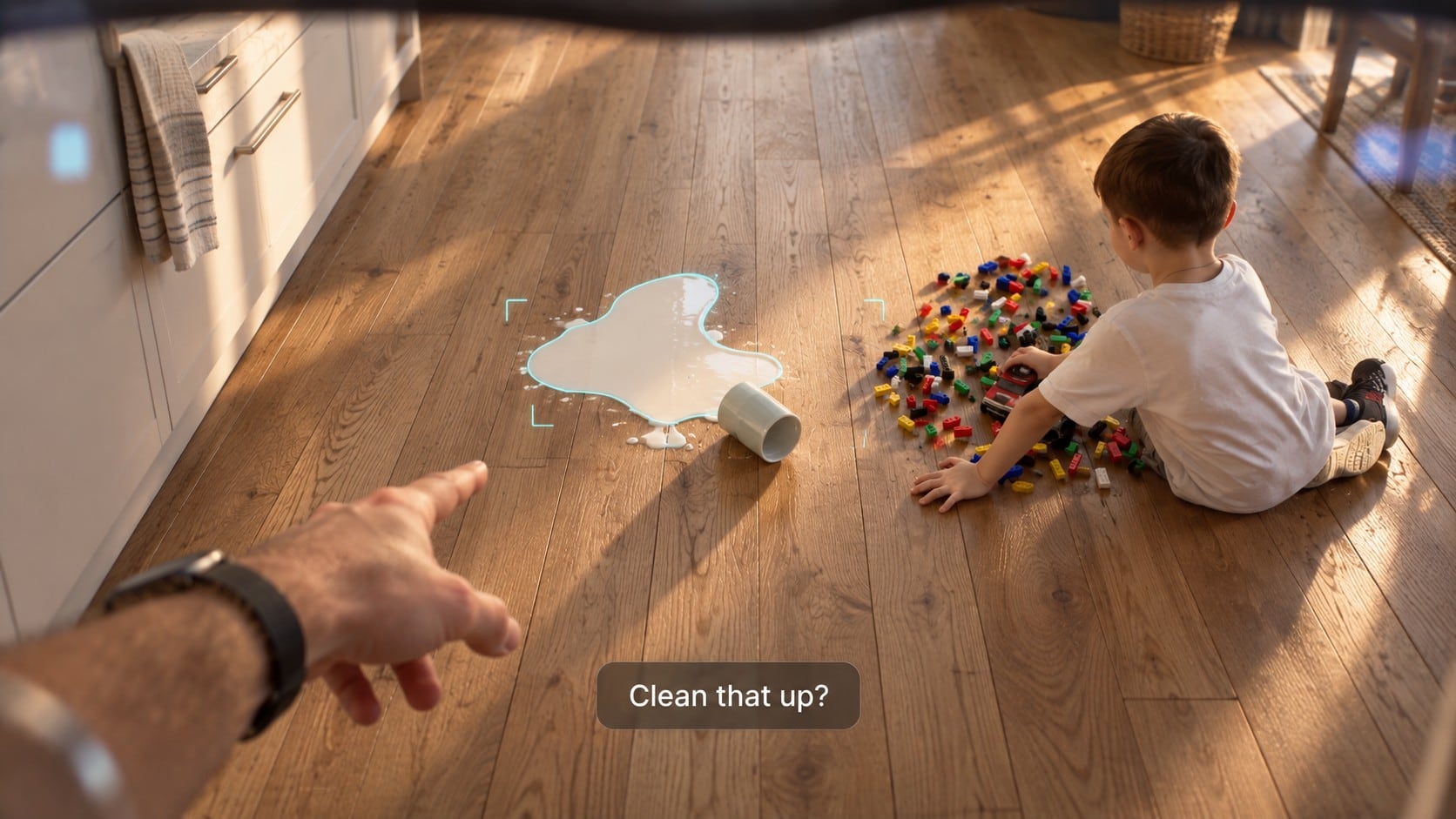
for AI UX Scenario Film Development
Every advance costs somebody something. The film had to show who, and what an assistant could take off them.
The word is technostress, and it does not fall evenly. It lands hardest on people the ordinary path already excludes — a deaf user, an older user, anyone for whom the obvious way in does not open.
The argument lives or dies on which people and which moments you choose to show. Pick the wrong scene and inclusive AI reads as a feature list; pick the right one and it needs no explaining.
So we wrote scenarios in which a multimodal assistant — one that can see the screen, hear the room and act on the device — takes the difficulty off the person instead of adding to it.
Then we built what the film needed in order to be true rather than illustrated: the key screens, the assistant's own graphics, the micro-interaction motion, and the composite that puts all of it back into the footage with sound.
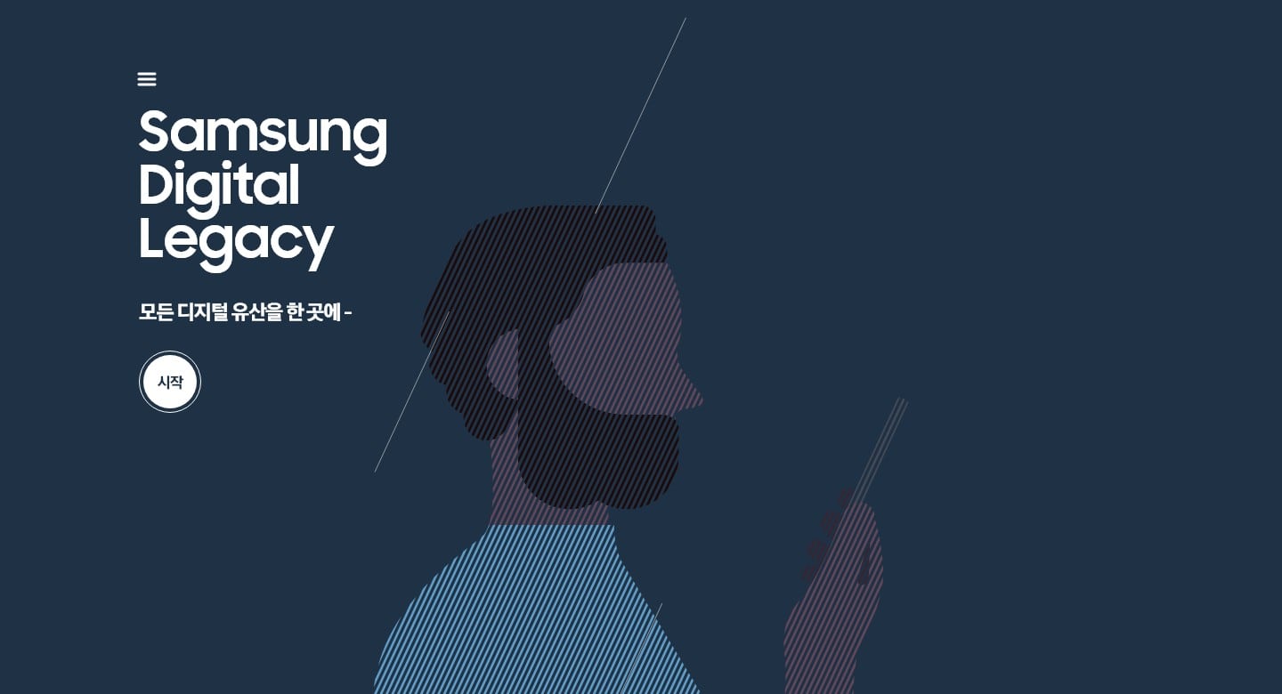
Digital Legacy
The person who set this up is gone. The people using it are grieving, and some of them are old.
Digital Legacy hands a person's data to their family after they die. That sentence is the whole design problem: the user is not the customer, and they arrive at the worst moment of their year.
A death has to be evidenced, a temporary account issued to the family, and the data made available to download. Each of those is a form somebody is filling in while grieving. Behind it sits a console showing the applications as they arrive, where each has got to, and the documents attached.
How few steps can a transfer of this kind survive? Security wants proof, and proof means forms; grief has no patience for them. Every screen sits somewhere on that line, and the position has to be chosen rather than defaulted into.
The path runs long before it runs fast — finding the feature, naming an heir, changing your mind, and only then the part that happens afterwards. We began with desk research and a content guide, since here the words come before the layout, and carried it through interface, graphics, a responsive HTML guide and a working prototype. Cloud and account behaviour, and the handover between phone and web, had to hold across all of it.
2 separate engagements on this line in 2024.

LIG Nex1 Groupware Screen Sharing Service Build Publishing
A groupware system built more than a decade earlier, inside a defence company, for people who are frequently not at their desks.
A renewal inherits the original build. Much of what could be changed had been settled years before by decisions nobody was there to argue with.
In a defence company security is not a setting; it is the condition the work happens under. Moving between a desk machine and a phone has to stay safe without becoming unusable for someone who is travelling — which is most of them, most of the time.
Front-end publishing for the screen-sharing service.
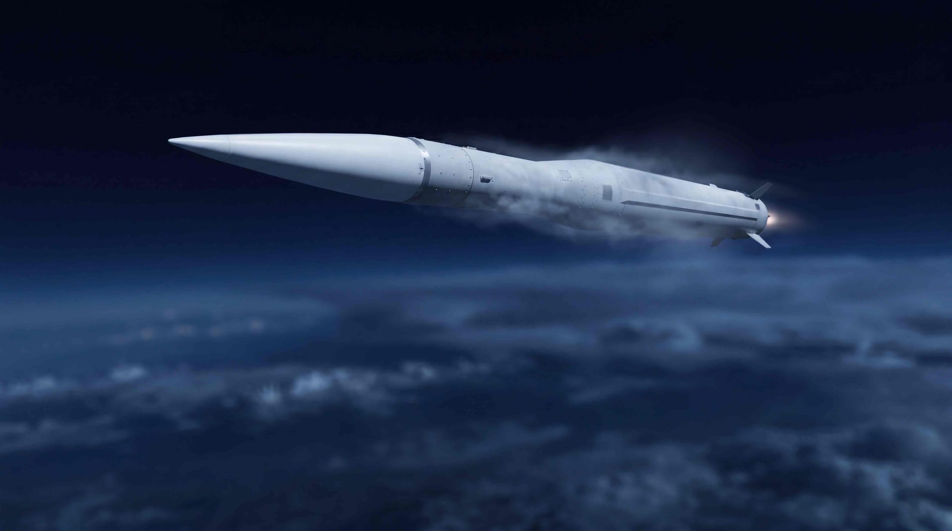
L-SAM Operations/Engagement Control Centre Film
A system that took years to build has to be explained in minutes, to the people who commissioned it.
The film reporting the completion of L-SAM's development.
What a completion film has to do is show the system working as one thing — which is exactly what a room full of separate subsystems does not look like.
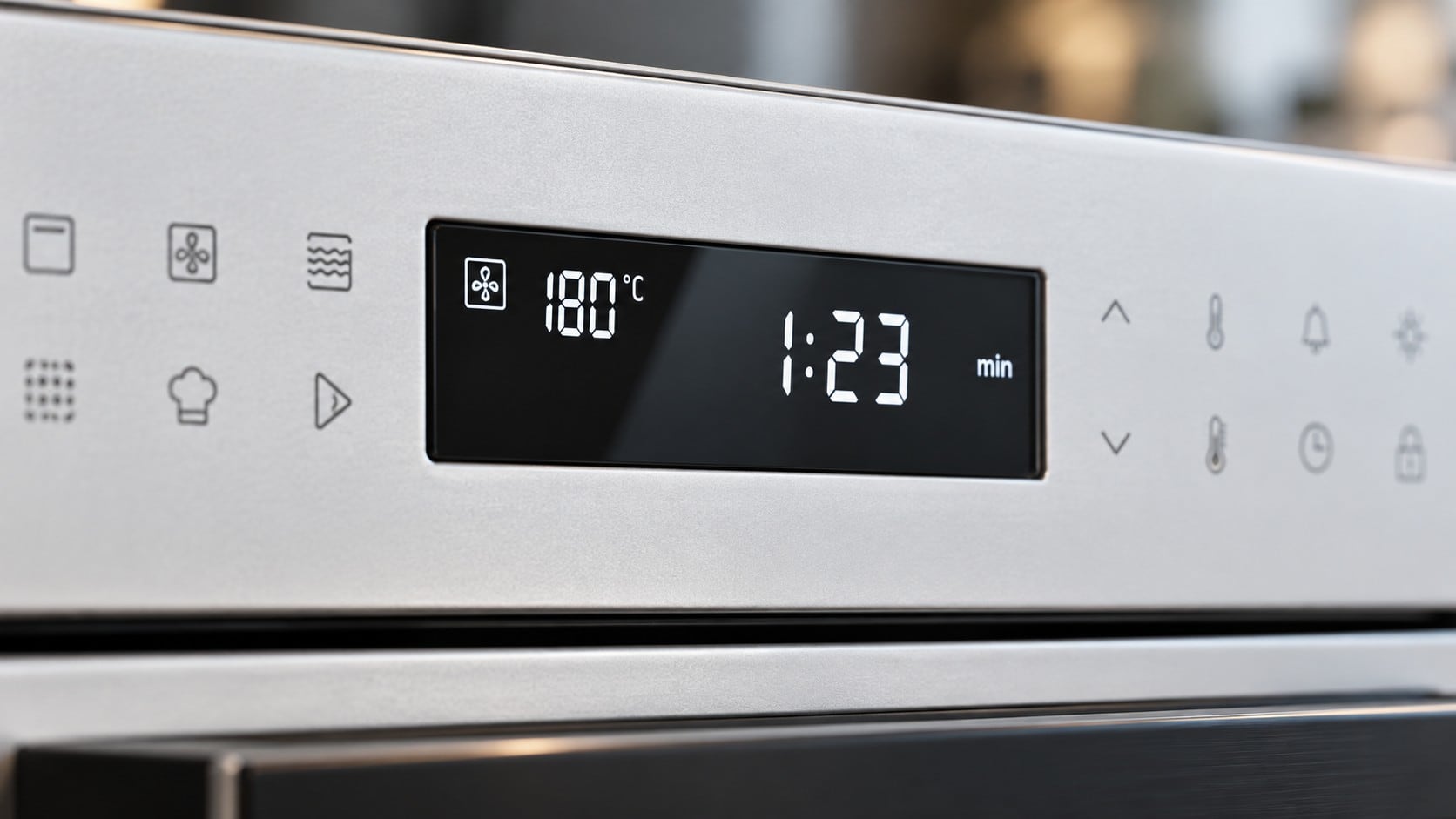
2.25LCD UI Common & Product Guidelines Collaboration
One 2.25-inch panel, many appliances. The screen is the same size everywhere and the machine behind it never is.
A guideline for a display this small is mostly a question of what it is allowed not to say. The work was drawing the line between what every product must share and what each one may keep for itself — written as a common guideline with product guidelines sitting under it.
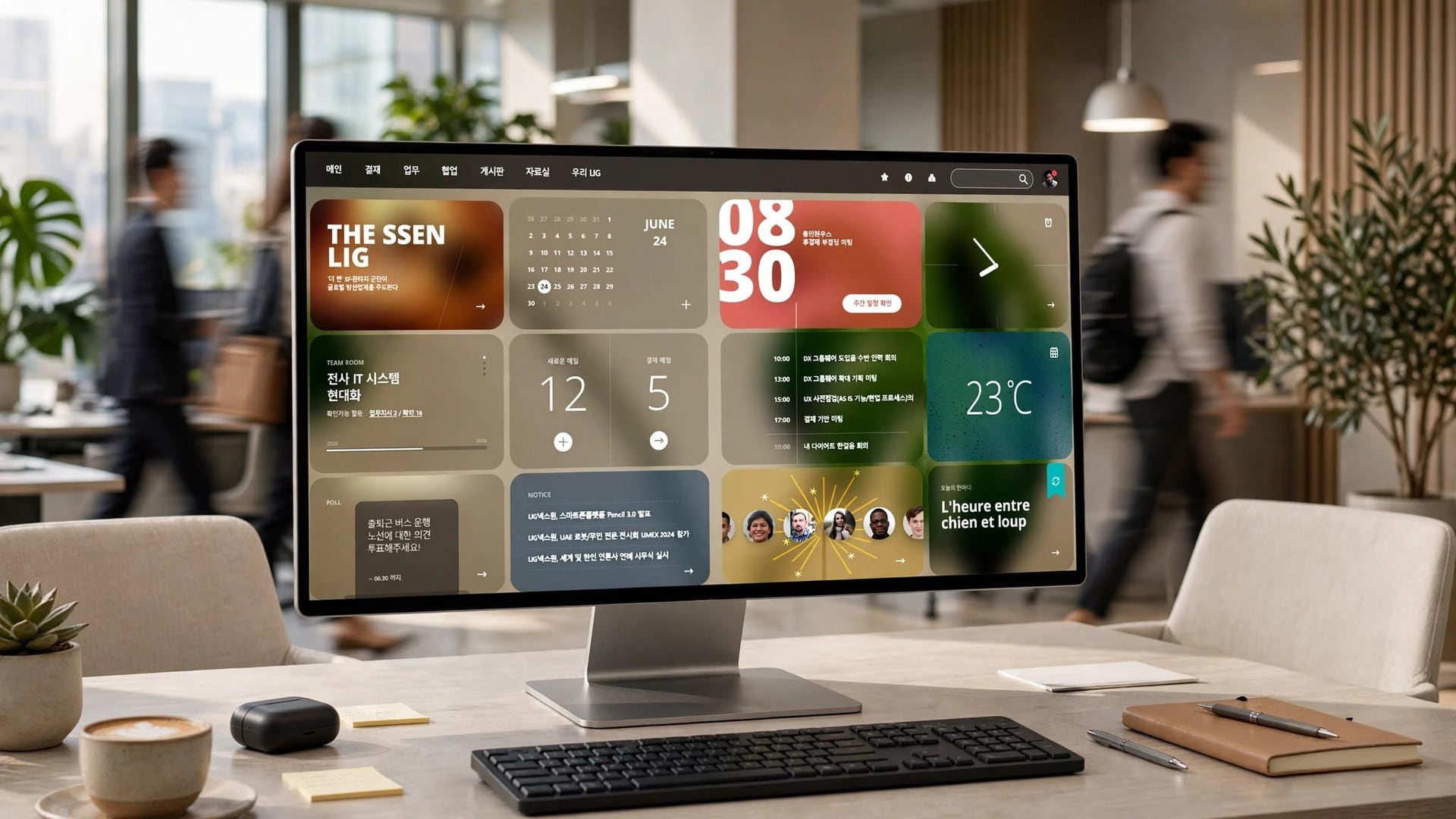
LIG Nex1 Groupware & Integrated Support Enhancement UX/UI Development
A groupware system more than a decade old, patched on request and never once rebuilt.
For over ten years it absorbed whatever individual departments asked for, one request at a time. The code underneath had become as difficult as the screens above it, and the age of the thing showed everywhere a person touched it.
The worst of it was the phone. A defence company keeps mobile access behind its own security boundary, so the little that could be done from a handset took several authentications to reach — and the people who needed it most were the ones travelling, furthest from a desk.
Integrated support, in the end, meant the mobile side: making a phone a real way into the system rather than a reduced copy of it. The users were every employee and officer in the company, so there was no group small enough to leave behind.
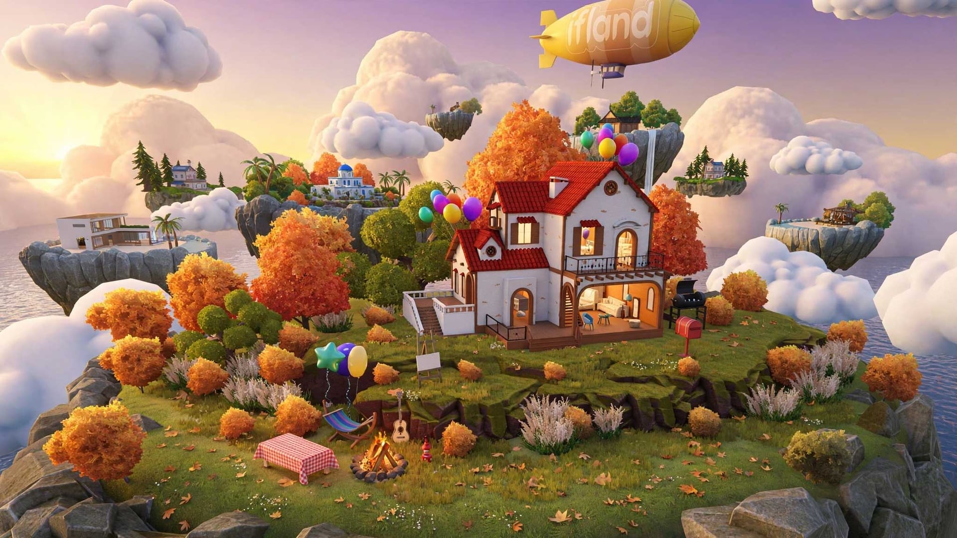
Windows For ifland Renewal (AI including) Planning and Design
A renewal with AI folded into a service people already knew how to use.
Where the AI goes is decided by what it must not disturb. The existing path through the service was the constraint, not the canvas. Planning and design for the PC version.
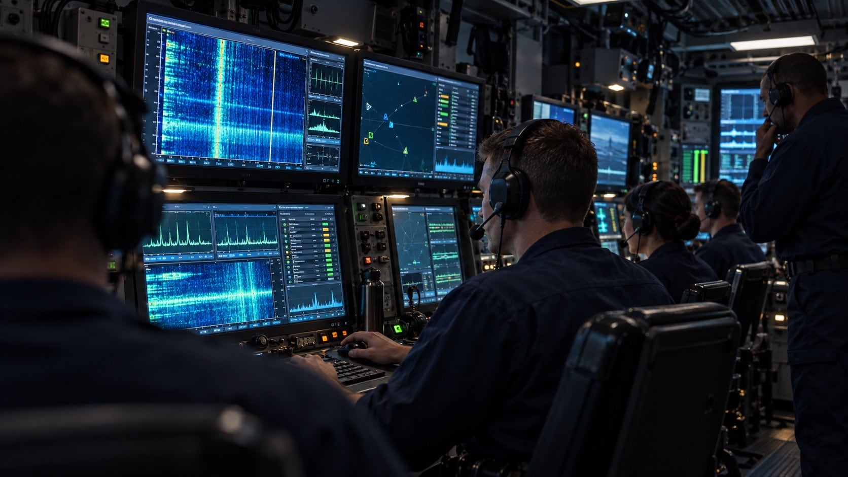
UI Design Consulting (Naval Acoustic Information Management System (NAIMS))
Sound gathered by surface ships and submarines, and then the question of what to do with it.
What the sonar brings back — a contact — is rarely clear. Deciding what kind of thing made the sound is a judgement rather than a reading, and two operators can look at the same trace and disagree.
So the system has to keep the evidence next to its uncertainty, where an operator can see why something was called what it was called.
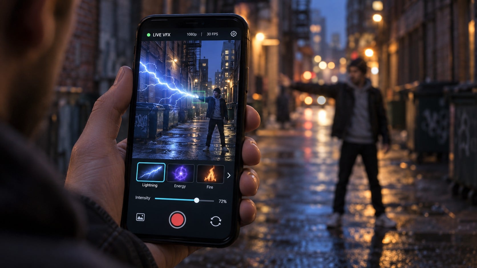
VIT Create UI
A visual effects studio turning its own craft into software that other people drive.
Real-time effects running off a camera — in a photo booth, or on a phone in someone's hand.
The company's advantage is the effects; the risk is that only the company can operate them. So the interface had to make an edit quick for someone who is not a compositor, and keep the software behaving the same way in places as different as a booth and a handset.
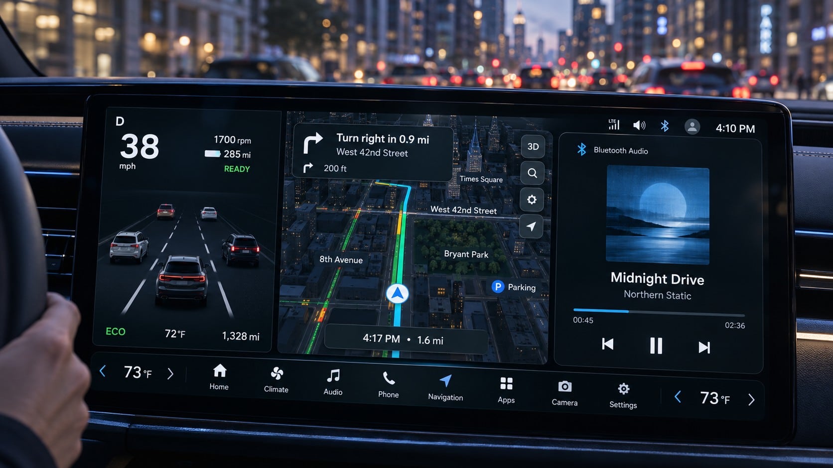
OEM Navigation Map UI Design Specification Development
The specification is read by engineers building different cars for different countries. One document has to hold all of them.
A factory-fitted navigation screen is looked at while driving, and that fixes what may be on it. Beyond that nothing is fixed — model, region and year each move the specification.
So the real subject is not the map but how the variants are kept inside one document. How much is allowed onto the map, and where a difference is declared rather than duplicated.
Two-year contracts, revised against the development schedule. Working with the same organisation that long means the design principles are inherited rather than reopened, and what changes is written as change.

b.IoT Smart Building Solution
Every release adds features. The person running the building is the same person, with the same amount of attention.
The energy solution shows a building manager consumption and cost. There is a great deal of data and only a few figures that change what anyone does.
So the priority is not what matters most but what has to be legible to someone who has just walked up. Which number leads, and how an abnormal reading makes itself seen without raising an alarm for everything.
We started from that — that nobody is watching — and re-ordered the information around the moment of return.
5 separate engagements on this line, 2018–2023.
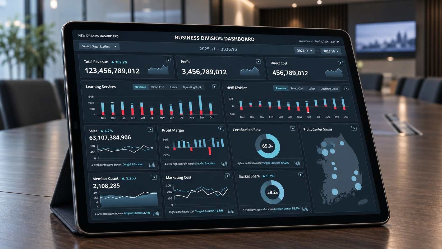
New Dreams Data Visualisation Consulting and Build
Executives do not read data. They look at it for as long as it takes to decide something, and then they stop.
A management report for a chief executive, on a tablet. Reporting had been split between paper and screens and multiplied into a different format for every department.
What a chief executive needs to see is not a smaller version of what a centre manager needs to see. So the work was to decide, level by level, which indicators appear at all — and how plain a chart has to be to survive a glance.
We interviewed eight people across three levels before drawing anything, then set the indicators for each level, brought the reporting formats into one, and laid out the daily, weekly, monthly and annual views on the principles that came out of it.

Donghae City Briefing Materials
The audience is not a client, an operator or a committee. It is the people who live there, and they have already said no.
Defence companies wanted to build a research institute for advanced unmanned systems on the coast at Donghae. Residents opposed it. The city's mayor commissioned the materials that would be used to talk to them.
Persuading is a different brief from explaining. A briefing can usually assume the room wants the project to work; this one could assume nothing of the sort, so what had to be settled first was the order — which objection gets answered before anything about the facility is described at all.
Presentation materials for the mayor's meetings with residents.
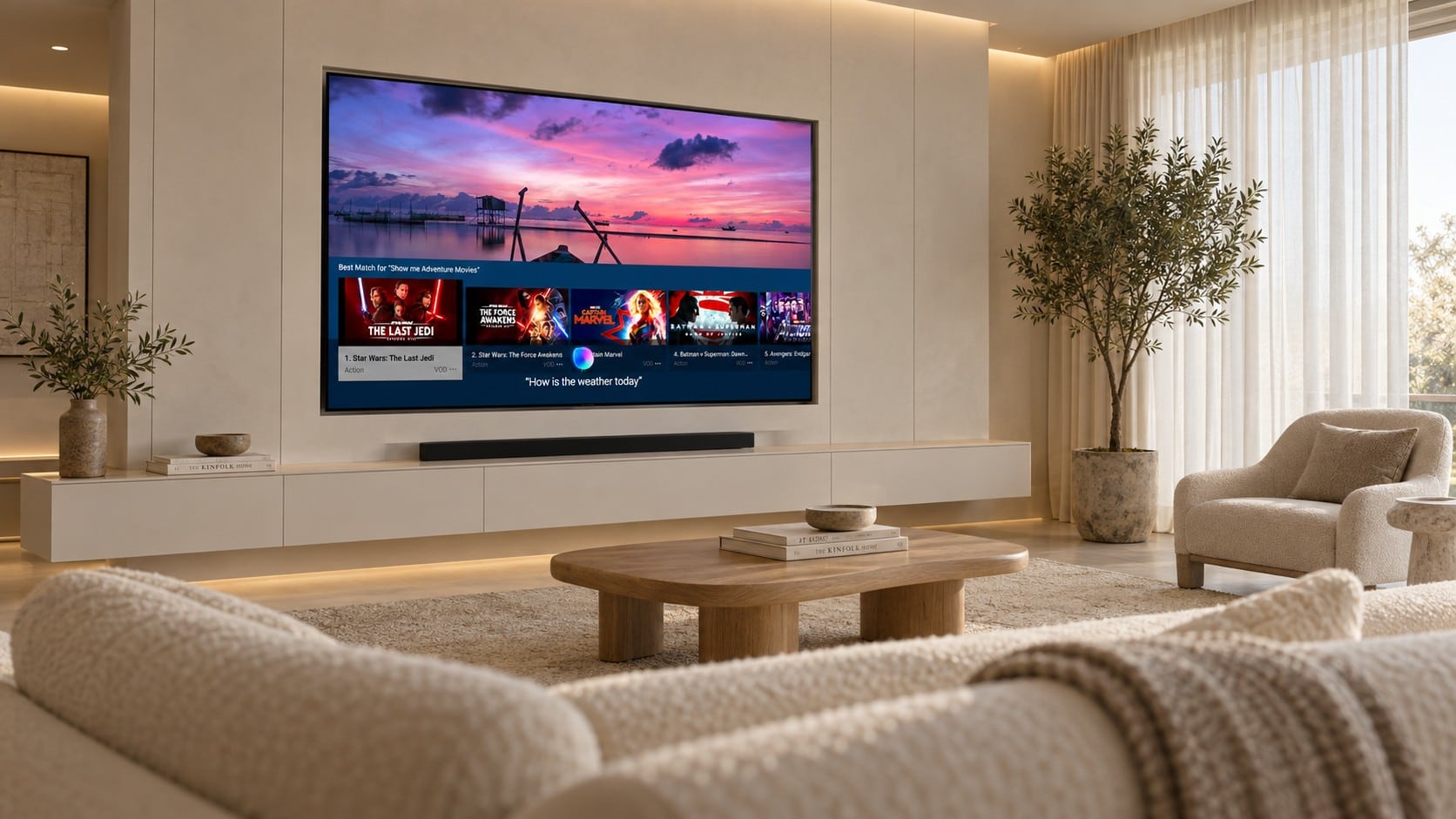
Next Bixby UX for Advance UX Design
Bixby is summoned by voice. Its identity has to be a visible answer to something invisible.
It had to be recognisable on a watch, a fold, a vacuum cleaner, a television — and on machines with no screen at all.
The three states are the identity: listening, working, answering. They have to read the same whether a screen shows them, a light shows them, or a sound does.
We carried the existing identity forward into new visuals and motion, and wrote it as a guide that reaches devices with nothing to display on.
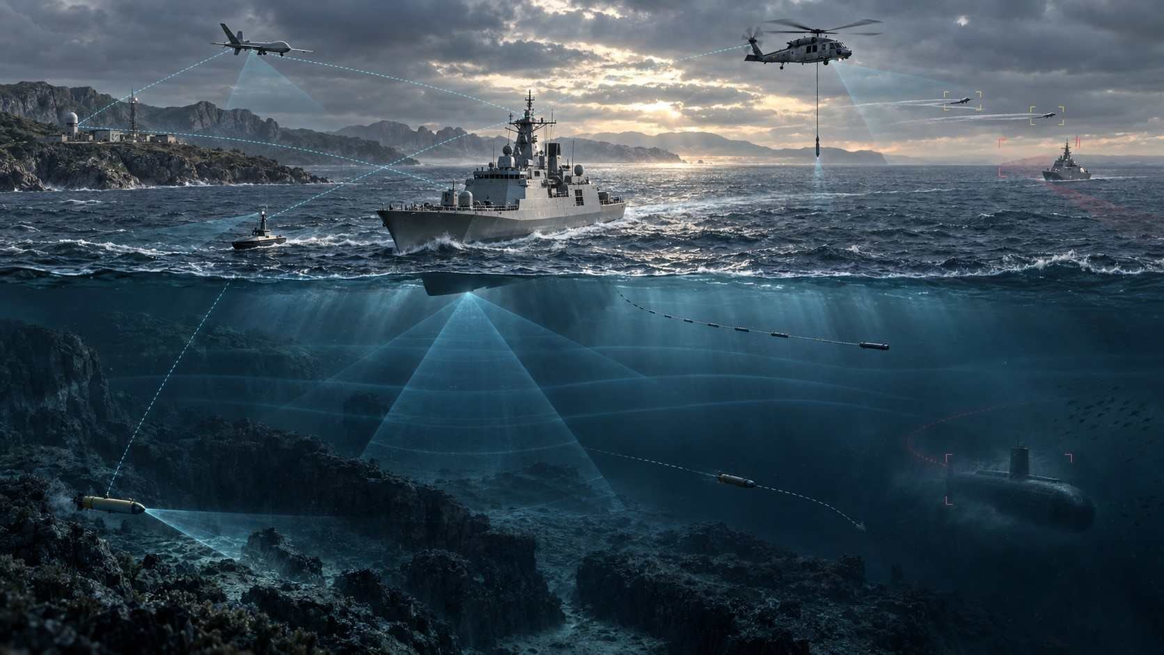
Naval Engagement-Class Analysis Model (Build-I) UX/UI Development
A simulator for a single naval engagement — and the standard every later build would follow.
A guide written at Build-I decides what the later builds are allowed to be. Interface standards for the engagement-level analysis model.
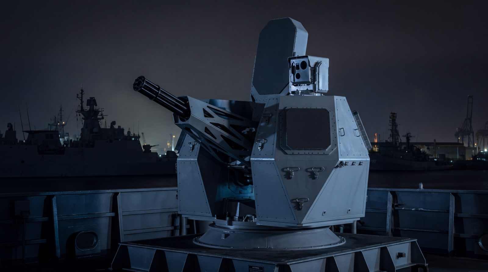
CIWS(Close-In Weapons System)-II UI/UX Consulting
The engagement is too short for anyone to sit down for.
A close-in weapon system defends a destroyer in the last seconds. It runs automatic or semi-automatic because nothing slower would finish in time.
The console has no seat — the operator stands at it. That is not a detail of the furniture; it sets reach, posture, how long anything can be read, and what may reasonably be asked of someone already on their feet.
Interface consulting for the domestic development of the system.
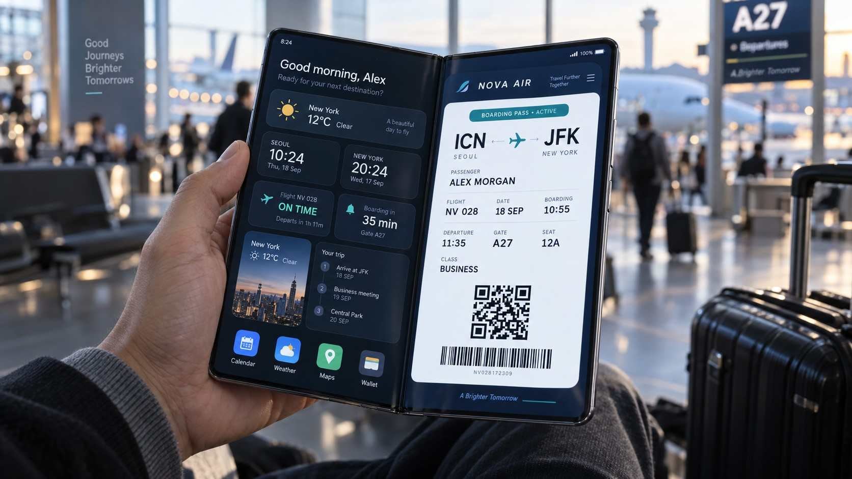
New Foldable Device UX Prototype Development
The first foldables were shipping, and every assumption an interface makes about its screen was suddenly negotiable.
A screen that changes size in the hand changes what was safe to assume — where things sit, what survives the fold, what should happen at the moment it opens.
Much of that can only be judged with the thing in your hand, so the decision was which scenarios were worth building rather than describing. Interface, graphics and visual identity were resolved together into a prototype that actually ran.
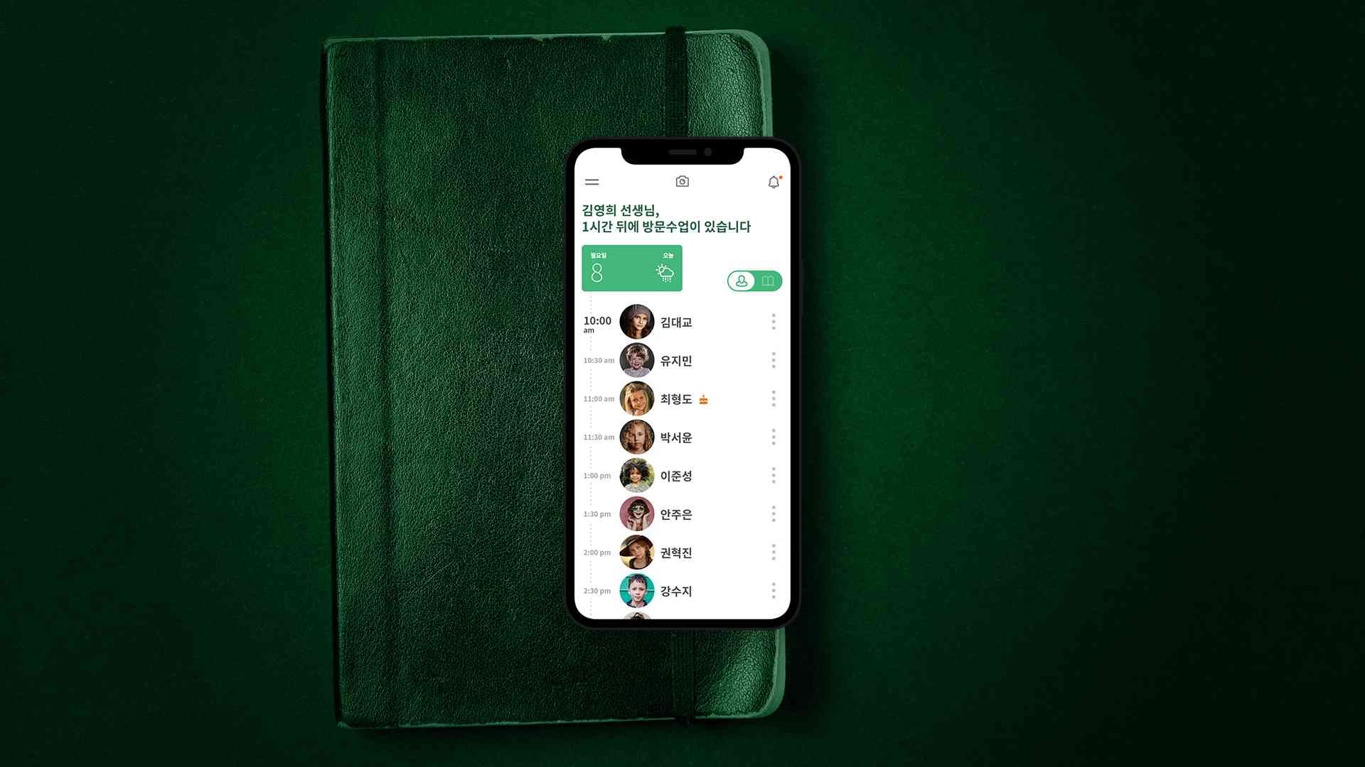
Next-Generation Dreams UX Consulting Development
The teachers had done this on paper for decades. The system was newer than the method and worse at it.
Home-visit tutoring still ran on paper. A teacher on their round, a branch director, a regional manager, head-office staff and executives — five different days, one system, and it served none of them well.
A tool that loses to paper is not losing on features. So the question was what each role actually does in the course of a day, and how plain the screens have to be for people who have never needed them to be anything else.
We ran focus groups on the work itself and on their experience of the system, and proposed a UX direction and baseline guidelines out of what came back.
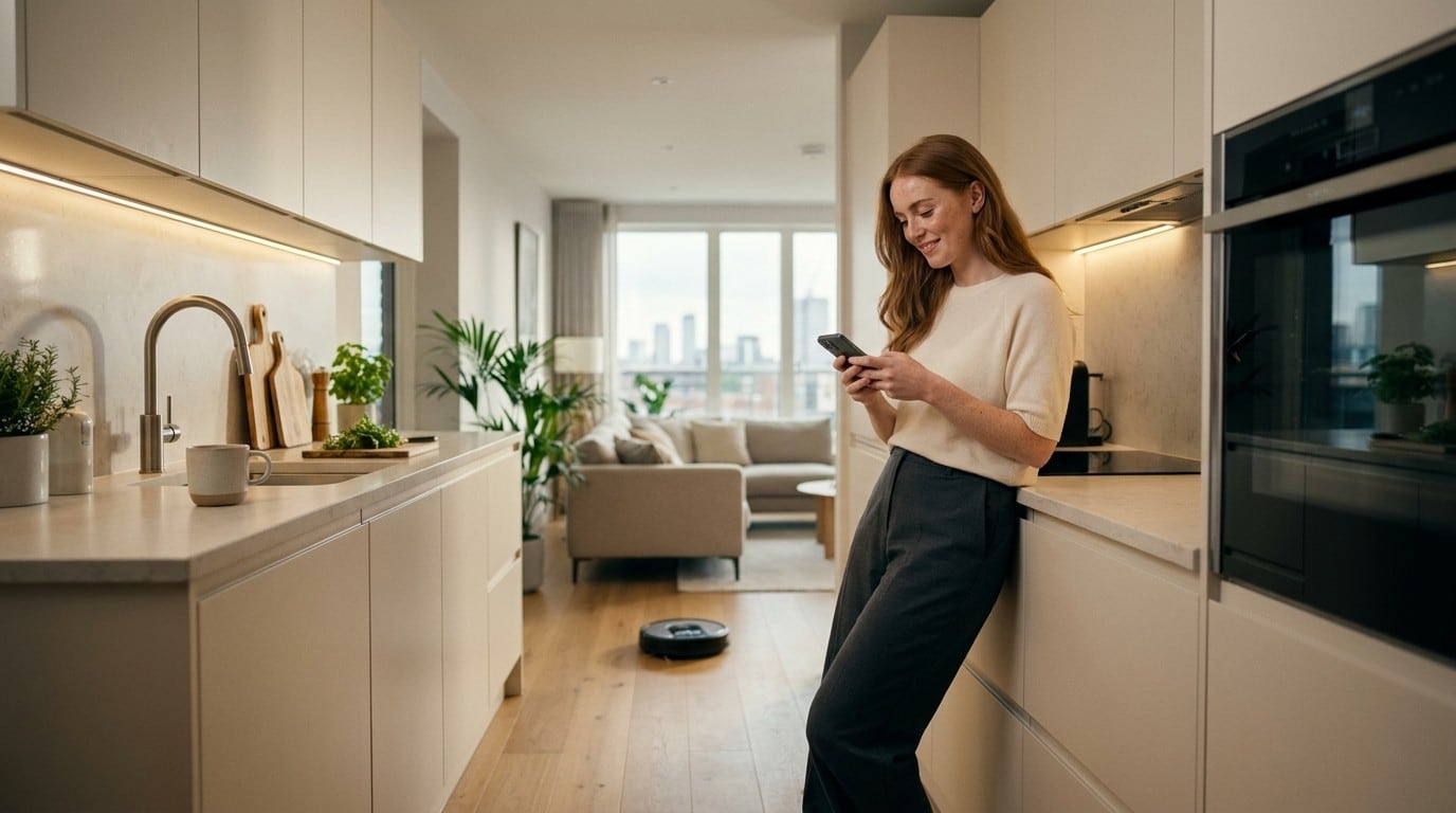
Home Appliance Device Mobile App UX/UI Design
Buy a different appliance and you should not have to learn the app again.
When every product is controlled its own way, the customer pays for the inconsistency. The work was finding the frame that holds across product lines — the flow and the interface for the appliance app, designed on a structure the categories share.
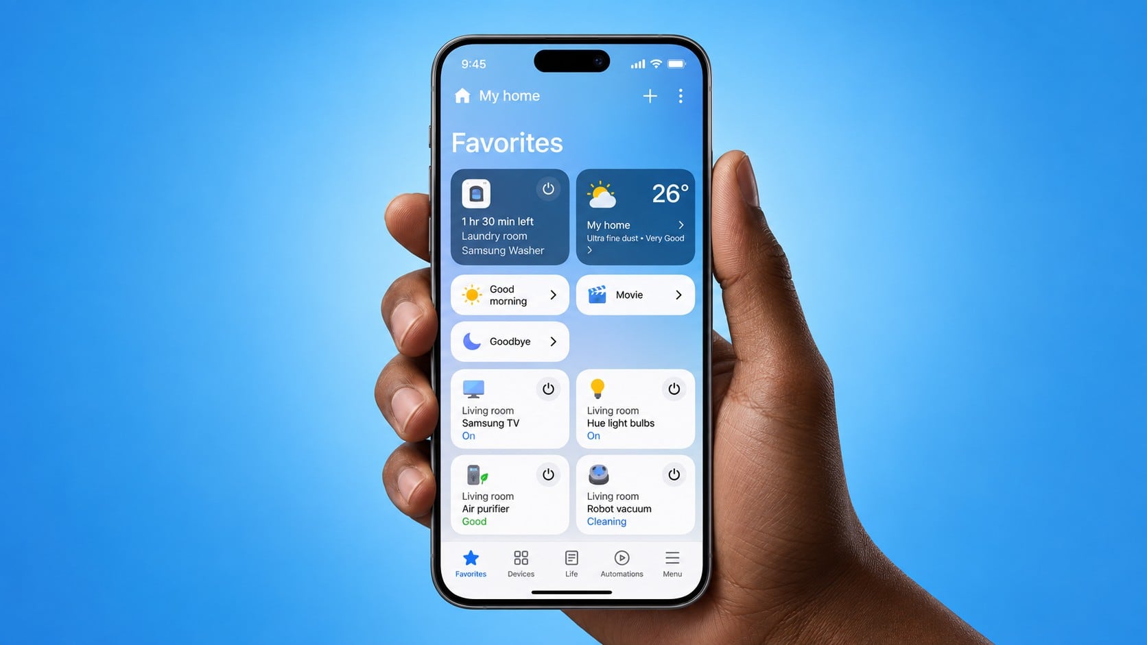
SmartThings iOS GUI
The same service on two platforms. Some of the difference is required and some of it is only drift.
People move between an Android phone and an iPhone and expect to find the same service on both.
So the work was separating what must match from what must differ. One list is about identity and the other about convention, and confusing them is how an app ends up feeling wrong on one platform and generic on the other.
We set the Android reference design and the iOS guidelines side by side, wrote down the differences, and built the graphics from that.
2 separate engagements on this line in 2022.
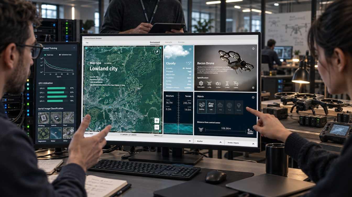
AI Object Recognition Training Simulator UX Design
The thing being trained here is a chip, not a person. The interface belongs to whoever is shaping what it learns.
The one being trained is not the one operating it, which inverts the usual question — the interface serves whoever is shaping the training, not whoever is learning from it.
UX design for the object-recognition simulator, built for reinforcement learning on a neural processing unit.
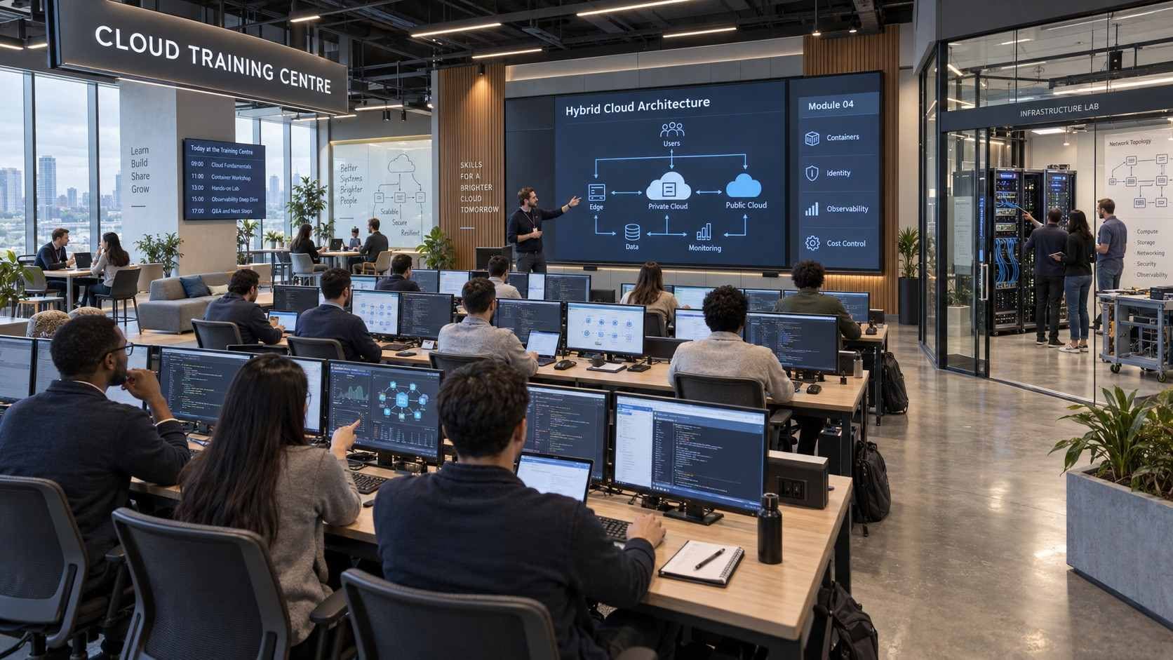
NHN Cloud Training Centre UX Planning
A person arrives knowing what they want to learn, not what the catalogue calls it.
The centre ran a great many courses at a great many levels. Classification is the whole design here — how the courses are divided decides whether anyone finds theirs.
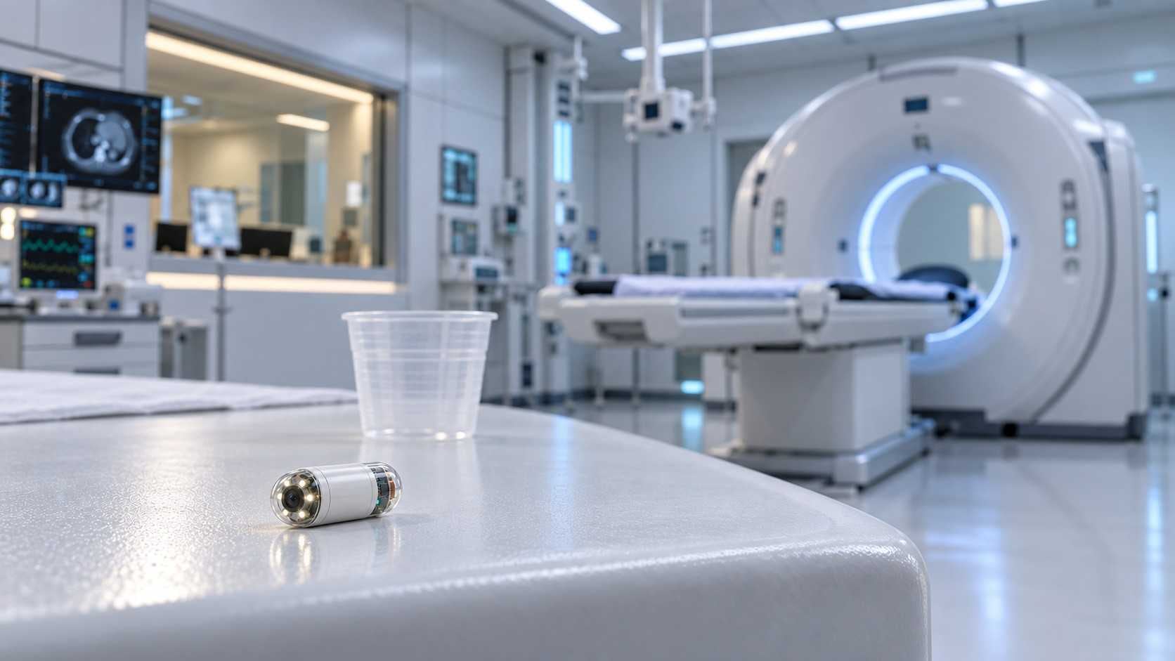
DICEVIEW UX Development
The endoscope is swallowed. From then on the doctor is working something they cannot see, in a room built around a machine the size of a scanner.
A capsule endoscope is not a smaller endoscope. The doctor drives it with a control in one hand while reading live video with the other, and the whole procedure has to be recorded precisely as it happens.
The design question is the room, not the screen — when the view has to change, and how the patient's data moves between the instrument and the record without anyone entering it twice.
We looked at the space and the procedure before drawing anything, then designed the graphics for the monitoring software.
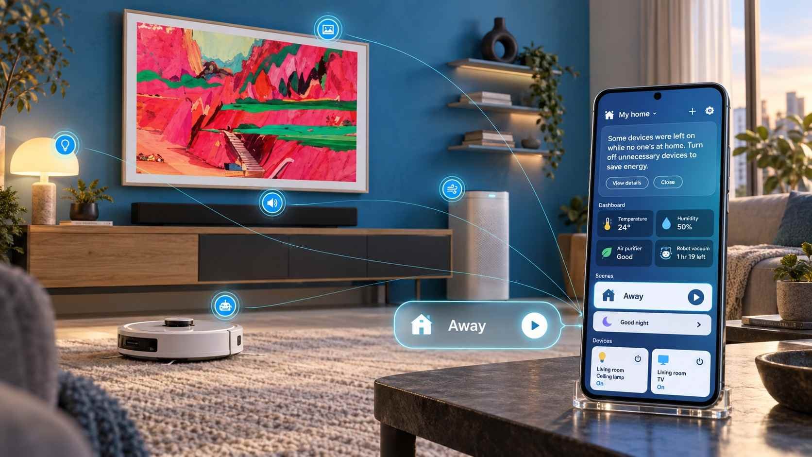
SmartThings 3.0 UI Guidelines
Several smart-home apps had just been folded into one. Everything arrived at once and none of it had been introduced.
Products and functions that had lived in separate apps now shared a single structure, and the structure showed the strain.
The guideline had to decide what all these devices have in common before it could decide how they look. A flow and an information structure that hold whether the thing on the other end is a television or a door lock.
The 3.0 guidelines set the rules across the whole app. Having worked on it since the pilot, we knew why the earlier decisions were made and could move them rather than guess at them.
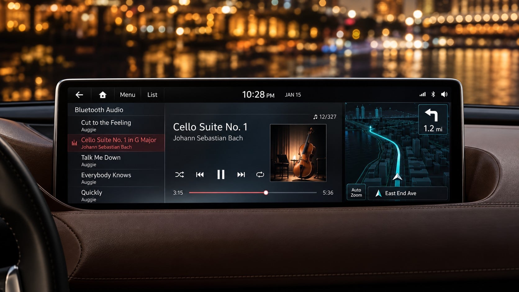
Hyundai MN Navigation UI Design
Features keep arriving. The menu they arrive into was settled years ago.
A premium navigation system carries a great deal and appears in many different cars. The driver glances and decides.
So the real work is finding where a new function fits without moving anything the driver already knows. An extension that disturbs the screen's rules costs more than the function is worth.
A yearly engagement, revising the specification alongside the planning team. Each time a function was added we checked first where it collided with the existing rules.
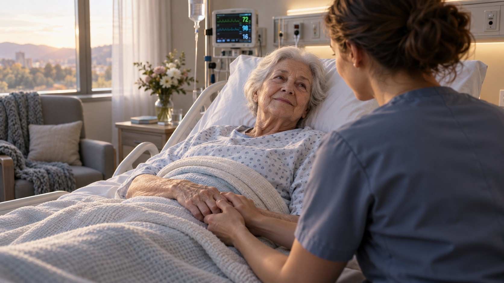
Continence Care Informatisation Service UI/UX and Development
A care device worn on the body, and a record of it read by a doctor, a care worker and a family member. It cannot mean the same thing to all three.
The robot has its own controls on the patient's side; everything else happens on a tablet or a desktop, at the bedside, at the station and at home — and a good deal of it in the middle of the night. The patient's condition and their rhythm have to be watched continuously, which is a great deal of data arriving from a private place.
So the first structure to settle was not the screen but who is allowed to see what. Where the clinical view divides from the lay view, and whether the care log belongs in the same flow as the alerts and the statistics.
We separated the information by stakeholder before designing, then built the permissions from that. One adaptive layout covers desktop, tablet and phone, and a dark mode was designed alongside it because so much of this happens at night.
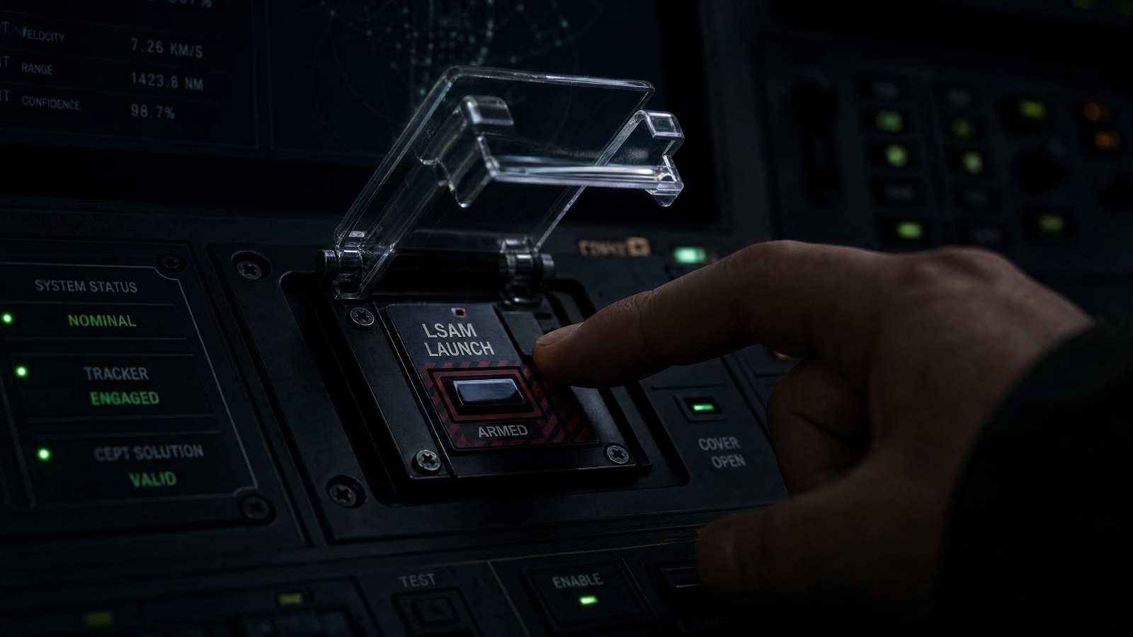
L-SAM Operations/Engagement Control Centre UX
Long-range surface-to-air. The control centre is where that gets decided.
Interface design for the multifunction console at the centre of L-SAM's control room.
Everything the later programmes inherited begins here — M-SAM Block-III and L-SAM-Ⅱ both carry this design forward.
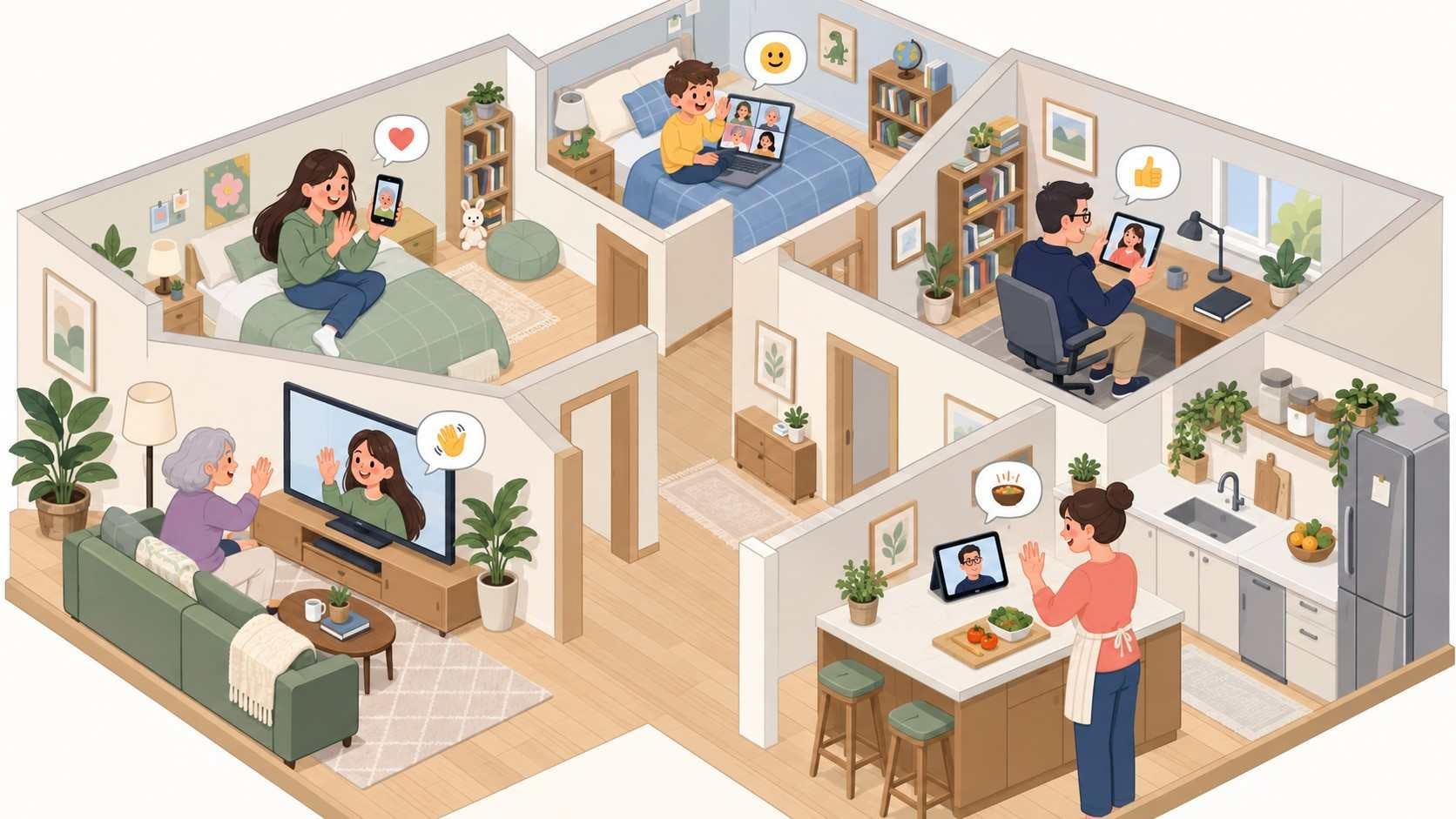
MDE Base Service UX Development
Multi Device Experience — the promise that what you were doing on one device is already waiting on the next.
A handover is only believable when it is invisible. The design question is less the moment of transition than what the second device already knows by the time you pick it up — and how much of that has to be settled before the first one is put down.
This was the base service in the sense the word carries here: the first one, written so the rest could be cut from it. A phone, a tablet, a television and a computer do not divide the work the same way, so what gets decided at the centre is not a screen but the part all of them have to agree on.
Writing something to be inherited is a different job from designing it. A choice that is merely convenient at the centre becomes expensive at every edge, and it reaches each device team as a constraint rather than a suggestion.
UX development for the service across the range.
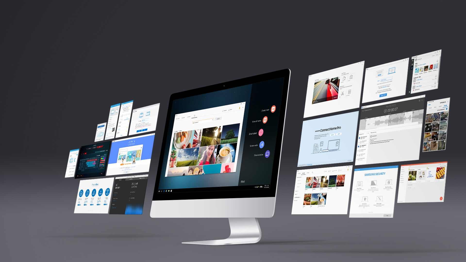
Samsung PC Software UX
Software nobody chose. It is already on the machine when the box is opened, and it has about a minute to earn the space it takes.
Samsung builds the PC and ships it with its own software on it. Samsung Flow and SideSync for moving between a phone and the machine; PC Settings, Samsung Update and Smart Manager for the machine itself; the gallery, the recorder, the camera control, the radio; Samsung Security; Air Command for the pen; a companion for the television; a layer for the Odyssey gaming models. Around two dozen titles. To the person opening the box they are not two dozen titles — they are what the computer is like.
Preinstalled software is judged before it is used. None of it was searched for or downloaded, so each one has to explain itself on its first screen or be removed, and removing it is easy. That is the brief: the shortest distance between opening the thing and it being obviously worth having open.
The other half is that they have to read as one manufacturer rather than a dozen teams. A settings panel and a photo gallery have almost nothing in common as tasks, but the same person meets both on the same machine within the same hour. What holds them together is not a style but a set of decisions repeated — where things live, what a state looks like, how far the software may go in interrupting.
UX, UI and GUI across the suite, sustained through versions — SideSync to SideSync 4.0, Samsung Update to 3.0, PC Studio Plus to 1.5. 10 separate engagements on this line, 2015–2020.
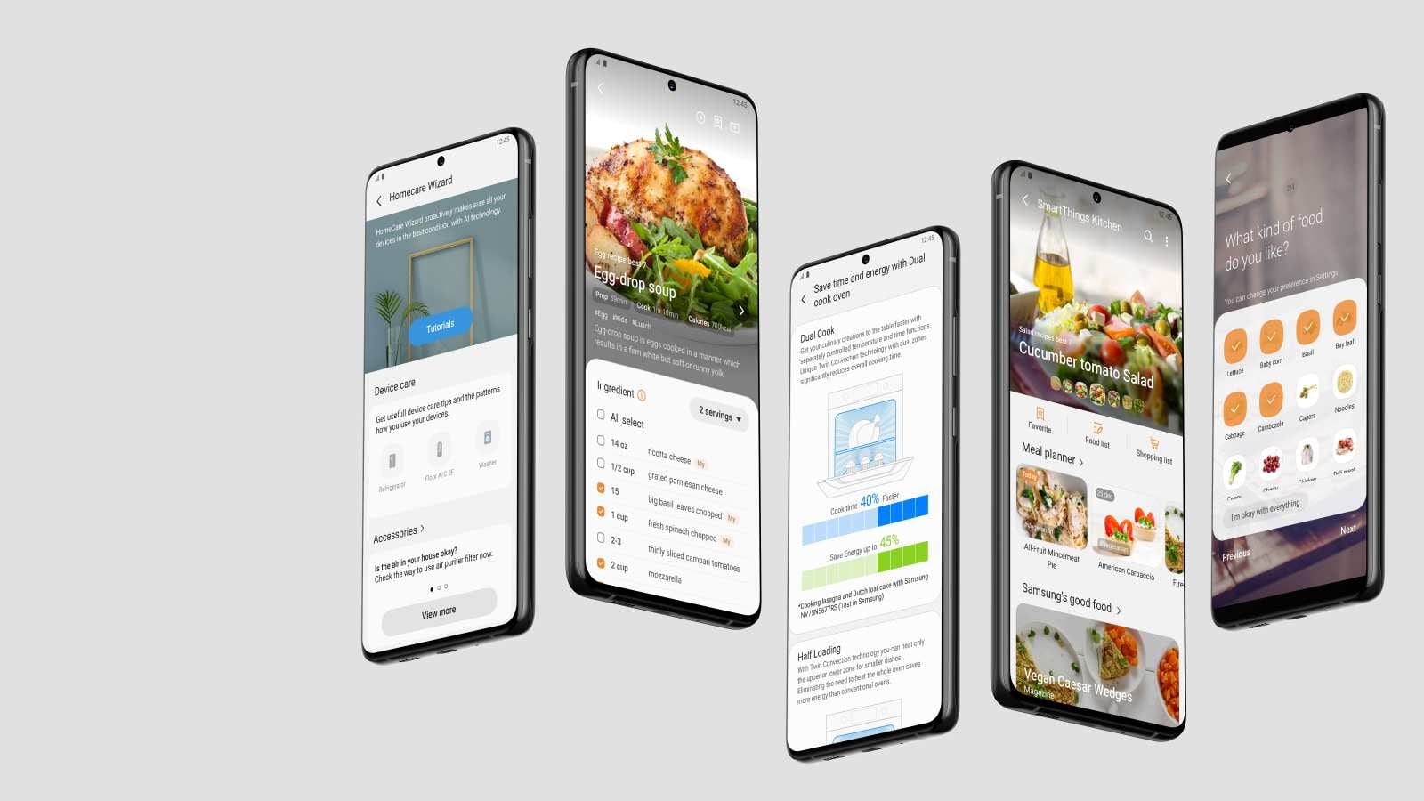
SmartThings Home Appliance GUI,UI Design and Guide
Appliances were joining faster than screens could be drawn for them.
Each product brought its own control screen, and the number was climbing.
Consistency at that speed is a matter of writing the guide while drawing, not after. Otherwise every product settles its own answer and the guide arrives only to describe the mess.
Product screens and the guide were made together, and the scope grew during the work.
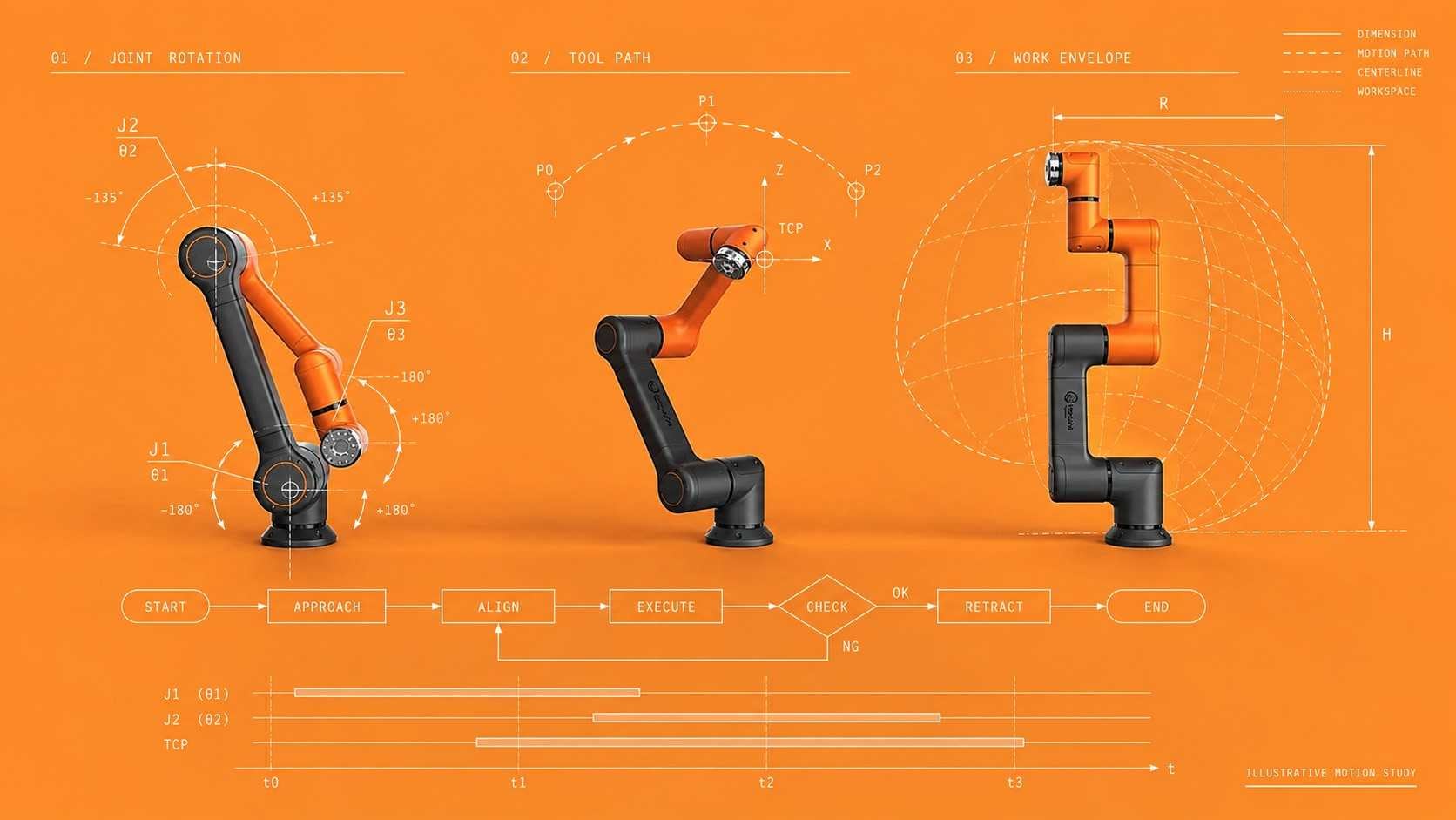
Hanwha Precision Machinery - Welding Robot SW Resource Artwork Development
A collaborative robot is sold on the idea that the person on the floor can set it up themselves. The programming screen is where that claim gets tested.
Hanwha's industrial collaborative robots are driven from a single panel that controls the cell. Before the robot does anything it has to be taught the job, and in the software as it stood that teaching had been cut into steps that each demanded a decision. The operator was making a great many selections and entering a great many values before the first weld happened.
That cost is easy to overlook because it is paid before the work starts, and it falls on someone whose trade is welding rather than robotics. Each input is also a place to be wrong, on a machine that then moves.
So the work was to take steps out rather than to make them look better. Which decisions the software could reach on its own, which ones belong together on one screen, and which had only ever been separate because that is how the code had grown. Interface, screen design and graphics for the control panel.
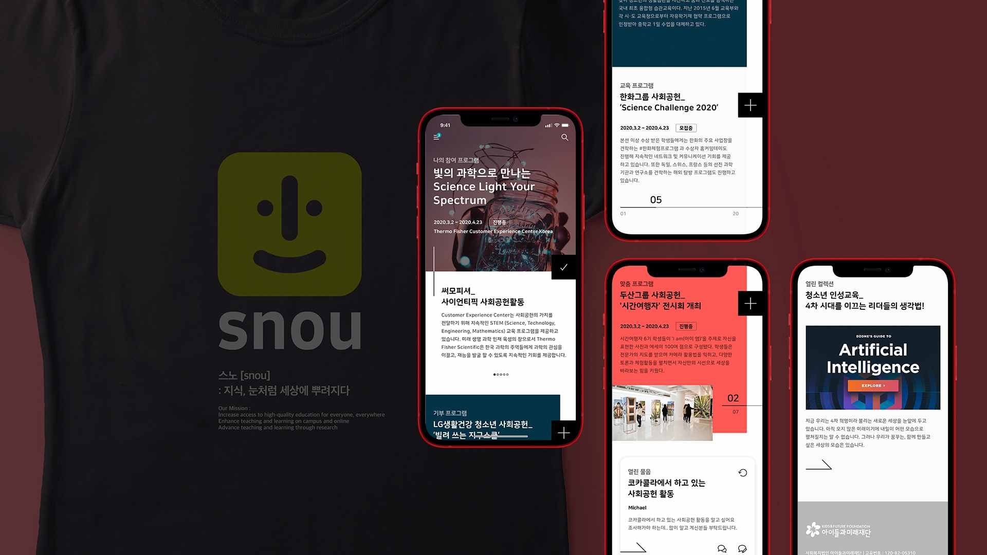
Education Sharing Platform Web Site Build
Companies with something to teach, students with time to give, and young people who need both — on one platform.
NGOs and businesses offering education, university volunteers, and the schools and teenagers on the receiving end. Each arrives expecting something different.
The structure has to connect roles that do not want the same thing from it. Put the participants and the teaching material on the two axes and the rest follows from where they meet.
We designed a service for each role around those axes and built the site.
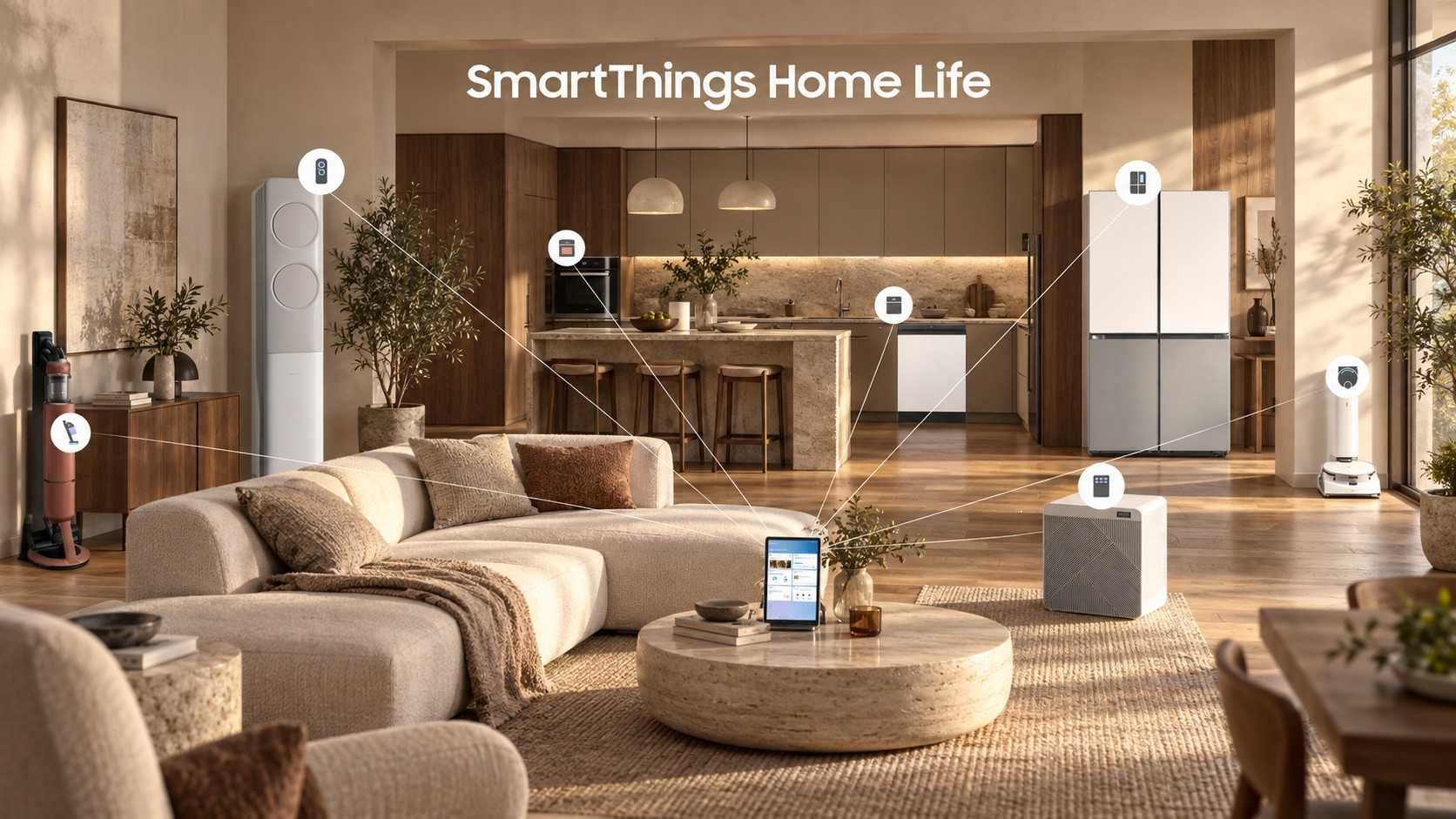
ST Service UI/GUI/VI Design and Guide
A television that tunes itself for a game, and keeps an eye on a child or an elderly parent while it does.
The service linked a smart TV to a phone, and it was asked to do two unrelated things at once.
Nobody pauses a game to adjust the lights. So one question was how the house gets operated without leaving what you are doing; the other was how a carer learns what is happening while it is happening.
We made the interface, the graphics and the visual identity with a guide to go with them. The scope grew during the work.
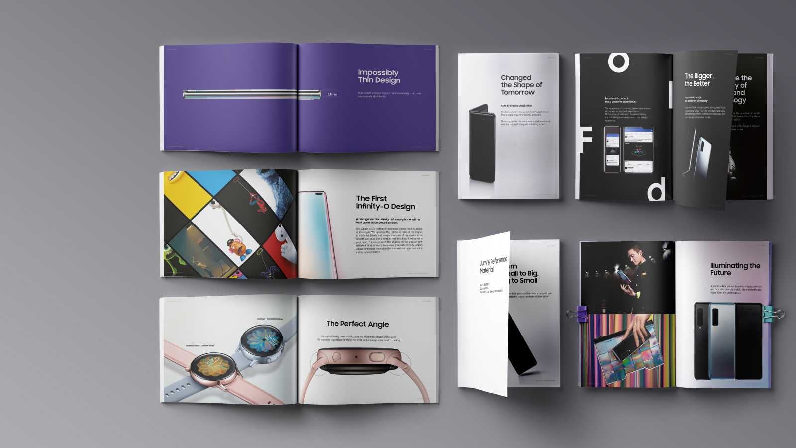
International Design Award Jury Brochure
A hall the size of a gymnasium, thousands of entries, and a few seconds each.
iF and Red Dot jurors move through the room on their feet. A brochure gets picked up, turned, put down, and then it is the next one's turn.
At that speed the layout is the argument. What the product is has to arrive before the juror has decided how long to give it.
Six Galaxy products, printed on a stock chosen to survive a day of being handled. We designed it and saw it through printing and binding.

Book Club Integrated Usability Improvement Design
Hundreds of thousands of books, three ways to get any one of them, and a reader who mostly wants to know which one comes next.
Woongjin Book Club opens the company's library to people who are not Woongjin ThinkBig subscribers. The same title can be bought, borrowed, or taken as part of a subscription, and several hundred thousand of them sit behind that choice. At that size the classification is not a convenience; it is the only way anyone arrives at a book at all. So the structure that was already in place was the first thing to take apart.
Buying, lending and subscribing are three different relationships with one object. Treat them as three product lines and the reader is left to reconcile them; hide the difference and it goes wrong exactly where it matters — what is kept, what goes back, and what stops when the paying stops.
Children on the service also choose a reading teacher. That is not the same kind of choice as choosing a book and it cannot be laid out as though it were: the question is trust rather than features, and the person deciding is often the parent rather than the reader.
Usability improvement across the web and tablet interfaces, including the screens where a reader keeps track of what they have.
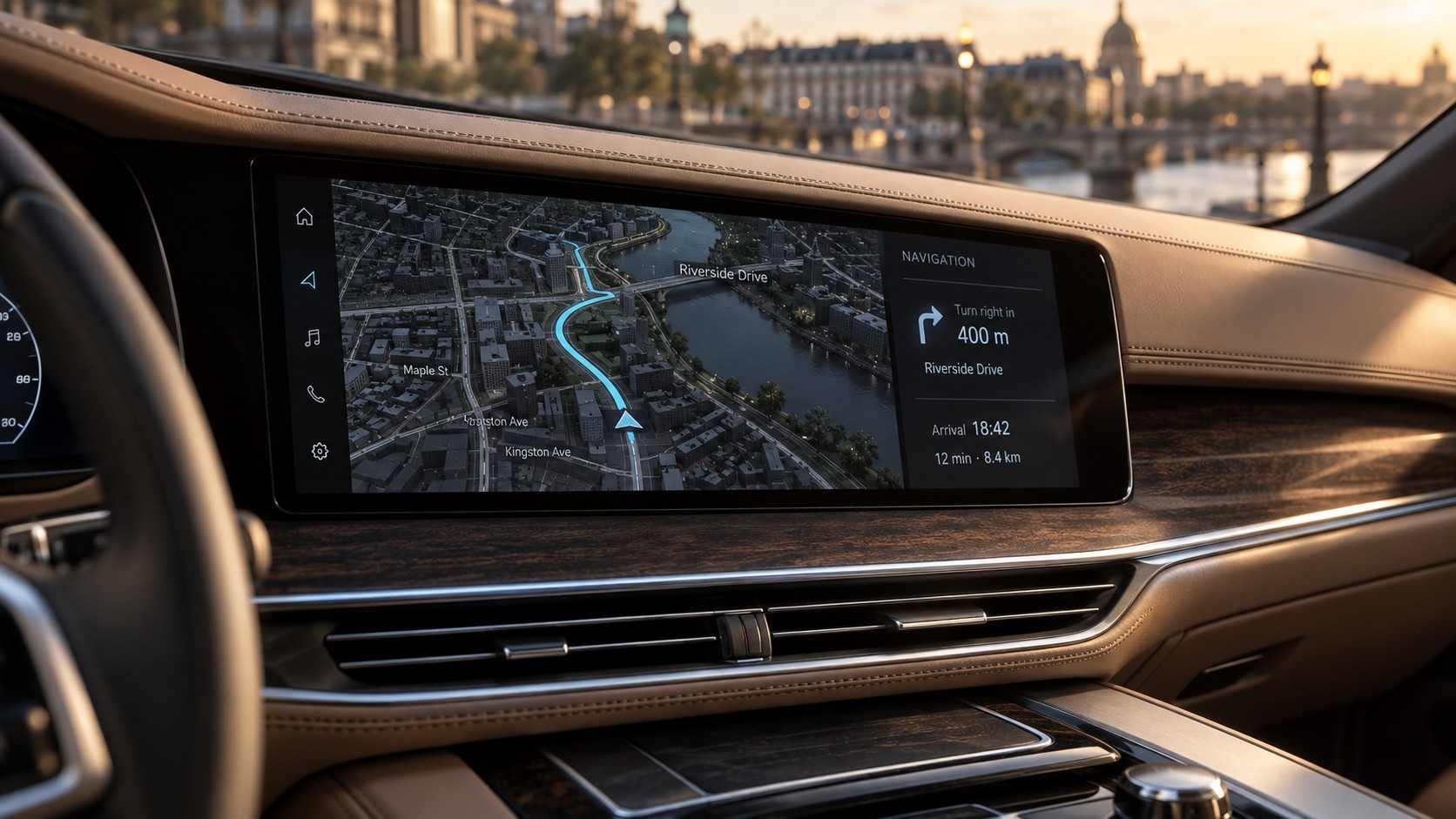
Premium Navigation UI Specification
A new generation of the system. The driver's second of attention has not changed; almost everything else has.
More functions than the last generation, and export markets with their own road rules, languages and units.
A generation change is mostly a decision about what not to redo. What gets defined afresh, what is inherited, and where the regional differences are separated out so they do not spread through the whole specification.
We set the common structure first and managed the regional differences as derivations from it. Several people shared the work, so the specification's own conventions were agreed before any of it was written. Standard and premium annual programmes followed.
2 separate engagements on this line, 2017–2019.
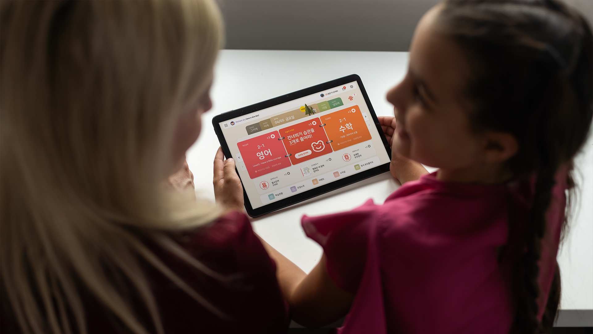
Learning Model Platform Service Design
Children already tired of homework had to want to open it again tomorrow.
An AI learning platform for primary school children on a tablet, with parents watching the results.
Words like revision and preview belong to adults. So the plan was written in the language children actually use — yesterday, tomorrow — and we had to decide how much of a child's progress a parent should be shown.
Achievement and reward were built into the structure rather than added on top.
Link Emulator UX Consulting
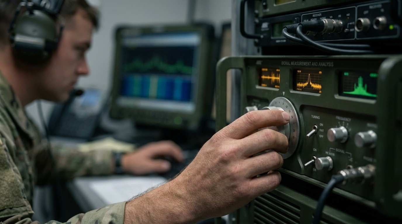
An analyser can bring several signals onto one screen at once. The moment it does, its job changes from showing a signal to keeping them apart.
Values from several sources can be linked and read together on the instrument. That is the point of it, and it is also where the screen begins to work against itself. Once traces share an axis, being visible is not the same as being individually readable — which one is which, which one moved, and whether what looks like a single reading is two of them lying on top of each other.
Colour alone does not settle that. Whatever carries the distinction has to survive the room the instrument is standing in, the eyesight of the person reading it, and the fact that a value is usually recognised at a glance rather than studied.
The other half was the settings. One instrument goes to a laboratory bench, to a shielded chamber and to a working site, and is picked up by a specialist one day and by someone running a routine check the next. A default is a claim about who is using it and where. So the question was which configurations deserve to exist as environments a person selects, rather than as preferences each of them rebuilds at the start of every session.
UX consulting on the legibility of combined signal information, and on setting the instrument's environments by place of use and type of user.
Samsung -ONE UI Company-wide Rollout for Reference Design
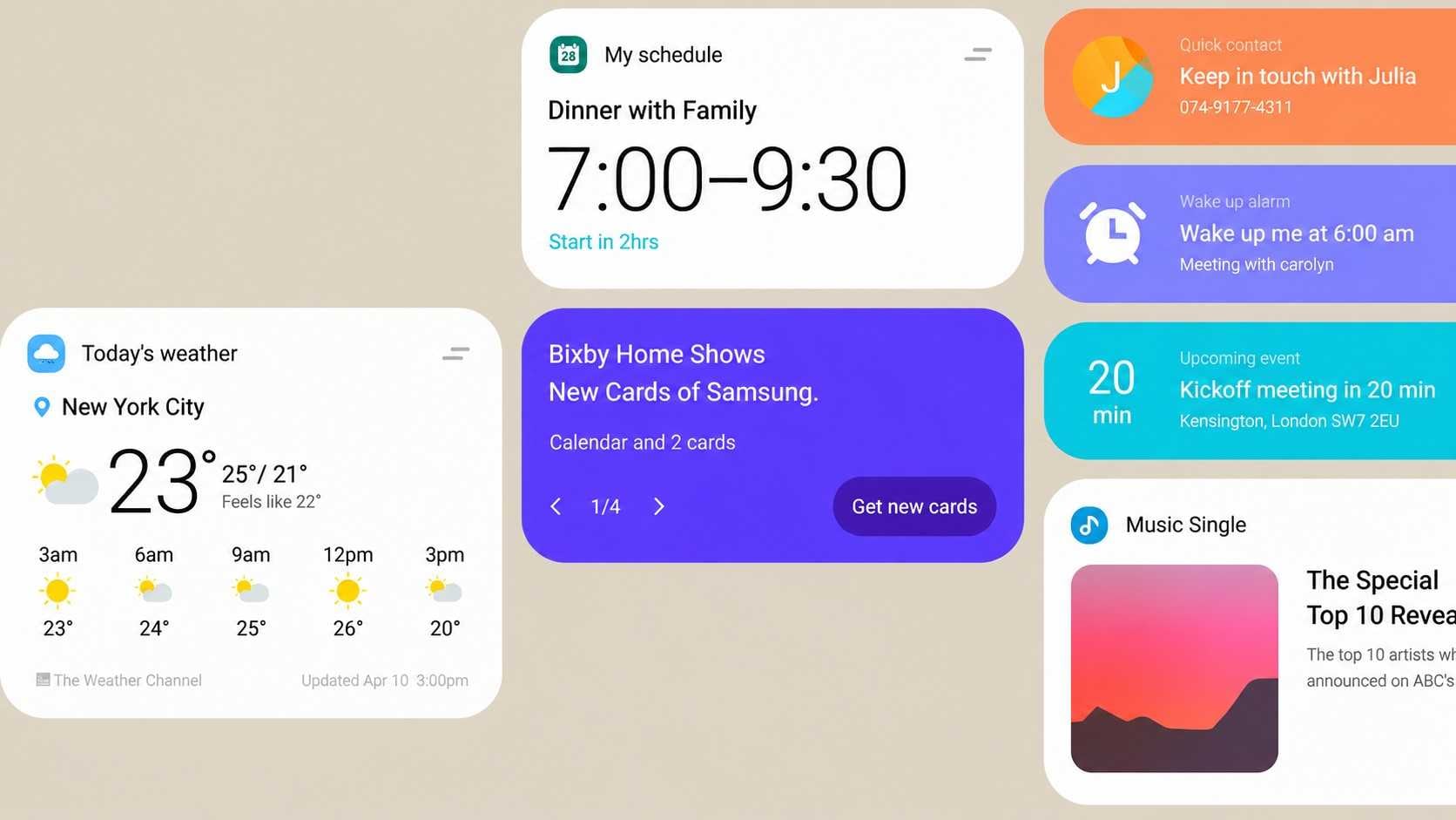
One UI was drawn for a phone. It had to reach a watch, a television and a refrigerator.
The same design language on screens of very different sizes, looked at from very different distances.
What travels unchanged is what makes it one language; what has to change is what keeps it usable. Separating those two is the whole of the rollout.
We analysed how each device is actually used, built reference designs from that, and folded in what came back from an online survey.
New Wearable Project UI Development
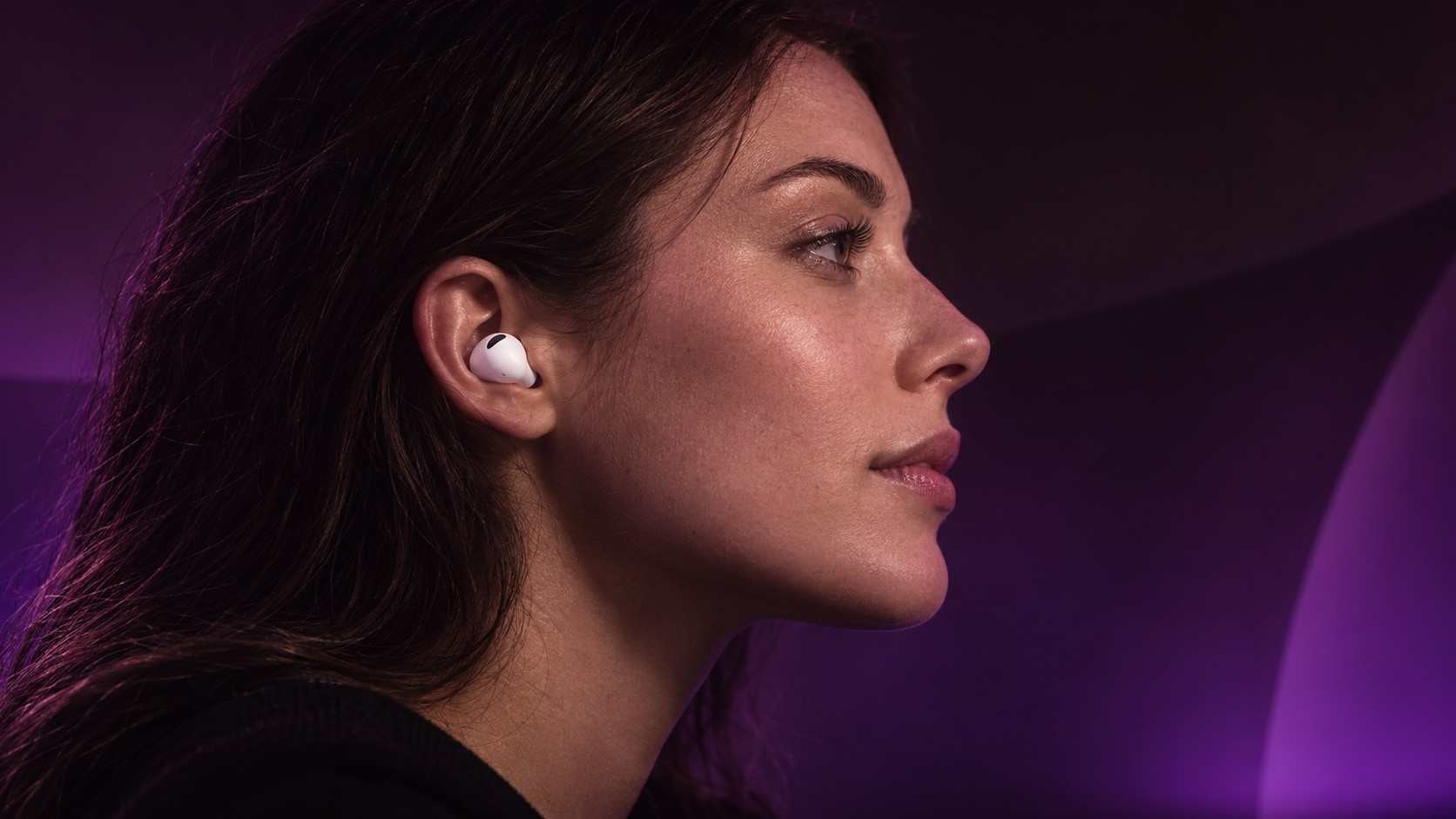
Two things worn at once, and neither of them is the phone. The earbuds have no screen, so the watch becomes the only place they can be seen.
Galaxy Buds2 and Galaxy Gear are both on the body, and the work was what passes between them. Everything about the earbuds a person might need to see has to appear somewhere other than the earbuds — which of them is connected, how much charge is left, what mode they are in. The nearest surface is the wrist.
A wrist screen is read in glances of about a second, so it cannot simply become a small second screen for the buds. What earns a place there has to be weighed against what could be a tone in the ear instead, and against what should wait for a screen large enough to deserve it.
The two channels are not interchangeable, because one of them is public. Raising a wrist is something other people see; a sound in the ear is not. Which of the two carries a given message is a decision about more than convenience.
UI development for the pairing, run in two phases across more than a year.
Utilizing Satellite Image Data Planning Projects
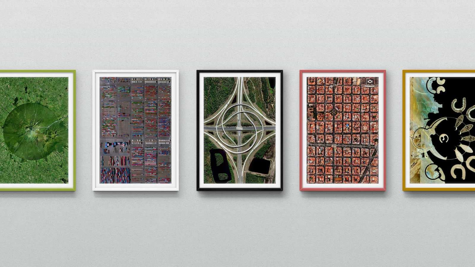
The pictures already exist and already have a buyer. The question was whether the same pictures are worth anything to anyone else.
LIG Nex1 wanted to work with Planet Labs, the American company running its own satellite constellation, and the proposal had to make that case. Satellite data already has a market — militaries and governments, who know what they are asking for and have a line in the budget for it. A civilian buyer does not turn up already knowing they want a photograph taken from orbit, so the work was to invent the demand rather than describe it.
That makes it a business question before it is a technical one: what a picture from orbit is actually worth to someone who is not a ministry, and what would have to be true of it before they paid for a second one.
A proposal has to make the thing real enough to be judged while none of it exists yet — and then survive a room. We built the future strategy and the business case, and presented them.
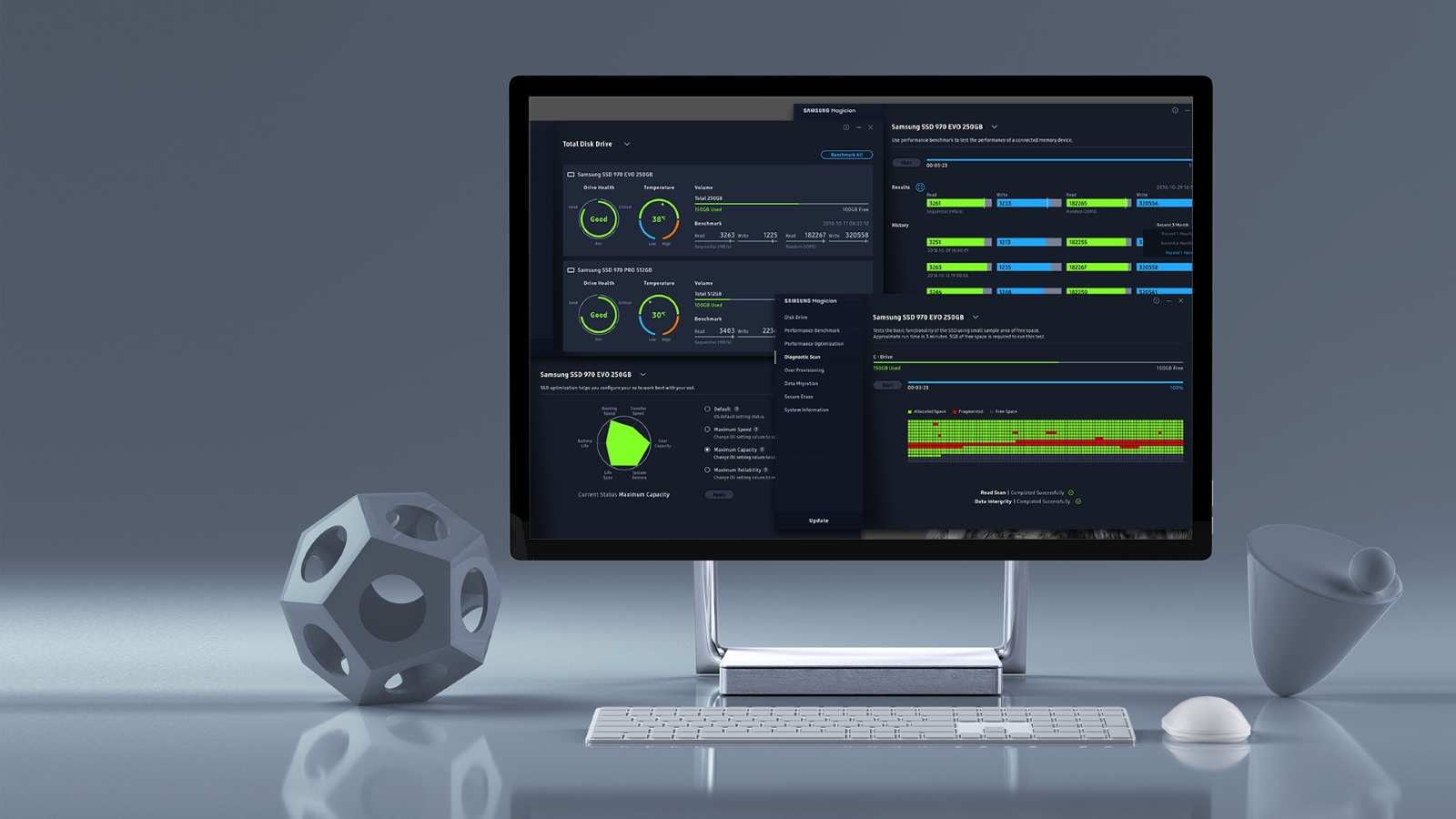
One Magician UX Project UX Prototype and Film
A table of figures tells you what the drive is doing. It does not tell you whether that is good.
Samsung's memory division ships a great many products, and this is the single piece of software that manages all of them. Whatever it shows has to hold across parts that differ in what they are even able to report about themselves.
What was there was a screen of numbers. A number is a measurement, and the person reading it wants a judgement — someone who has just bought a drive does not know what a given transfer rate means, or whether a given temperature is a problem. They open the software once, to find out whether the thing is all right.
So the work was to put the interpretation on screen beside the measurement and let graphics carry it. That is not decoration — it is the software answering the question the person actually arrived with. The figures stay for anyone who wants them.
UX prototype for the next version, and the film that explains it.
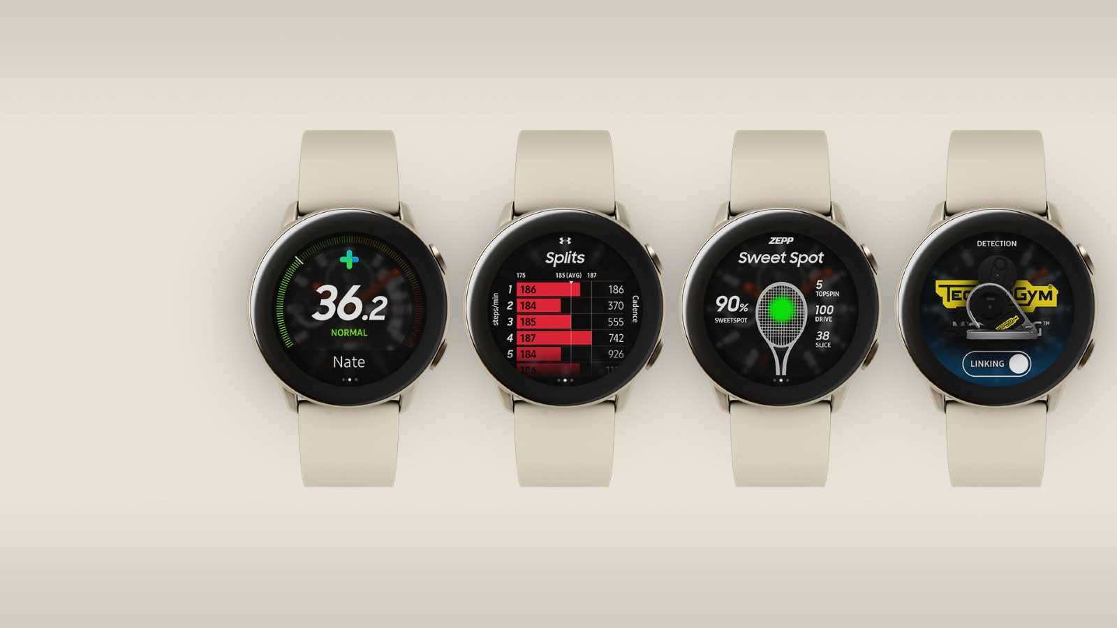
Open IoT Keynote Film and UX
A watch on an operating system of its own has very few apps. The way out was not to write more of them.
Galaxy Watch ran Tizen, and Tizen could not borrow from anywhere else. The shortage of applications was not a backlog; it was the platform.
If the watch cannot host the app, it can still be the thing that reaches it — which turns a platform problem into a connected-device one.
We set a reference brand to make it concrete, showed the linking scenarios as film for the developer keynote, and designed the interface and the guidelines behind them.
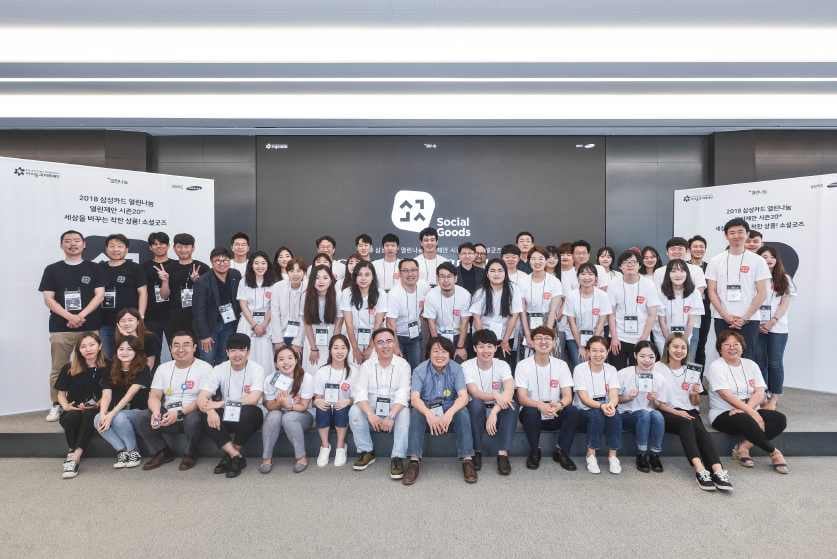
Samsung Card Open Sharing Season20 Social Goods Project
Young people with an idea, and no route from the idea to a shelf.
The programme took social-goods ideas through to products actually on sale.
Most of that is not design; it is the parts nobody plans for — finding mentors worth the young teams' time, running the talks and workshops, getting mock-ups made, and walking each team through what it takes to get listed in a shop.
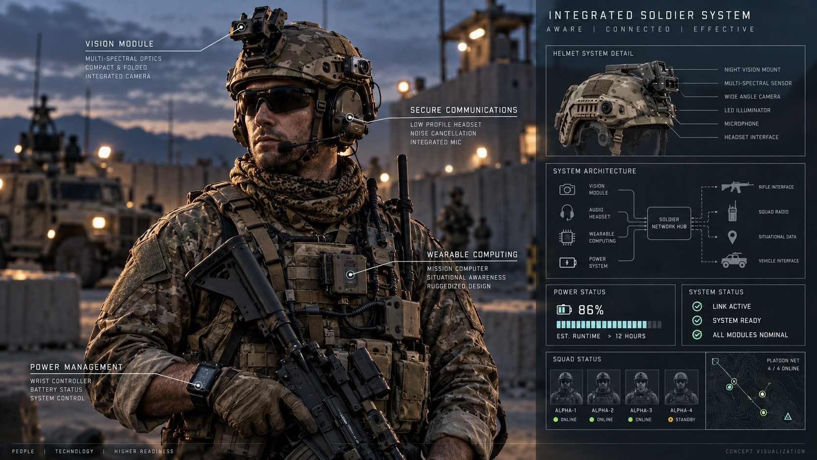
Warrior Platform BLOCK-I UX Consulting
Everything a soldier carries, considered as one system.
Hardware and software together — the equipment, the devices on it, and the system they report into.
The display gets carried, glanced at, and read in conditions that break ordinary interfaces. What stays legible in a glance, and what still works with one hand, is most of the design.
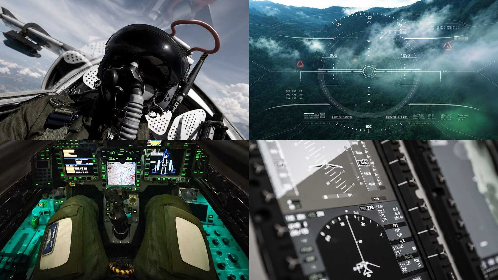
S-PDU(Pilot Display Unit) Prototype UX
A pilot display unit, prototyped on an Android handset.
Building it on a phone makes it real enough to argue about — which is the point of a prototype in a programme where the actual hardware is years away. Software and hardware experience for the unit.
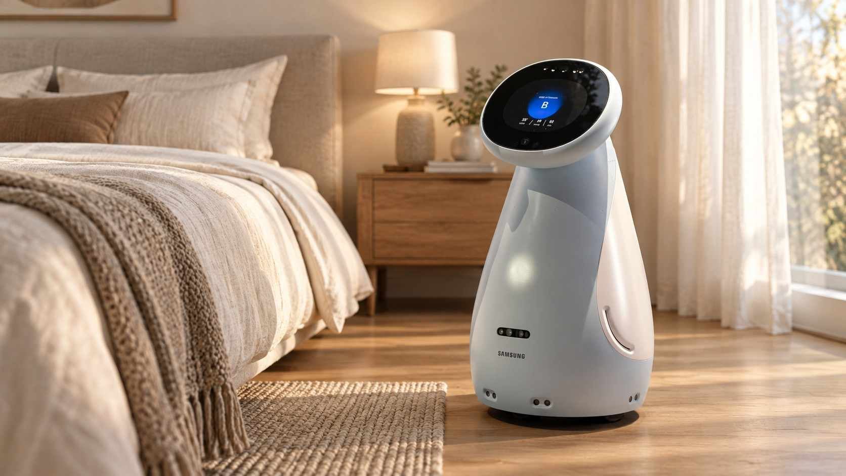
Life Care Robot Service for UX and Application Development
The robot lives with an older person. It reports blood pressure and sleep to someone who has never asked a machine for anything.
At home the users are elderly people and their families. Readings — blood pressure, heart rate, sleep — have to land with someone who is not comfortable with devices.
Whether a result is given as a number or said in words is not a matter of presentation; it decides whether it is understood. And a robot that speaks first is a different thing from one that waits, so when it does each had to be settled — along with how much belongs to the robot and how much to the family's remote scheduling app.
We drew on our earlier work on the URC home robots and designed the robot screens and the app flow together, taking the app far enough to be demonstrated. It was shown at CES the following year.
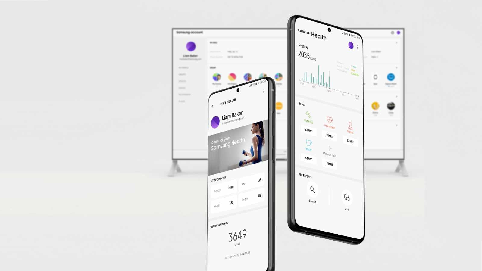
Samsung Account UX Development
The same account, signed into from a phone, a television, a refrigerator and a browser. Only one of those has a keyboard anyone would want to use.
Samsung Account is the door to all of them, and every device opens it differently.
One policy, four ways of typing. The flow has to stay recognisable while the input method changes underneath it.
We built prototypes that ran on mobile, TV, Family Hub and the web, and used them to show what the improvements would be.
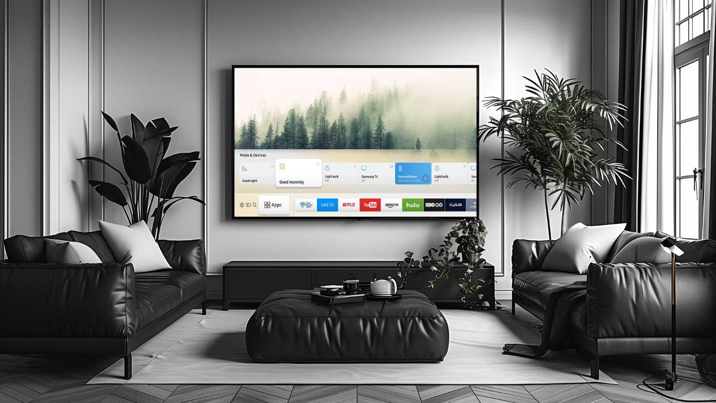
Smart TV Mass-Production GUI Guide
An annual engagement on the mass-production GUI guide for smart televisions and the site that carries it, absorbing specification changes as they arrived through the year.
Finding is the function. The structure that gets someone to the rule they need decides whether the guide is used or worked around. We built it as a website, and the scope grew.
2 separate engagements on this line, 2017–2018.
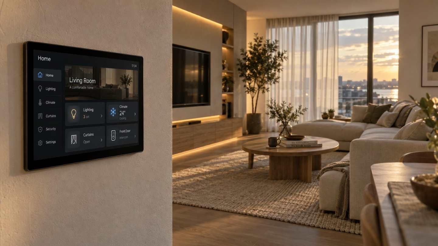
Smart Home Accessibility UI Guideline Development
A smart home that only opens for people who can see it, hear it and reach it is not a smart home.
The service had to work for users with limited sight, hearing or movement.
Accessibility standards are written in general, and a house is not general. Contrast, type size and spoken guidance each mean something particular once the thing being controlled is a boiler or a door.
We took the standards and wrote them into the smart home context as UI guidelines. The scope grew during the work, and the contract with it.
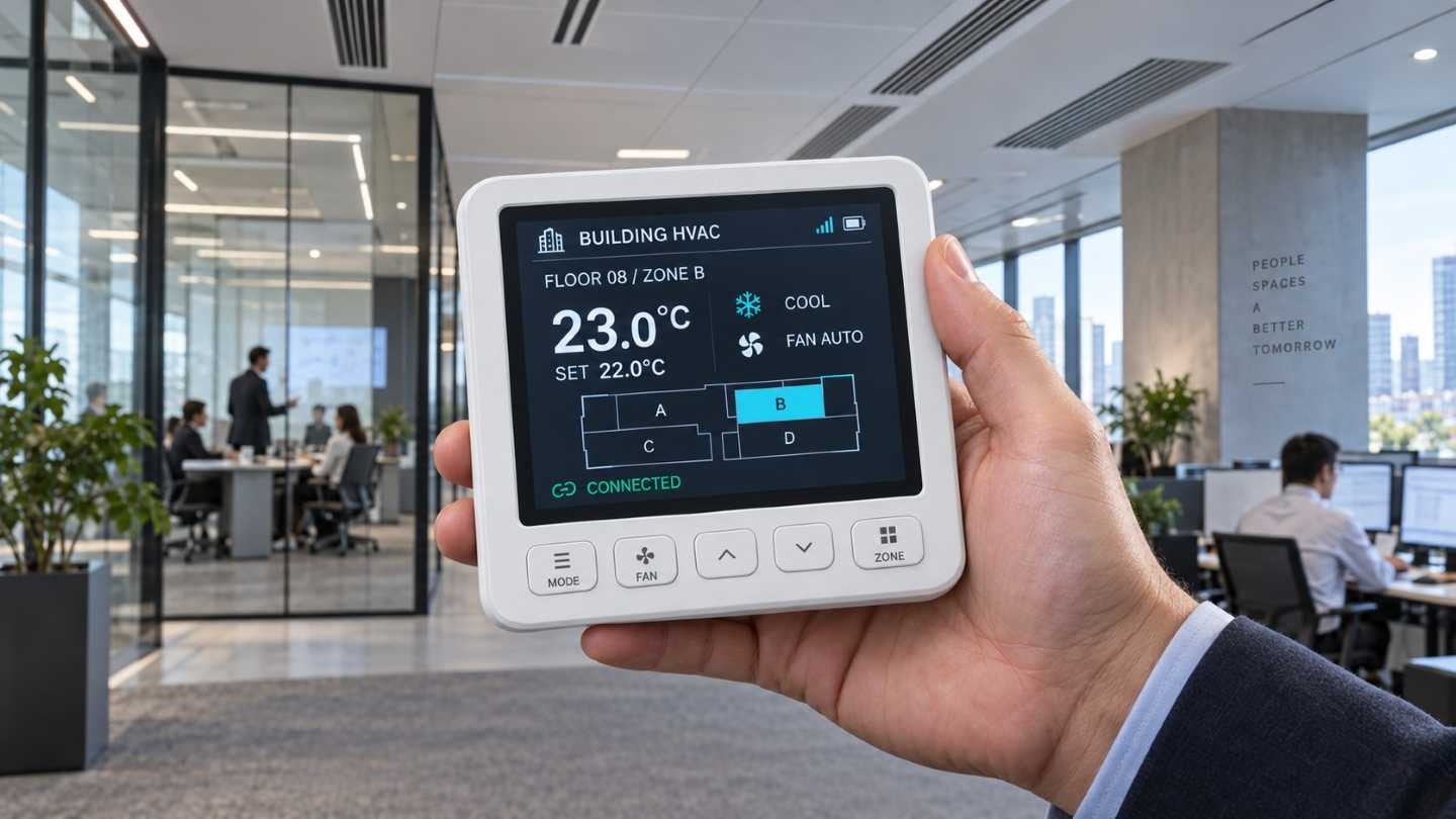
System Air Conditioner Wired Remote
It is screwed to a wall in an office. Everybody touches it and nobody has read the manual.
A wired remote for a system air conditioner is shared property — in a shop, an office, a corridor.
On a screen that small, the default view is the product. Which of operation, temperature and mode is simply there, and how the administrator's settings are kept away from whoever is passing.
Building on the earlier graphics and visual identity work, we filled in the detail screens and the exceptions that commercialisation asks for.
2 separate engagements on this line, 2016–2017.
One App Plug-ins
One app, many machines, and a different plug-in for each one.
Samsung had just settled on controlling everything from a single app, and each device arrived as its own plug-in.
Left alone, every plug-in becomes a separate app inside the same app. A common screen frame and a shared set of visual elements are what stop that.
We made the plug-in graphics and visual identity together, and the scope grew into a further contract.
3 separate engagements on this line, 2016–2017.
Quaduron Home Appliance for Commercialisation UX Guidelines Development
One platform underneath, and a different development organisation for every product on top of it.
Several appliance lines were being commercialised on a shared chip and platform.
A guideline written for organisations that do not talk to each other has to be exact about very little and silent about a great deal. What every product keeps, and what each is free to decide for itself.
We wrote the guidelines from the commercialisation point of view, and the scope — and the contract — grew during the work.
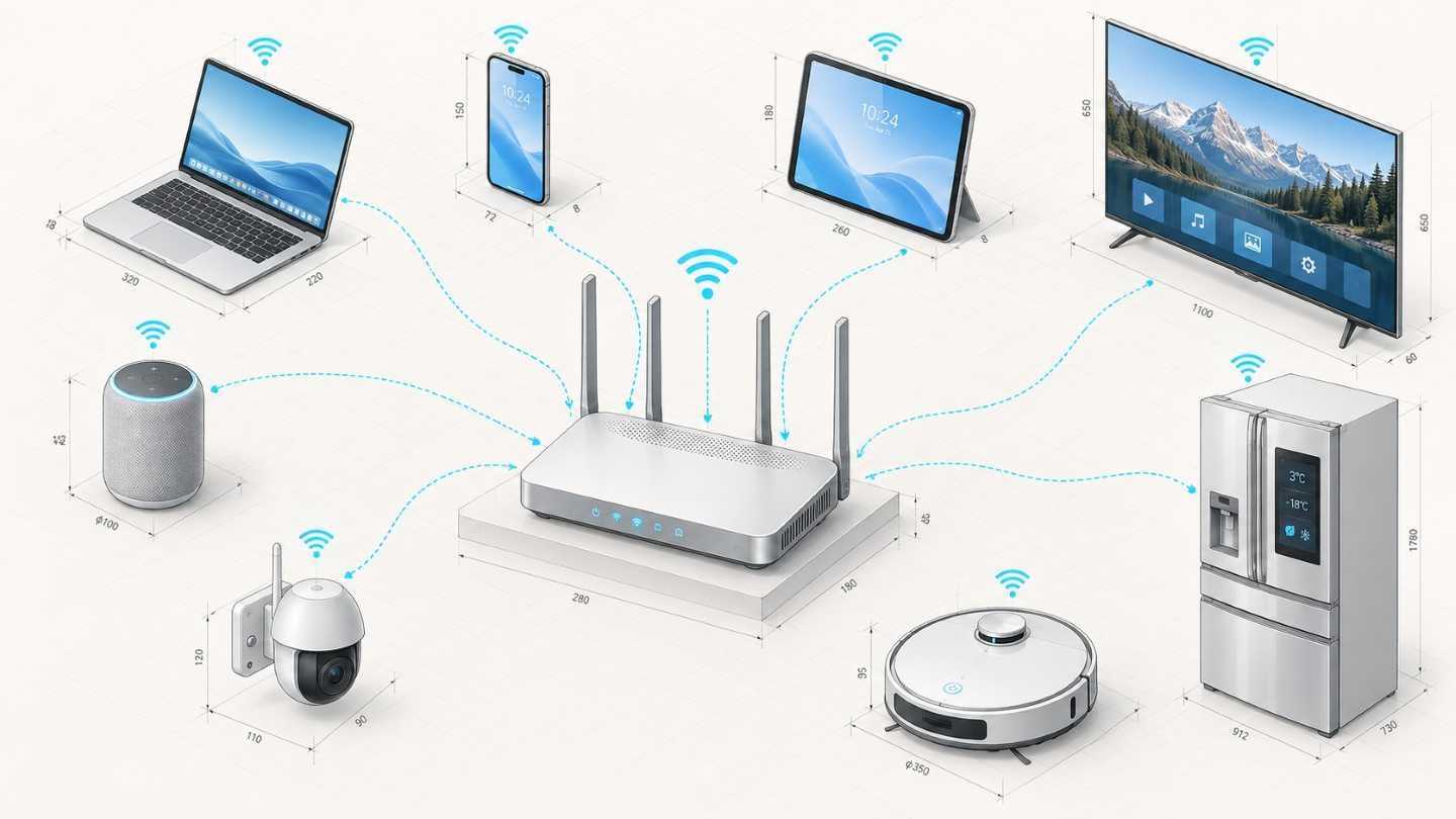
CELL(WiFi router)Web app UX Design
Every device in the house can be measured — its size, its weight, its model number. The one thing nobody can see is what joins them.
A router is the device everything else depends on and no one ever looks at. It sits on a shelf doing its work invisibly, and the only time a person opens its settings is when something has stopped working — which is the worst possible moment to be met by a vocabulary.
SSID, band, channel, DHCP, WPA: these are not words anyone learns, they are words people are made to accept. So the work is how many steps can be taken out, and how much of that language can be said in plain words instead.
What the person wants to know is always smaller than what the interface offers — which things in the house are connected, whether each of them is all right, and what to do about the one that is not.
UX design for the router's web app, carried through an additional phase.

UNICEF Web Audit
Someone who leaves halfway through a donation does not come back later.
The audit's first decision is where to look — the screens between intention and completion are worth more attention than the rest of the site put together. We diagnosed the problems and proposed the direction.
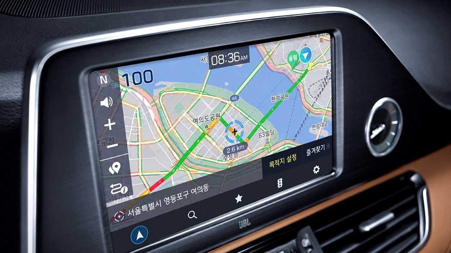
Mappy OBN 3.0 UI Design
The map arrives over the air. Sometimes it does not arrive.
A connected navigation system fetches its maps and routes as it goes, so the screen spends part of its life waiting.
Waiting is a state to be designed, not a gap between states. What is shown while the data is on its way, and what is said when the connection goes.
We started from the embedded navigation work, listed the states that only exist in a connected system, and designed from that list.

Smart Helmet Premium Value-Added Service Consulting
A rider cannot operate anything while riding. Almost the whole service has to happen before the ride and after it.
The helmet carries a camera, a speaker, a GPS receiver and sensors for position, altitude, speed and attitude. What comes off it is one ride recorded twice — as footage, and as numbers. The numbers are what make the footage usable: they know where the climb was, where the speed rose, where the machine leaned, and those are the places worth cutting to.
Everything the rider actually does with it, they do with their hands free — on a phone or on the web, after the helmet comes off. Editing the video, planning the next route, keeping the record of where they have been. The helmet's part is to capture all of it without ever asking to be operated.
And riding of this kind is social. The recording exists because it is going to be shown, so somewhere to show it is not an extra feature; a community site belonged inside the service rather than beside it.
We proposed the direction for the premium services and carried it through to the interface.
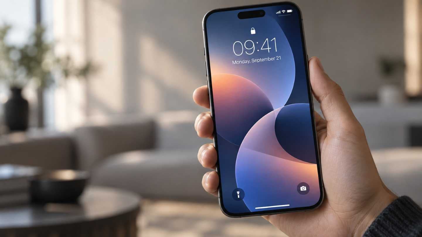
Company-wide App Icon/Branding Element Design Development
The same app wore a different icon and a different colour on every device.
A brand is not applied at the end; it is the thing that has to be identical in four places at once. We analysed the icons, colours and layouts of the apps common to phone, watch, TV and Family Hub, wrote the standard, and made the film that introduced it internally.
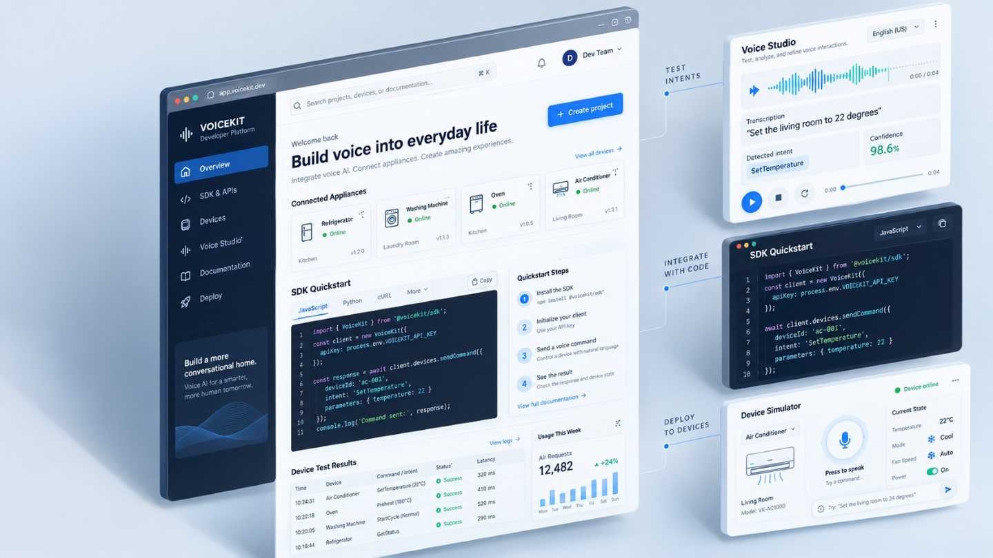
Byxbyhome SDK portal UX
A guideline site for the developers writing the software inside Samsung's appliances.
Two rulebooks had to become one — Android's reference guidance and Samsung's own One UI policy — and the portal is where a developer finds out which of them applies to the thing in front of them. The scope grew twice during the work.
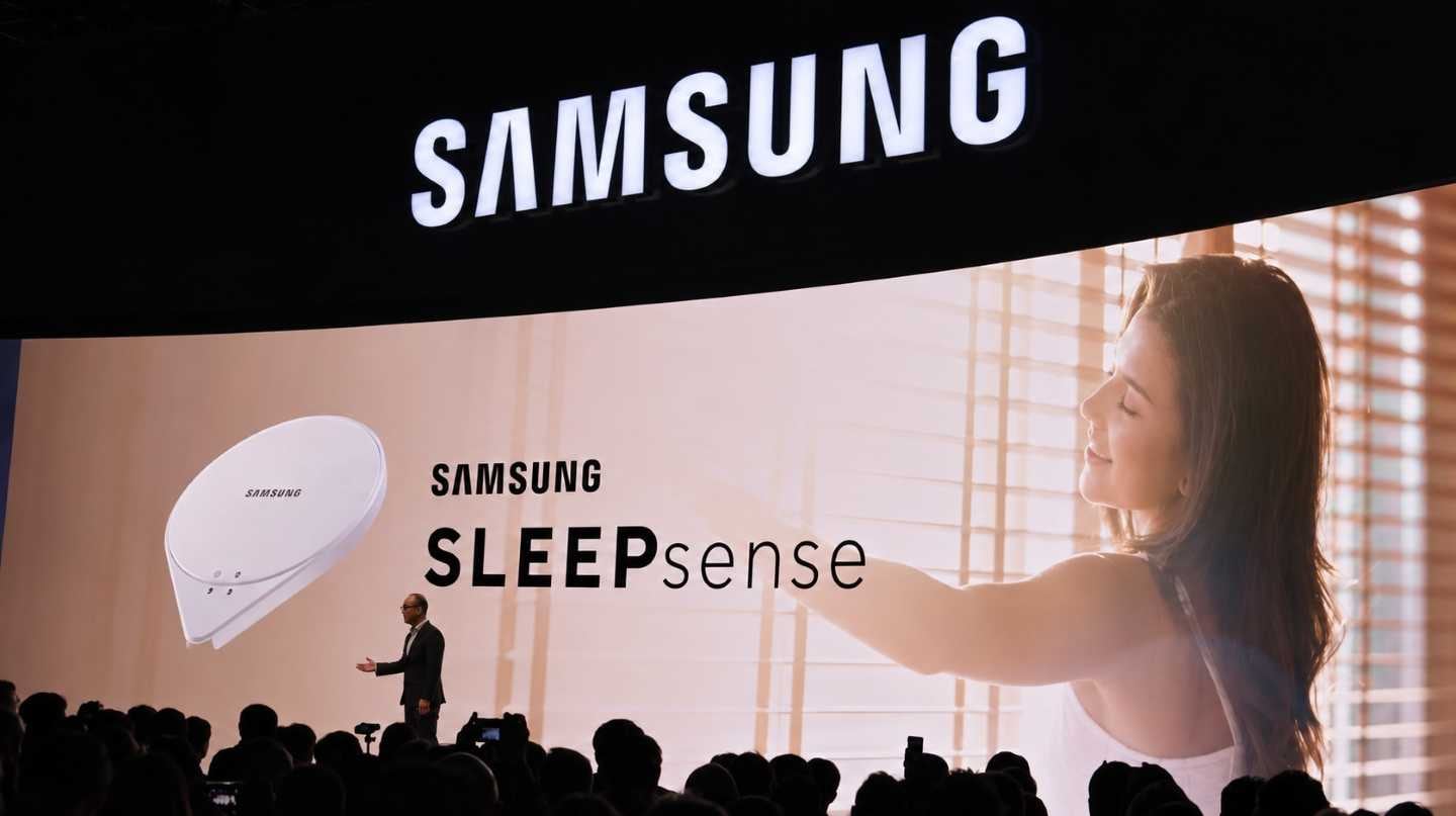
SLEEPsense 2.0 UI
The sensor sits under the mattress and is never touched. The report in the morning is the entire product.
A contactless sensor means the user has no relationship with the device itself — only with what it tells them.
A night produces more data than a morning has patience for. What leads at breakfast, and how much of it belongs in the report a family member sees.
We went through the 1.0 flow first and rebuilt the interface around the structure of the report. On a shared engagement, the interface design was our part.
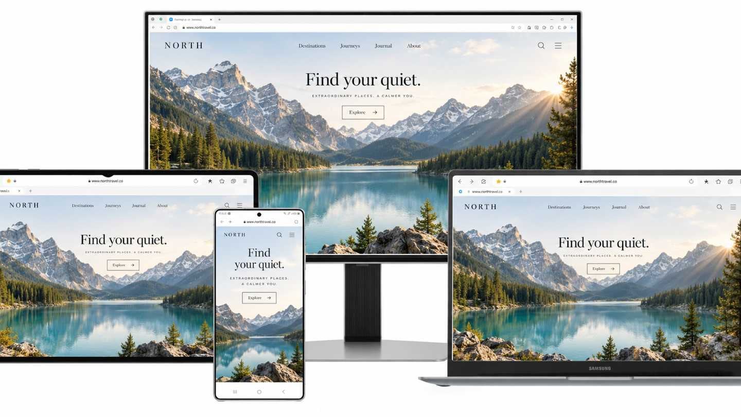
Samsung Internet PC Extension UX
Bookmarks made on a phone, wanted on a desktop, inside somebody else's browser.
An extension lives in a window it does not own, so what it may do and when it may appear are decided by the browser before they are decided by us. UX for the PC extension.
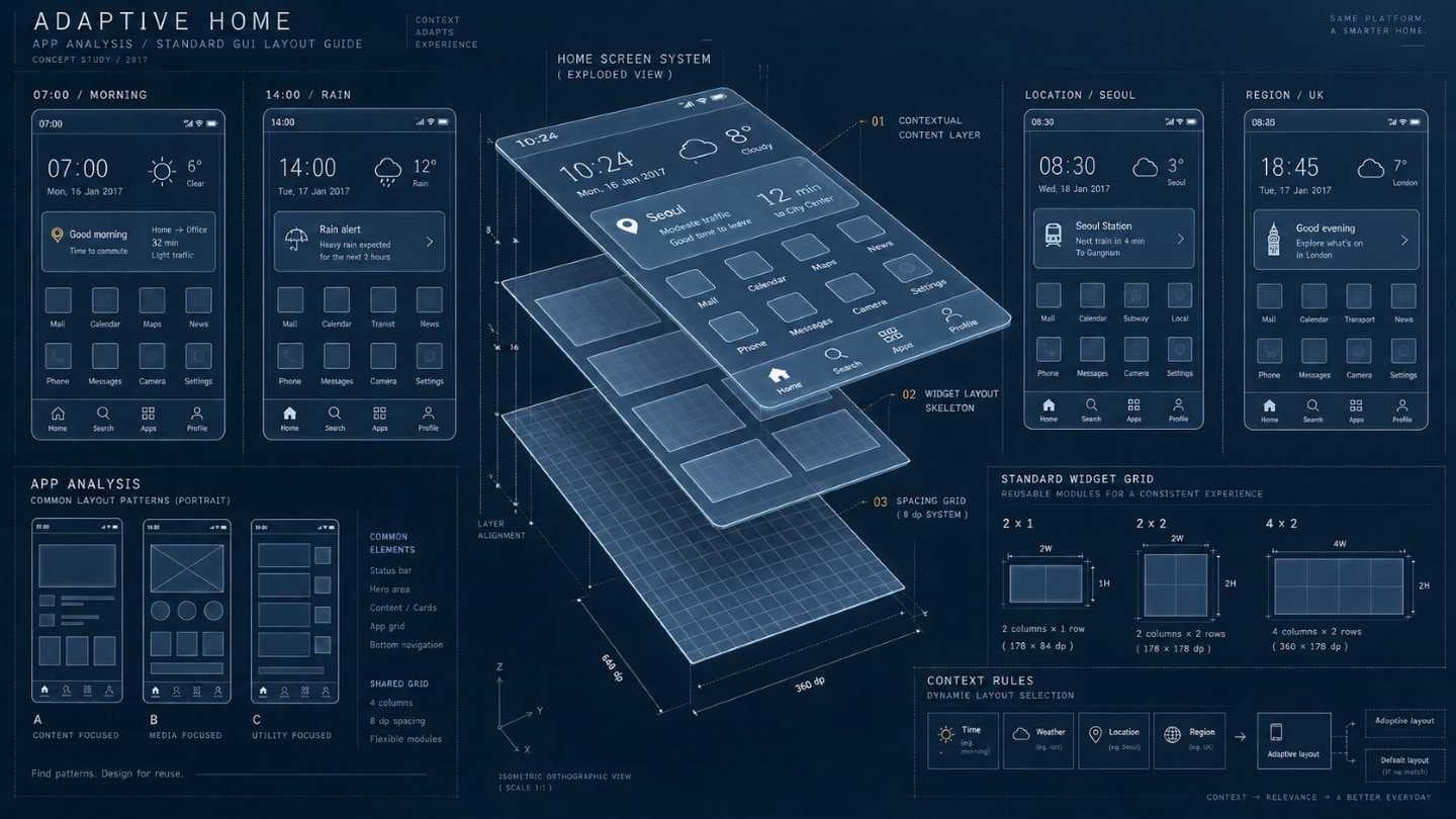
App Analysis and Standard GUI Layout Guide
A home screen that arranges itself around the hour, the weather, where you are and which country you are in.
Concept work for a common mobile home screen, with the guidelines for the widget screens beneath it.
A template that adapts has to decide what it is allowed to assume. Guess well and it reads as attentive; guess badly and it reads as guessing, which is worse than a screen that simply sits still.
Built on an analysis of the existing apps and the layouts they had each settled on.
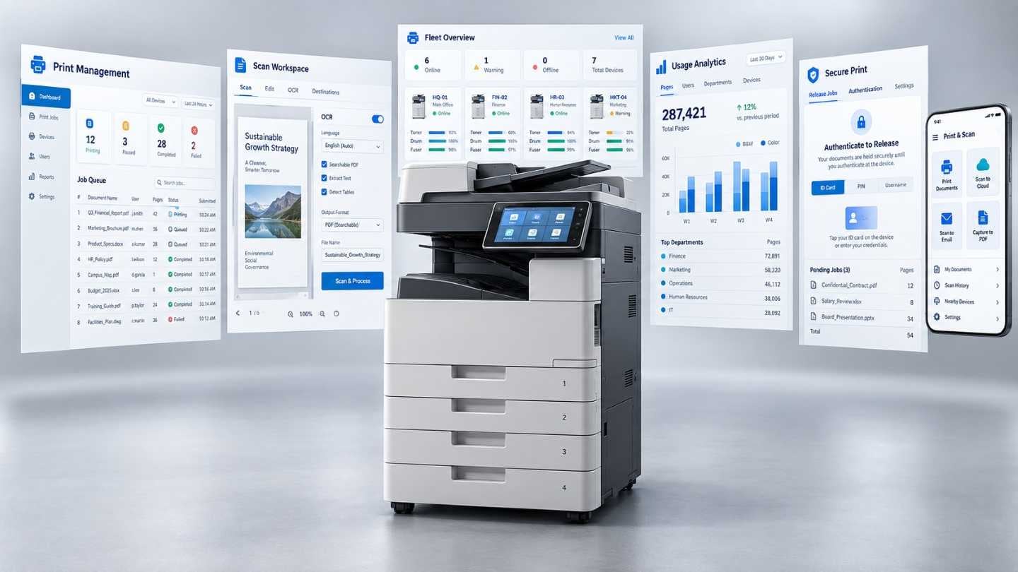
Printing App Center 2.0 UI/GUI Development
A printer on every floor, a different one in every department, and someone who just wants a document.
The machines are not the problem; the difference between them is. Interface and graphics for version 2.0 of the app centre that holds a whole building's printing together.
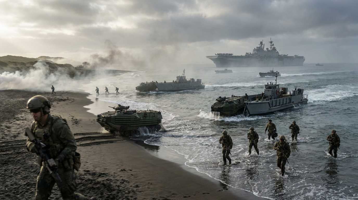
Improvements to the CSS HMI on Amphibious Assault Ship (LPH)
An amphibious landing is run by several services at once, and they do not share a vocabulary.
The command support system aboard ROKS Marado, the second of the LPH class, serves every unit taking part in the landing — navy, army, marines and allied forces.
A screen read by four organisations cannot be written in any one of their languages. That is the constraint the improvements were made against.
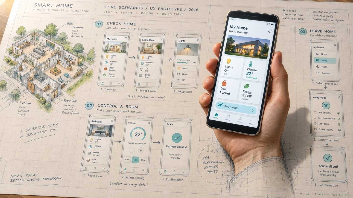
Smart Home Mobile App UX Prototype
Checking the experience before committing to build it.
A prototype is defined by what it is allowed not to do, so scoping what would actually be tested came before making anything. We built the core scenarios far enough to run, and the direction could be judged on them.
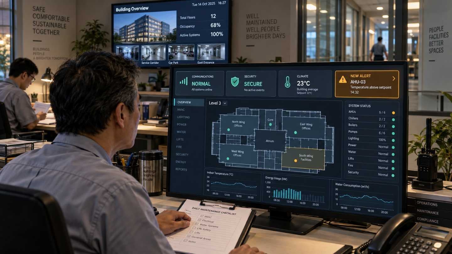
Smart Building Service UI/GUI Development
Three shifts a day, and not one of them spends its time watching the screen.
In a large building the manager has to see communications, security and climate in one place. Nobody can keep looking at it.
So the information divides in two: what must be legible whenever someone glances up, and what has to be caught in the instant it happens. They are different design problems and they compete for the same screen.
We gathered what the building's people needed and found difficult, then designed an interface that put visibility first because monitoring is what it is for. This engagement led on to the commercialisation of b.IoT.
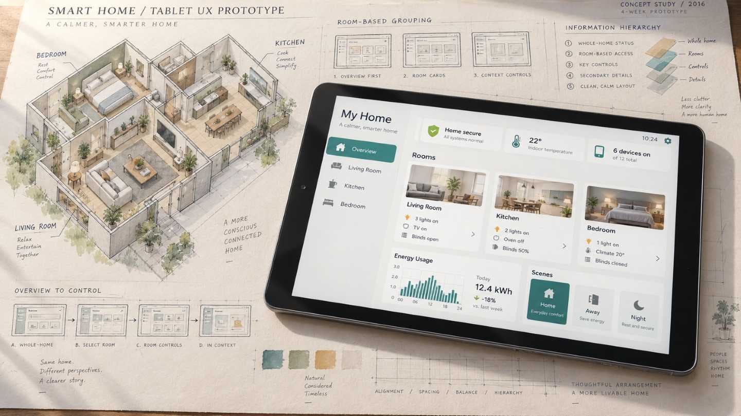
Smart Home Tablet UX Prototype
A tablet can show the whole house at once, which is not automatically an advantage.
Several devices on one large screen is a question of arrangement, not capacity. About a month to build the tablet UX prototype.
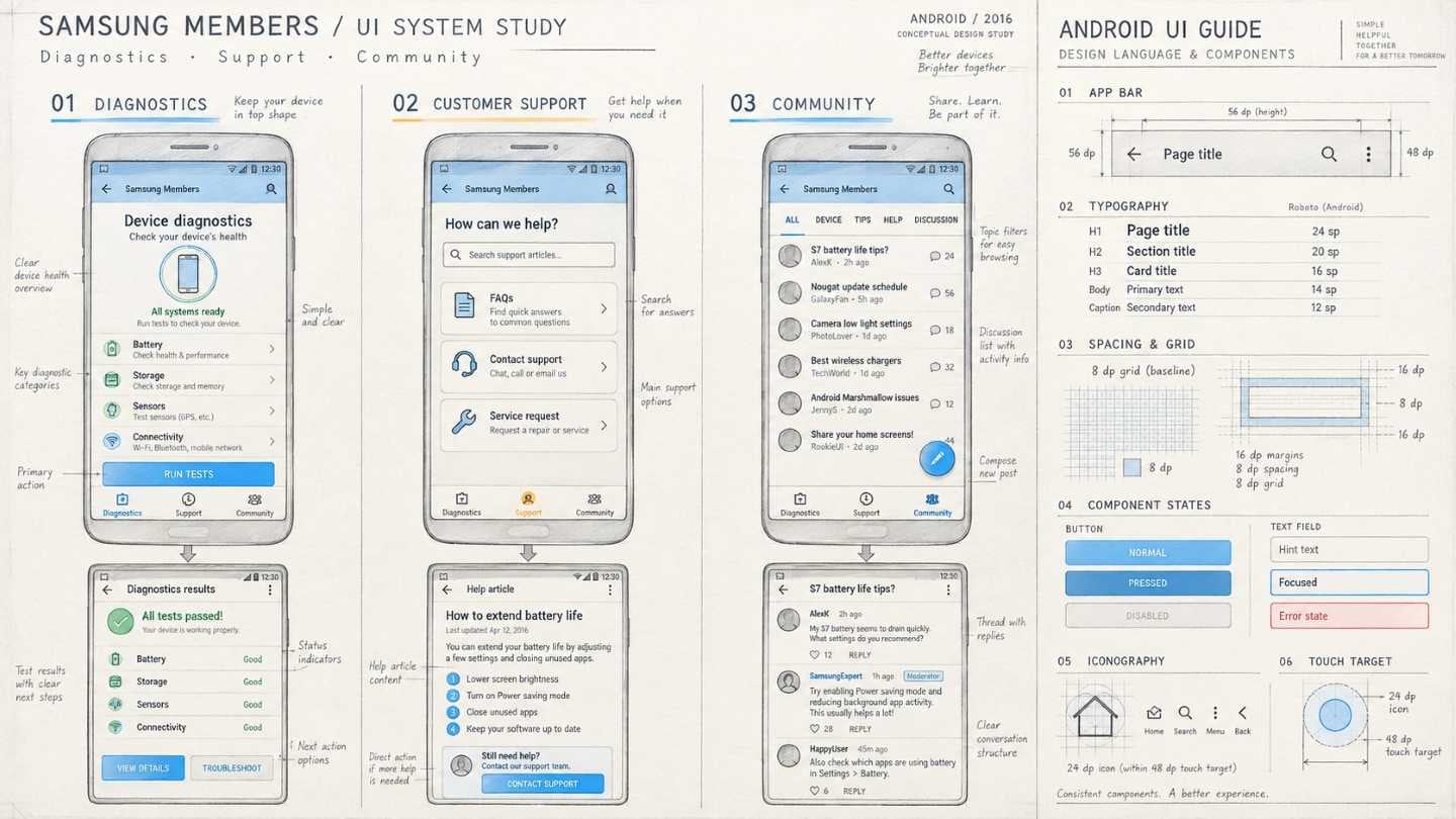
Samsung Members of UI and Android UI GUIDE
Diagnostics, customer support and a community forum, in one app.
Three functions with nothing in common need a structure that does not pretend they have something in common. Interface design for the app, with the Android UI guide alongside it.
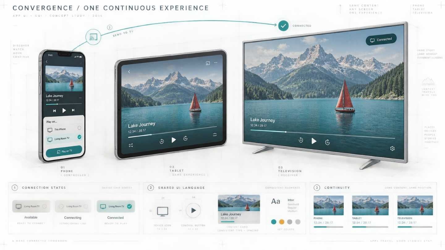
Convergence App UI/GUI Design
An app that moves between devices has to explain the move without explaining it.
A connection is understood or it is not; there is no halfway that a caption can rescue. Interface and graphics, developed jointly, with the scope growing during the work.
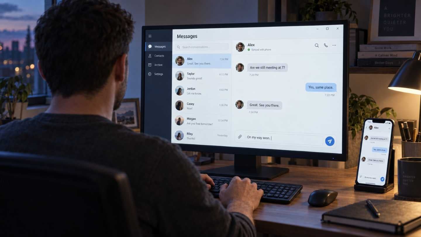
Message PC App UI/GUI
The same conversation, continued on a bigger screen.
Messages sent from a phone, read and answered on a PC. What has to stay identical is the thread itself — a conversation that looks like a different conversation on the other device is not continuous, whatever the data says. Interface and graphics developed together.
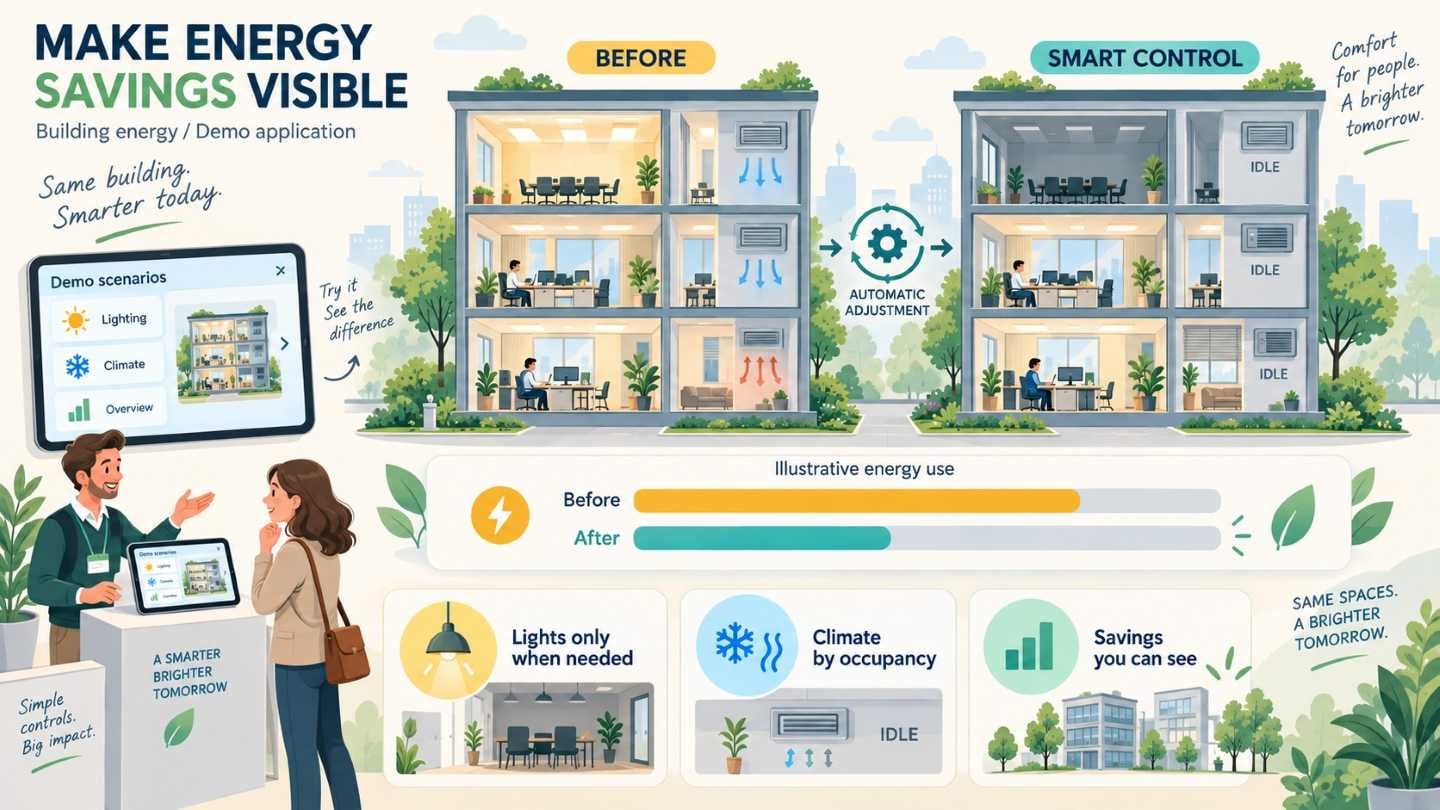
Energy Reduction Solution Promotion for Demo Application
A few minutes at a stand, in front of someone who may not be technical.
The energy solution had to show what it saves, quickly, at sales meetings and exhibitions.
A demonstration is an argument about which scene to show. Pick the function that saves the most and it may take too long to read; pick the one that reads instantly and it may not be the point.
We chose the moments where the saving is visible on its own and built the demo application around them.
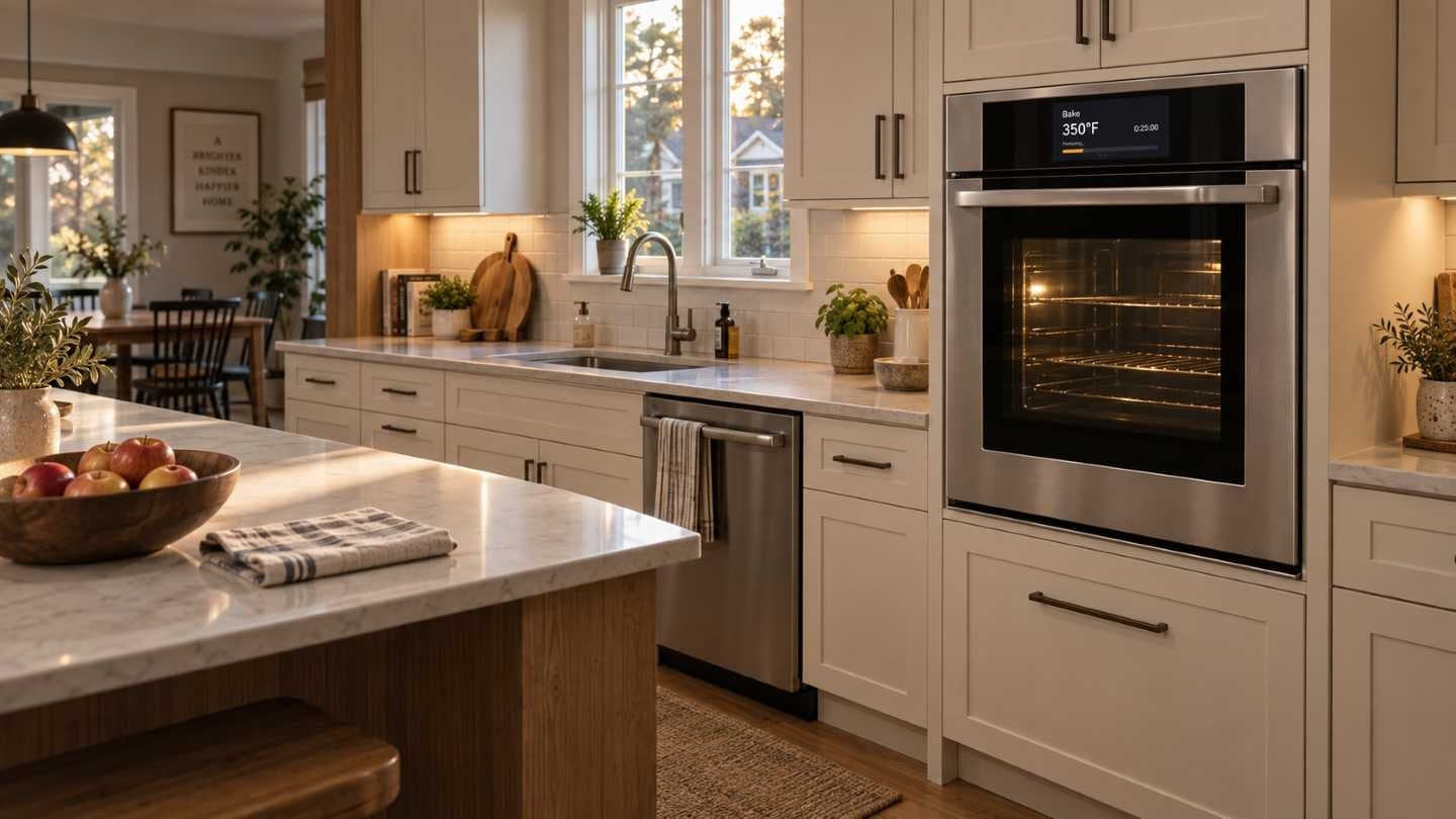
North America Luxury Built-in UI Guidelines
A built-in appliance is furniture first. In this market it is also a claim about the kitchen it sits in.
North American luxury buyers expect a great deal, and the product has to belong to the room around it.
A guideline can specify a tone, which is harder than specifying a layout. What makes a screen read as premium, and how that is written down so that different products arrive at it independently.
We set out the market conditions and wrote them up as UI guidelines for the built-in range.
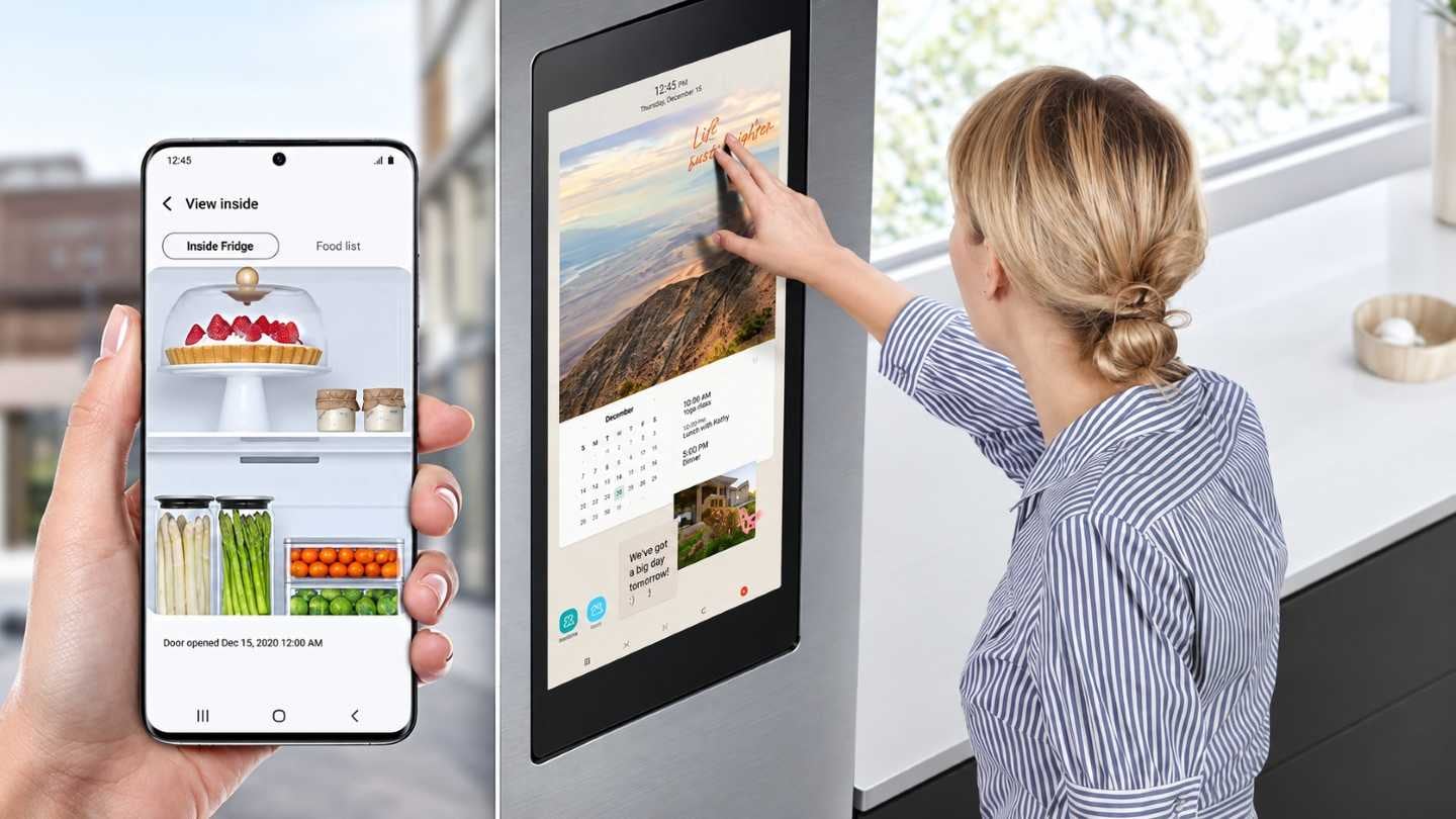
Family hub 2.0 GUI Guidelines (Mobile App)
Everyone in the house uses the refrigerator, in passing, without deciding to. In 2.0 the phone joined it.
Family Hub tied the fridge screen to a mobile app, so a task begun in the kitchen could be finished in another room, by someone else.
The same function shown twice has to be recognisably the same function — and some of it should not be shown to everyone in the house. Both were decisions for the guideline, not for the individual screens.
We wrote the mobile app GUI guidelines on the appliance experience built up since the internet refrigerator. The scope grew during the work and the contract with it.
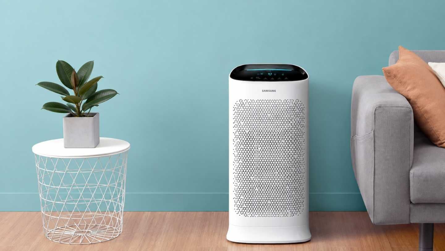
Premium Air Purifier (AX7700) GUI/VI Development
It stands in the living room, so its display is part of the furniture — and it has to be readable from the sofa.
A premium air purifier is looked at from across a room, by people who are not thinking about it.
Air quality has to be legible at a distance and unobtrusive at rest, which are opposite demands on the same display. Colour and marking carry both: what dust and gas readings look like, and what the product's visual identity is when nothing is happening.
Graphics and visual identity were developed together, and the scope grew twice during the work.
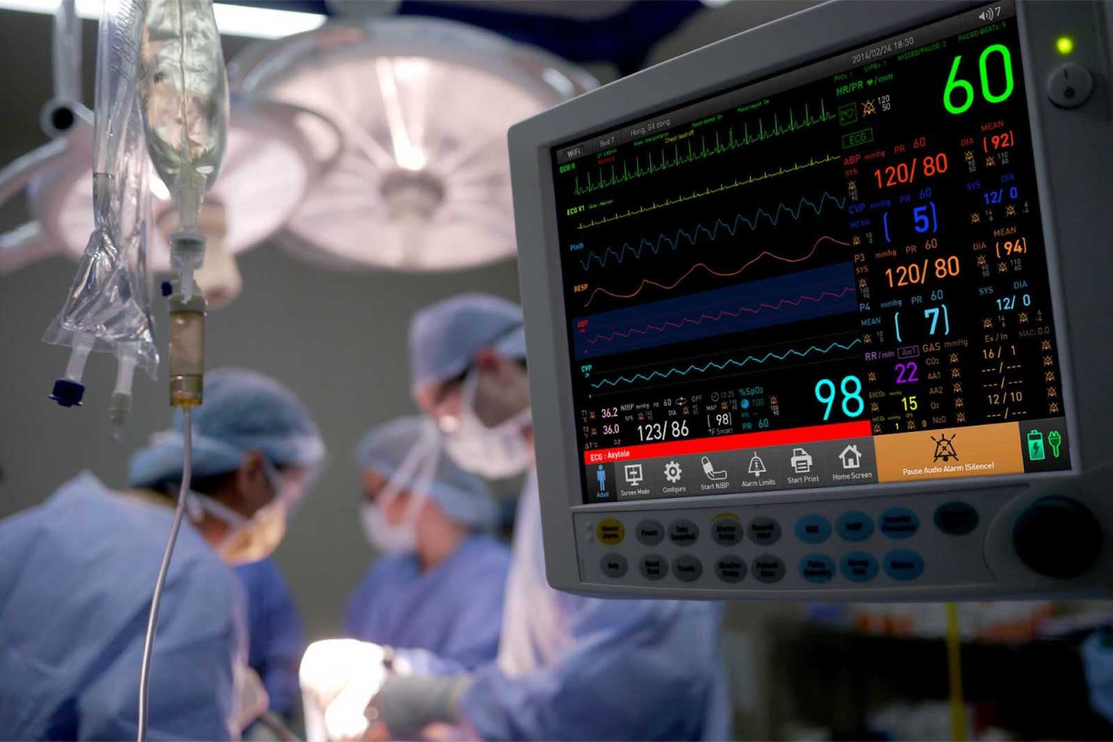
Mediana Patient monitor (Hawk) UI/GUI Development
The ward already knew how to read a patient monitor. The risk in redesigning one is not that the new screen is worse — it is that it is different.
A patient monitor gets read by people who are not looking at it. A nurse crossing the ward takes a number in and keeps walking. A doctor glances at it mid-sentence. That reading is not learned from a manual — it accumulates over years, on whatever machine the ward happens to own, and a new design inherits all of it.
So the first decision was not what to change. It was what to leave alone. Which readings hold their position no matter what else moves. How an alarm reaches someone who is facing the other way. And where the existing way of working is genuinely inconvenient, as opposed to merely unfamiliar to whoever is redesigning it.
We kept the learned environment and changed only where the inconvenience was clear, one function at a time. Units, colours and symbols were set against international standards rather than preference. On a device like this a colour is not a matter of style — it is the thing someone acts on.
PC Smart Manager UX Design
People open this app because something is wrong. They are not in the mood to learn vocabulary.
A diagnosis that has to be looked up has not been delivered. The work was saying what the check found without the terms it was found in. UX design, completed in a short period.
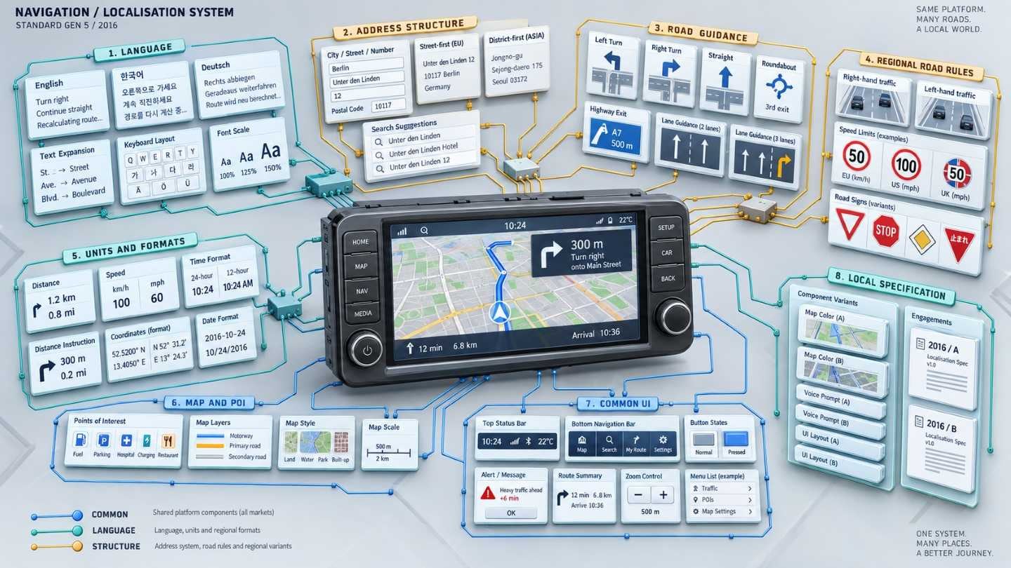
Standard Gen 5 Navigation
Another language, another address system, another set of road rules. A screen built for one country does not simply translate.
Localisation divides into two piles: the words, and the structure. Confusing them is how a specification either bloats or breaks — everything treated as structure means a second product, everything treated as words means a screen that lies about the roads.
Working from the common Standard Gen 5 design, we pulled out what the local conditions actually change and wrote those into the specification.
2 separate engagements on this line in 2016.
Mobile Print App 4.0
Nobody opens a printing app to look at it. They open it because a sheet has to come out.
Version 4.0 had to show the printer's state and its options so that both read at a glance, which is a different task from listing them.
So the only number that matters is how many steps stand between opening the app and the sheet coming out.
Interface and graphics developed together. 2 separate engagements on this line in 2015.
Galaxy Apps
Store interface for Galaxy Apps — how apps are browsed, and how browsing turns into installing.
Two stores, one errand. The design was the join — how looking for a Gear app on a phone leads to it being installed on the watch without the user tracking where anything is. Produced together, with the period extended.
3 separate engagements on this line, 2014–2015.
DIMS System UX Development
Nobody chooses an internal system. They put up with it, and putting up with it is invisible.
Staff use the company's information systems because the job requires it, which means the friction never arrives as a complaint.
So the first task is finding where the work actually stalls, not asking what people dislike. Those are different lists and only one of them is worth fixing.
We ran research with the people doing the work, then took what it found into interface and graphics improvements.
PLM System UX Development
Product data outlasts the people who entered it, and the screen shows all of it at once.
A PLM system holds the development record for a product, which makes any single view crowded by nature.
On a dense screen the design decision is placement and route — where the things people look for every day sit, and how search and browsing divide the work between them.
Research ran alongside the interface and graphics improvements. It was carried out in parallel with the department's other systems so that the rules came out the same across them.
Maps System UX Consulting
Another internal system in the same department, and the same question: what to fix first.
Consulting here produces an order, not a design. Research-based, and delivered as a direction for improvement.
DMS — System Air Conditioner Central Management
Central management for system air conditioning, where a great many indoor units are watched at once and the graphics have to separate their states.
Central management for system air conditioning was moving to the web, where a manager works across a whole building at once.
Zones and floors are not a menu; they are how the person already thinks about the building. The navigation had to follow that, and the state of the equipment had to be readable across all of it without opening anything.
We took interface and graphics together and set the frame for the web screens. The later 3.0 work followed from it.
5 separate engagements on this line, 2014–2015.
Samsung Cloud Print
Graphics for the hosted cloud printing service, making the state of a print or a scan readable while it happens.
Connecting to a printer and storing to the cloud are two ideas the user should only have to hold as one. Interface design, developed alongside the graphics work.
3 separate engagements on this line, 2014–2015.
IoT Automation Service Design ToolKit UI/GUI Development
An automation rule is simple until the second condition arrives.
How conditions and actions are allowed to combine decides whether ordinary people can write a rule at all — the expressive version and the usable version are rarely the same. Interface and graphics for the toolkit.
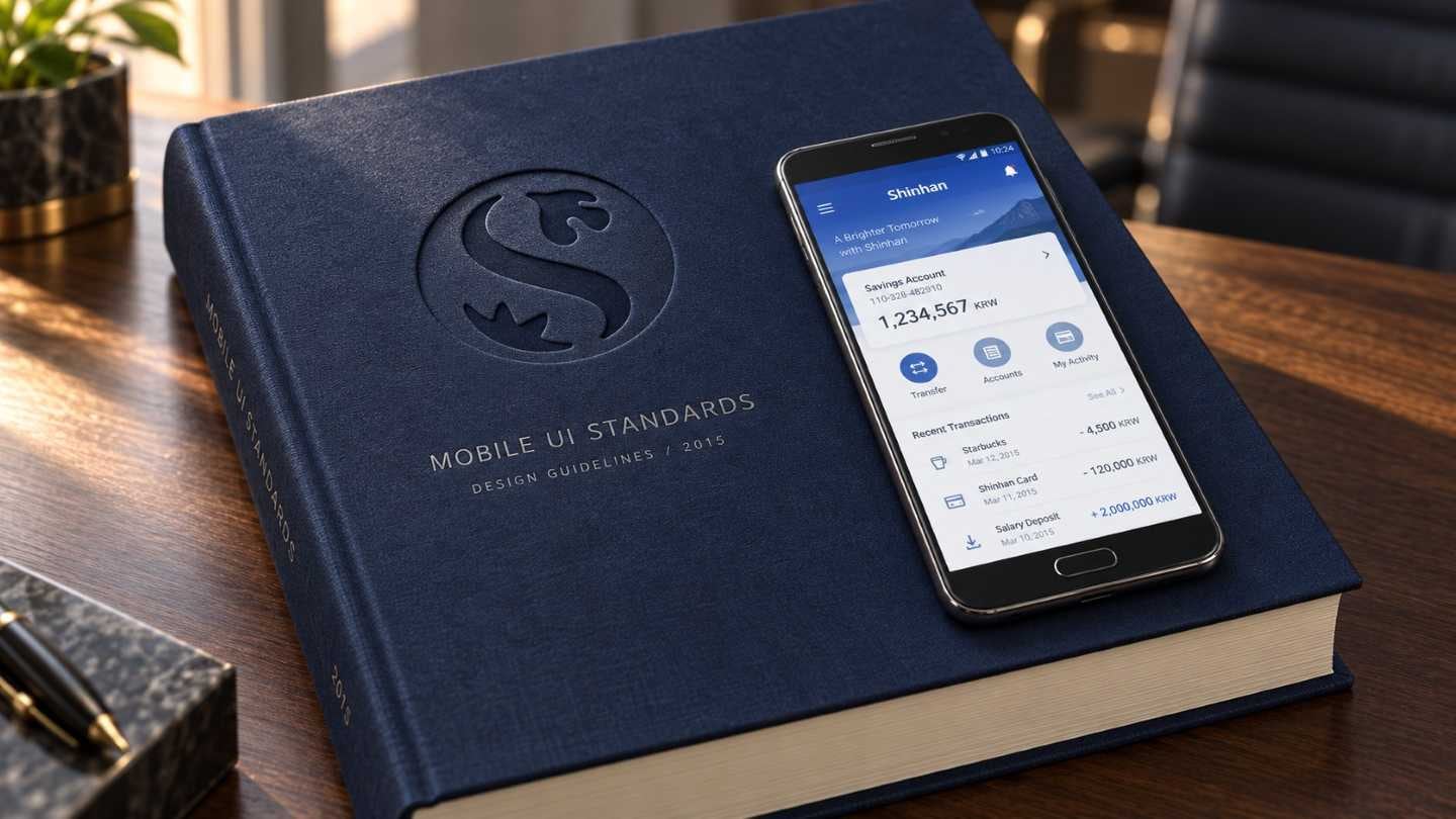
Shinhan Mobile UI Standardisation Guidelines Restructuring for Design
Several mobile services from one company, each with its own idea of how a screen works.
Restructuring a standard is an argument about what is genuinely common — pull too much into the centre and every service has to fight the guideline to do its job. Built on the Shinhan mobile UX guidelines produced earlier.
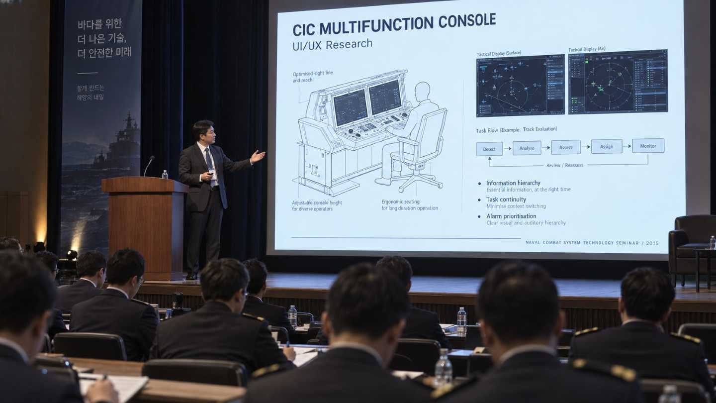
Naval Combat System Seminar — CIC Multifunction Console UI/UX Research (Presentation)
A paper at the first naval combat system technology seminar, hosted by LIG.
Research into the multifunction console in a ship's combat information centre, prepared and presented there.
A seminar paper has to be arguable, not merely correct — it goes in front of the people who will build the next one.
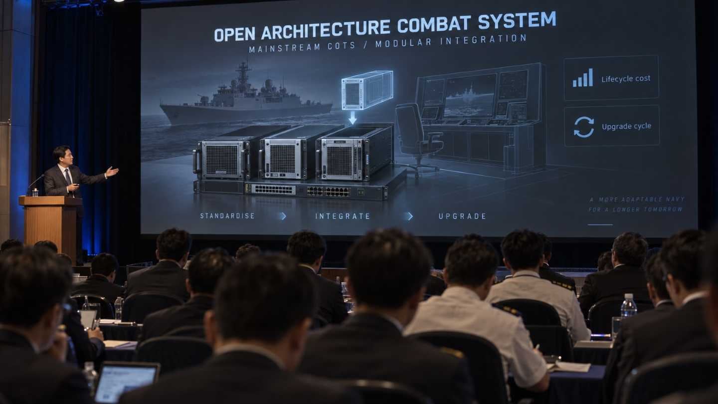
Naval Combat System Seminar — Open Architecture Combat System Using Mainstream COTS, Promotional Film (Exhibit)
A film about building an open combat system out of mainstream commercial parts.
Open architecture is an argument about cost and pace rather than about hardware, which is a difficult thing to put on screen. Made for the first naval combat system technology seminar.
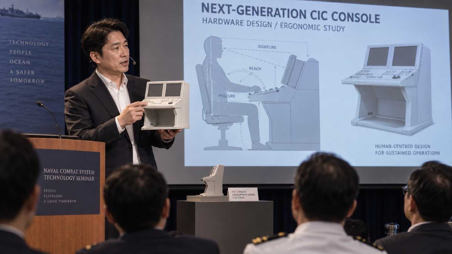
Naval Combat System Seminar — Next-Generation CIC Multifunction Console Design Consulting (Exhibit)
A next-generation console, presented as something you could pick up.
Hardware design for a future multifunction console in a ship's combat information centre, exhibited at the seminar.
It was 3D printed so the argument could be held rather than shown. A console is judged by reach and posture before anyone looks at its screens.
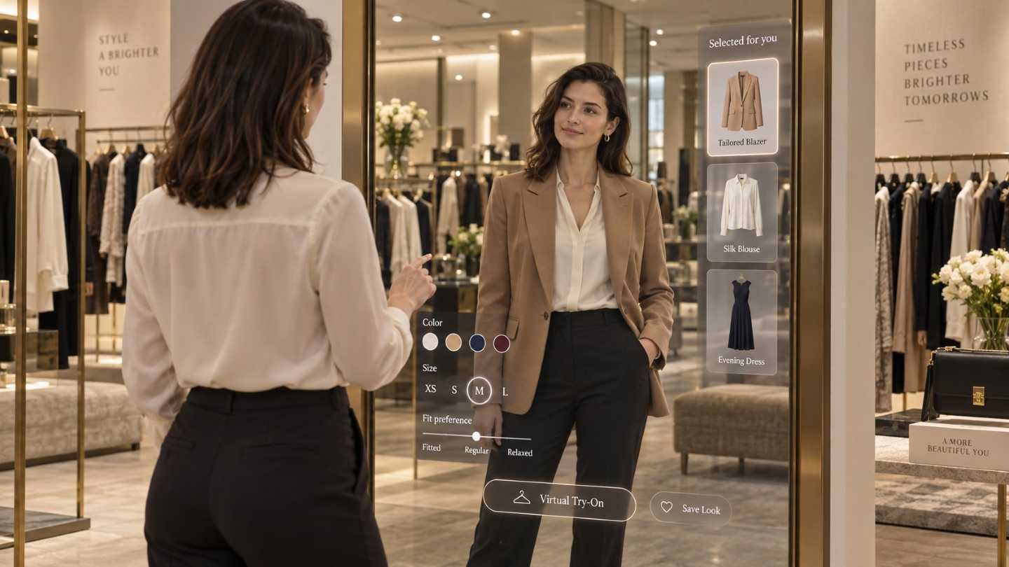
StyleMirror UI Development
A mirror that knows who is standing in front of it — studied years before that was an ordinary idea.
An early concept study for a smart mirror, at home and in a shop.
Everything shown on it competes with the reflection, which is the one thing the person actually came for. The research asked what an intelligent interface may put there, and where it may stand.
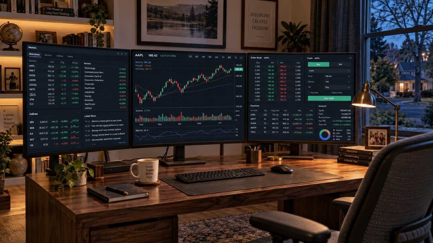
Home Trading System
Traders know where everything is. That is the constraint, not the opportunity.
On a system people use at speed and under money, familiarity is a feature you can destroy by improving. So the work was drawing the line between what to change and what to leave. Carried out jointly.
3 separate engagements on this line, 2013–2015.
K Project Accessibility Function End-User Usability Evaluation
An accessibility feature only shows its faults when someone who needs it tries to use it.
Who is recruited and what they are asked to do is the whole validity of the test. Evaluation carried out with the users the features were built for.
Samsung Hub UI(Android/Tizen Phone Type)
Music, video and books in one place, on two operating systems.
The service has to be recognisably one thing while sitting inside two platforms that disagree about how things are done. Phone-type interface designed for both.
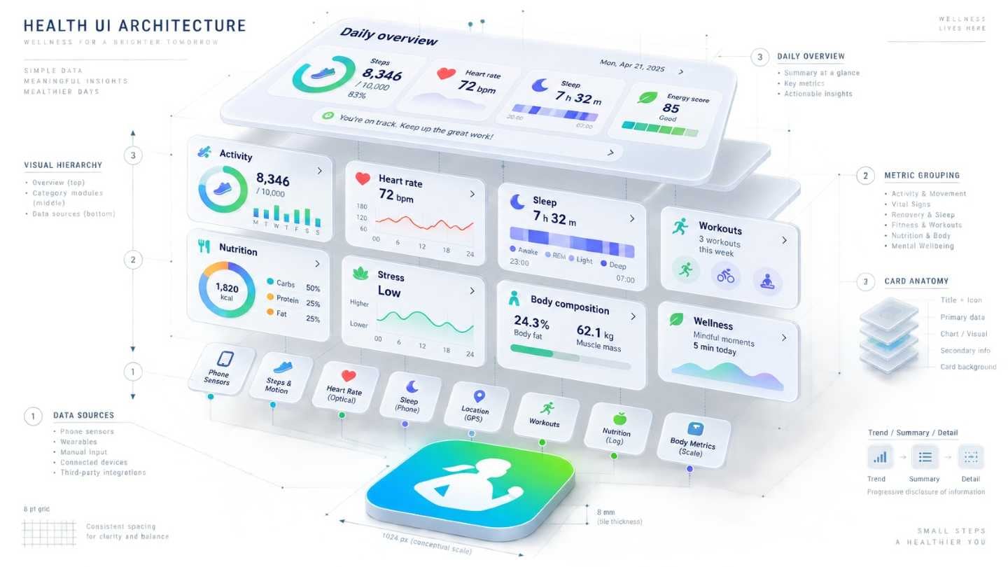
S Health
Version 3.0 brought heart rate, coaching and much else. A first-time user opens it and has no idea where to begin.
A service used occasionally has one chance to show where things stand before it is closed again.
So the first screen is the whole service, and entering a record has to finish in fewer steps than the user expected. Anything longer and the next gap is permanent.
We took the issues raised by the previous version's usability work through into the 2.5 guide. Working with the same team meant the context did not have to be explained again.
4 separate engagements on this line, 2013–2014.
[Wingtip, Gear2] Wearable UX part Line-up UI
Small screens, short interactions, and several products in the line.
What the line-up shares has to be settled once, or each product answers the same question differently. A second phase continuing the interface work across the range.
Tizen Platform -based LCD Refrigerator of Food Manager Application
Used standing up, in a kitchen, with one hand, for a few seconds at a time.
A food manager on the refrigerator's own screen, opened in the middle of doing something else.
Registering an item has to cost less effort than remembering it would have — otherwise nobody registers anything and the rest of the app has no data to work with. Expiry dates had to announce themselves without being looked for.
We checked what the Tizen platform allowed and designed the interface within a short period.
Windows Phone 8.1 Applications
Interface and graphics for Samsung's apps on Windows Phone 8.1, balanced between the platform's design principles and the apps' own identity.
An app that ignores the platform looks foreign; an app that surrenders to it stops being yours. The graphics were made on that line. A second phase continuing the work.
3 separate engagements on this line in 2014.
Tizen for Simple UX of Commercialisation GUI Guideline Development
A simple phone experience, for people whose first smartphone this is.
Simplicity is subtraction, and subtraction is the argument — what goes, what stays, and who decides when the two collide at commercialisation. Written up as GUI guidelines.
Refrigerator LCD GUI — Export Markets
Canada means English and French on the same screen, and French is longer.
Mirroring a layout is not a translation task; it decides where the eye starts. Every relationship on the screen has to survive being reversed. We set out the conditions for each market first, then developed the LCD graphics.
2 separate engagements on this line, 2012–2014.
Sign Language Animator Usability Test Development
Whether signing reads correctly can only be judged by people who sign.
So the test had to measure comprehension, not preference — a hearing observer can tell you an animation looks smooth and nothing about whether it said anything. We designed the test and ran it.
Kids Platform
A kids mode has two users who must never meet on the same screen — the child using it and the parent setting its limits.
Kids mode shipped across several new handsets, and the graphics had to stay the same while the hardware and the platform underneath them did not.
So the child's screen and the parent's screen are separated before either is designed — everything else follows from where that line is drawn. Character work and graphic tone were settled alongside it.
Mass-production graphics and visual identity. 3 separate engagements on this line, 2013–2014.
Set Smart Rule Authoring Tool UX Development
People write the rules themselves, and rules get complicated in about two steps.
Authoring is a sequence problem: what you are asked for first decides whether the rest stays comprehensible. UX for the authoring tool.
Next TV Specialised UX Design and Working Prototype Development
An idea about television is hard to argue for. A working one is not.
So the question was which part of the experience had to actually run. We designed the specialised UX and built it far enough that people could operate it and decide.
Handset UI & GUI — Mass-Production Line-up
Forty-one handset and tablet programmes between 2008 and 2014, for a manufacturer shipping to carriers in several markets while the platform underneath changed three times.
Every model arrives with its own screen, its own keys, and an operator that wants something the last one did not. What is right for an open-market phone in Europe is wrong for the same handset at a US carrier, and wrong again in Russia or China.
At that rate the work is not designing screens. It is holding a line of them together while everything underneath moves. Feature phone to TouchWiz, TouchWiz to Android, Android to Bada and Tizen — and the base interface has to come through each of those recognisably itself.
So most of the effort goes into what gets decided once: the menu tree, the widget conventions, the base screens every model inherits, and the point at which a market’s requirements are allowed to change them.
Forty-one programmes over seven years, from model graphics through carrier and regional variants to mass production.
Store(Music/Books/Video/Learning/Game) UI
Five stores selling five unlike things.
A shared frame has to hold a song and a textbook without flattening either. Each store's interface was designed on the same structure.
2.4-inch Monochrome Display GUI
Two and a half inches, and no colour to tell anything apart.
Take colour away and contrast and shape have to carry every distinction — state, selection, menu and warning, all in black and white. Graphics developed for the monochrome display in a short period.
Zero Project for Accessibility Function End-User Usability Evaluation
Accessibility features in another new programme, put in front of the people they were built for.
Which features are tested and who is recruited decides what the evaluation can find. Run on the method established by the earlier evaluations.
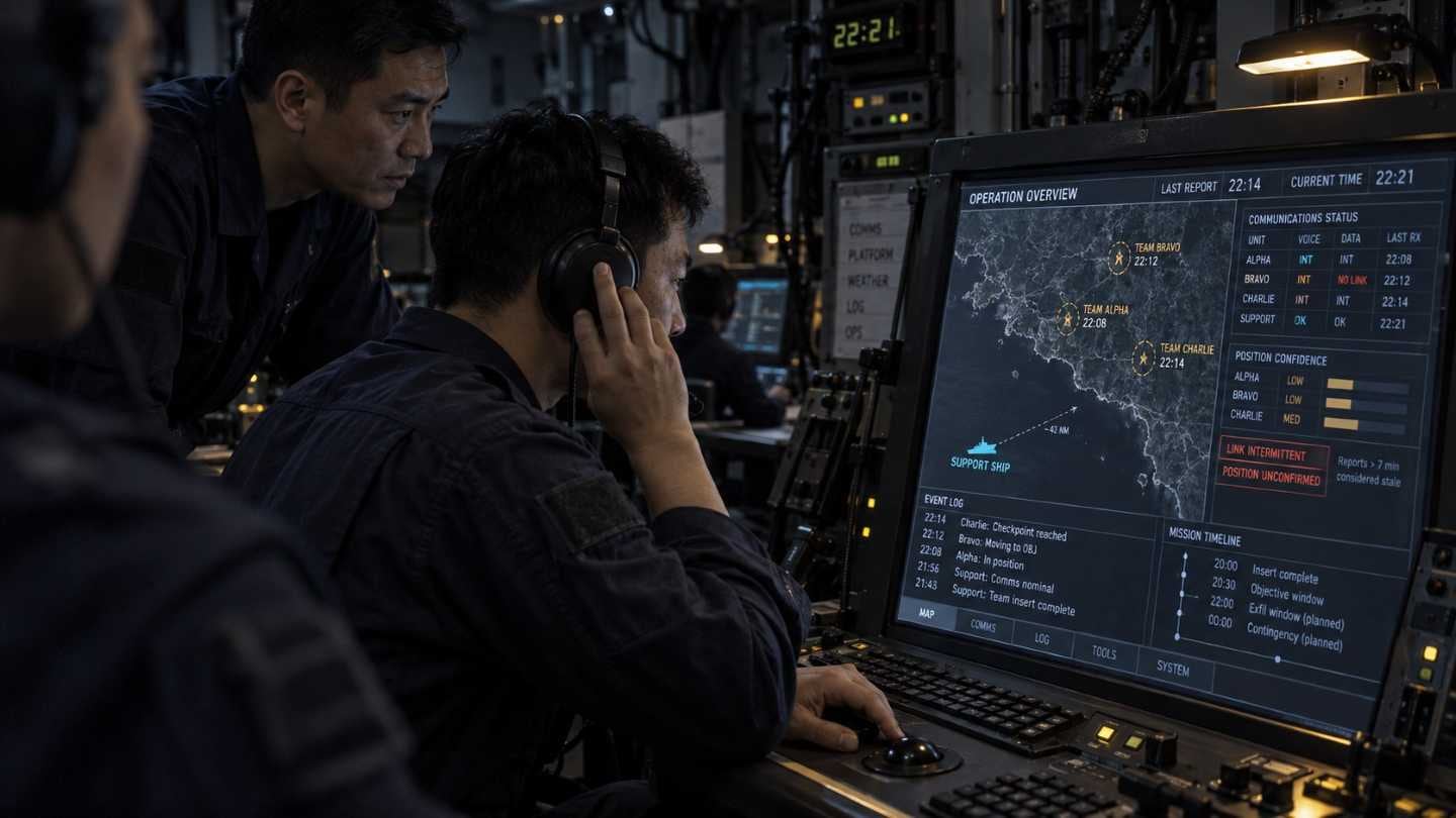
Special Operations Support System Command & Control Screen Consulting
A ship supporting special operations from the water, and the command screen that runs it.
The unit being supported is somewhere else and largely out of contact, which changes what the screen is for — it holds a picture of an operation nobody aboard can see. Interface design for the command and control display.
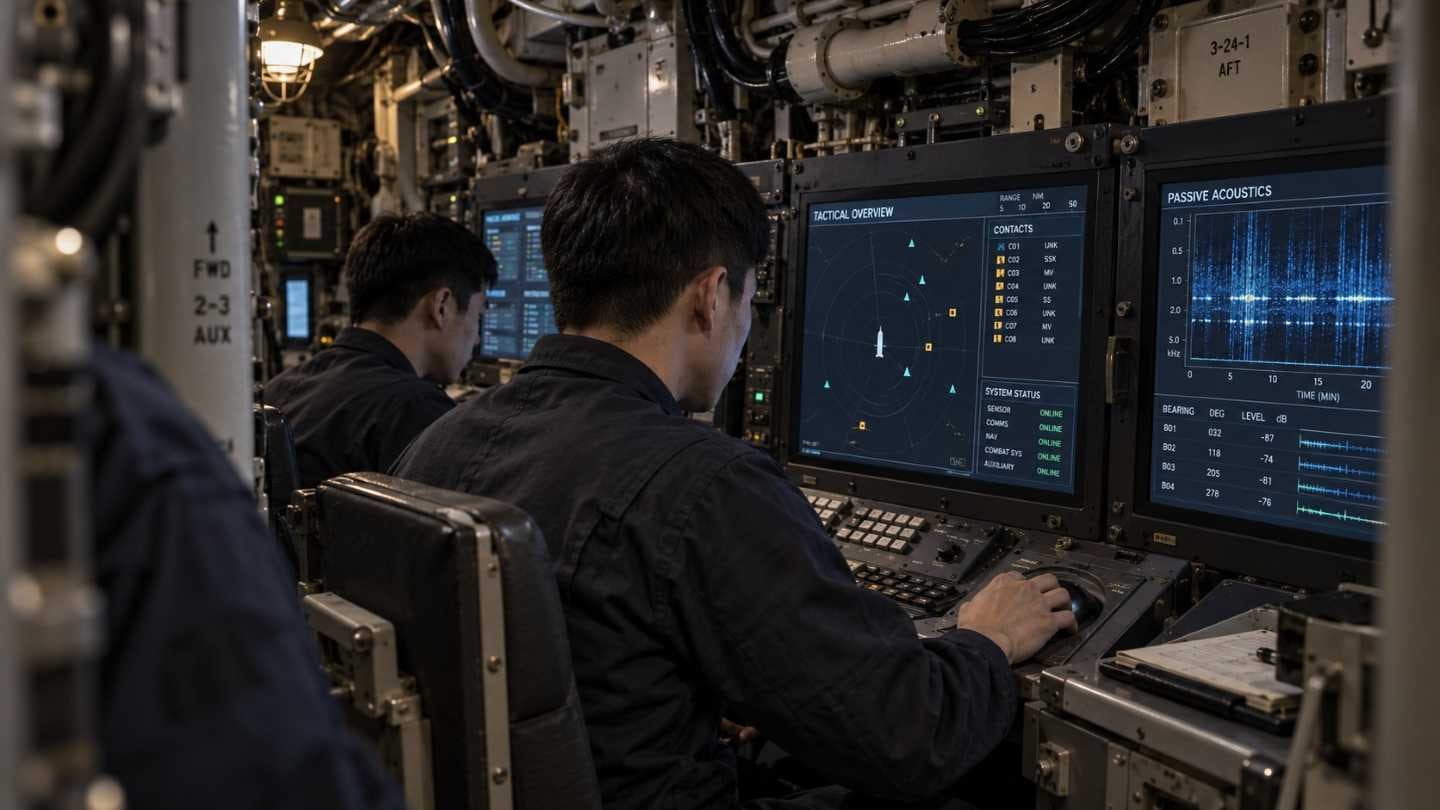
Submarine Combat System UX Consulting
A submarine's combat information centre is smaller than any design would like, and that is not negotiable.
A capability upgrade for the Jangbogo class — 56 metres, 1,200 tonnes — taking the combat system of the later 214 boats as its base.
Carrying a newer system into an older hull means the limits set the design rather than the other way round. The space in the CIC and what the multifunction console can physically do decided what could be brought across.
Interface design under those constraints.
— AEON has carried out more than 800 UX projects to date. —
What is shown here is a selection.