S Health
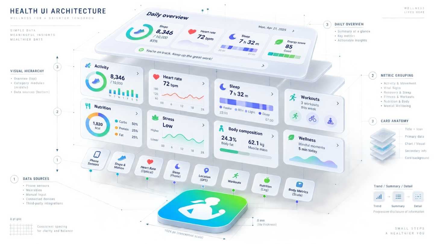
Version 3.0 brought heart rate, coaching and much else. A first-time user opens it and has no idea where to begin.
A service used occasionally has one chance to show where things stand before it is closed again.
So the first screen is the whole service, and entering a record has to finish in fewer steps than the user expected. Anything longer and the next gap is permanent.
We took the issues raised by the previous version's usability work through into the 2.5 guide. Working with the same team meant the context did not have to be explained again.
4 separate engagements on this line, 2013–2014.